| Image |
Comment |
| 04/01/2006 11:16:52 AM |
Grand Pa ...by lglandonComment: I'd like to see more detail in the texture since that is what is most interesting about this image. |
| 04/01/2006 11:15:53 AM |
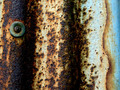
r u s t e dby imagesloyolaComment: Nice colors and textures. I like the inclusion of the rivit to the right of the picture plane. I kind of wish the blue portion was a bit darker. I would have sacrificed a little bit of detail in the darker portions to get a really good exposure on the blue portion. Darkening the midtones with your levels adjustment (assuming you have something like that in your software) would accomplish similar results). I wonder how this would look rotated 90 degrees clockwise? |
| 04/01/2006 11:11:56 AM |
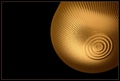
"Golden"by sfarrell23Comment: Very nice image quality. Simple and elegant. One of the handful of really nice images I've seen in this challenge. |
 Photographer found comment helpful. Photographer found comment helpful. |
| 04/01/2006 11:11:14 AM |
Bumpsby MisspavaComment: Interesting subject matter .Nice effort. I think it needs greater detail in the shadow area. |
| Photographer found comment helpful. |
| 04/01/2006 11:10:24 AM |
In the Roughby Kari48Comment: this needs to be lit better to really get a sense of the texture of the gravel (sidelighting is the key to enhancing texture). This looks a bit overexposed. The focus should be sharp on the entire image (so for a macro you need to point the camera straight down) to really get the graphic abstract quality of the gravel. |
| Photographer found comment helpful. |
| 04/01/2006 11:08:42 AM |
Who Nose?by genxm5Comment: It looks like a fly. Nice cropping for interest. I needs much better focus and it is a bit too contrasty (although the I like the blown-out background). |
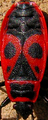
| 04/01/2006 11:07:45 AM |
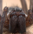
Maskby TiNComment: Very interesting subject matter. Good choice for the challenge. I would suggest cropping out the heads and legs for more of an abstract look. Of course, you have probably been getting lots of comments about the smallness and grainy quality of the image file. It looks like maybe your camera doesn't have a macro function and you had to crop this from a much bigger image. Nice effort, if not a great entry. |
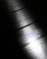
| 03/30/2006 12:32:18 PM |
Groovin' with macroby BosborneComment: There isn't enough sharp detail and the strong glare on the vinyl is a detraction more than a design feature, in my opinion. There just isn't enough going on here to grab my interest. |
| Photographer found comment helpful. |
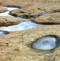
| 03/28/2006 03:58:44 PM |
Reflectionsby pmichaudComment: The reflections look mostly like glare to me, except for the foremost puddle. |
| Photographer found comment helpful. |
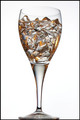
| 03/28/2006 03:46:34 PM |
Aqua Puraby TejComment: Very nice. Just a nit--It's cropped a bit to close at the bottom. |
| Photographer found comment helpful. |
Home -
Challenges -
Community -
League -
Photos -
Cameras -
Lenses -
Learn -
Help -
Terms of Use -
Privacy -
Top ^
DPChallenge, and website content and design, Copyright © 2001-2025 Challenging Technologies, LLC.
All digital photo copyrights belong to the photographers and may not be used without permission.
Current Server Time: 08/25/2025 01:07:13 AM EDT.