| Image |
Comment |
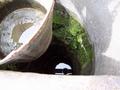
| 04/28/2004 05:04:22 PM |
circlesby claurusComment: Sorry, I don't know what this is and as an abstraction it does nothing for me. |
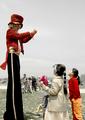
| 04/28/2004 05:03:22 PM |
Circus Clownby JoviComment: This is a nice image. I would have waited for the background to be free of people before shooting. Also, it took me a moment to notice there was a third, smaller child. I would have waited until the girl lowered the toy she is holding so little boy's face could be seen. It's also a bit overexposed looking. It meets the challenge. |
 Photographer found comment helpful. Photographer found comment helpful. |
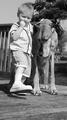
| 04/28/2004 04:59:03 PM |
Look, I've got big feet like you!by Prof_FateComment: This is a nice boy and his dog shot. I'm not sure that duotone is working very hard here. Placing your models in front of a less distracting background would have gone a long way toward making this fabulous instead of just cute. It is a bit high key for my taste. It looks like exposure came from the sky instead of something more neutral--the boy's face or the dog's fur for instance. See how the detail in the white sneakers are completely washed out? You can't see where the sneakers end and the socks begin. The subject does meet the challenge. |
| Photographer found comment helpful. |
| 04/28/2004 04:51:33 PM |
House of Worshipby jazzmanmgtComment: There is too much going on here. Perhaps if you had concentrated on only one or two elements of this landscape? Lines leading into the image can be a good design element but here they are stopped short by the fountain which is to small to be the main focus and which interrupts the progression to the building. The building is impressive enough that you could have stood in front of the fountain to get the shot. As it is, it is too far back in the frame and there is not enough contrast between the building and the sky. I also think this is an ugly building and the landscaping is bad and it is probably influencing how I see this picture. |
| Photographer found comment helpful. |
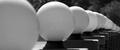
| 04/28/2004 04:40:38 PM |
Light Formsby breckinshireComment: I like this. I would like it more if you could have cropped it to exclude that foremost bulb. |
| Photographer found comment helpful. |
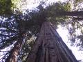
| 04/28/2004 04:38:17 PM |
Redwoodby axsdenyComment: It illustrates proportion but I don't really like the shot. Perhaps if you had moved around to the other side, placing the sun over your shoulder instead of behind the tree? There is that large expanse of overexposed sky that just detracts too much from the subject. A vertical composition probably would have worked much better. You could have cut out all the distractions to the right and left and the vertical image plane would have naturally led the eye upward. My eye keeps wandering off to that other tree and to that hot spot instead of focusing on the central tree. |
| 04/28/2004 04:34:56 PM |
Untitledby davidbedardComment: It illustrates proportion but this image doesn't hold my interest. There's too much going on with the colorful windows, the shadows at the bottom, and whatever those girder things are on the roof. I do kind of like the way they look against the blue sky but that leaves 2/3 of the frame filled with nothing much. |
| Photographer found comment helpful. |
| 04/28/2004 04:31:22 PM |
stone_n_buddhaby zephirComment: You could have spent a bit more time composing this photograph. The statement seems to be about the rock and the Buddah (I'm not sure what that statement is) so why take up so much of the frame with that expanse of distracting brick in the foreground. The blurred stems of grass isn't adding anything either. The darkness of the folliage does make a nice contrast with the Buddah but it would have been more striking if you had come in much tighter, placed the Buddah more to the left, and eliminated all that wasted space in the foreground and on either side of the arrangement.
Without the title it would have taken me a moment to notice the rock sitting there. It just looks kind of random and I don't get the point you are making. |
| Photographer found comment helpful. |
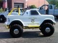
| 04/28/2004 04:23:03 PM |
A child size truck!by tolovemoonComment: This is a really small monster truck? I don't get this at all? This is a very poorly planned composition with too many distracting details to make a powerful statement. If this is a small monster truck than it might have been effective to pose someone standing next to it in order to make an obvious statement. You should also have isolated the truck against a totally neutral background. It is somewhat out of focus which is evident in the slight blurring of the letters on the door of the truck.
Here is a very important tip which will go a long way toward improving your photos.
A photographer has to remember that the camera records *everything* within the frame of its viewfinder. The human brain works in conjection with the eyes to filter out distracting and unpleasing details. The camera is incapable of doing this. When the photographer fails to pay careful attention to any distracting details the result is shots like this. |
| Photographer found comment helpful. |
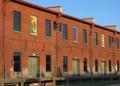
| 04/28/2004 04:16:09 PM |
Bricksby GolferDDSComment: This would have been a far more striking abstract without the black grate in the top left corner. I don't really see how that adds to the idea of proportion or lack of it unless you want to argue that the distracting grate adds a lack of proportion to the image. The problem there is, it does so in an unpleasing way and uninteresting way. I think focusing more tightly on fewer bricks and shooting straight ahead instead of slightly up would have made a more powerful statement about the proportion in the design of these colorful bricks. The slight tilt upward is skewing the design. |
| Photographer found comment helpful. |
Home -
Challenges -
Community -
League -
Photos -
Cameras -
Lenses -
Learn -
Help -
Terms of Use -
Privacy -
Top ^
DPChallenge, and website content and design, Copyright © 2001-2025 Challenging Technologies, LLC.
All digital photo copyrights belong to the photographers and may not be used without permission.
Current Server Time: 08/24/2025 03:19:55 AM EDT.