| Image |
Comment |
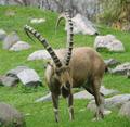
| 04/28/2004 06:19:05 PM |
Horny Fellowby TLL061Comment: This is too washed out looking and all those rocks in the background are distracting. It needs greater contrast and shorter depth of field. |
 Photographer found comment helpful. Photographer found comment helpful. |
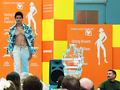
| 04/28/2004 06:17:57 PM |
Dreaming of a Well-Proportioned Bodyby flip89Comment: I like what you were attempting here. The man is definitely has a look of longing or adoration on his face. Unfortuantely, the ice sculpture and the loudspeaker smack dab in the center are hard to overlook. Not a lot you can do about that except perhaps move a little to the right and take the shot at a slight angle. At least then the two distractions wouldn't completelly overlap as they are now. Lowering the viewpoint a couple of inches to include more of the audience would have helped. As they are now, they are distracting blury details (particularly the bald head). Including a bit more of them would have made a nice contrast with the man who is facing the opposite direction but also has his eyes fixed on the model. Lowering the viewpoint and cropping that inch of space above the model's head would have put him on an even higher plane than the audience and reduced that large chunk of blue in the upper right to a less important chunk of blue. High marks because I like the moment you captured in the man's expression. |
| Photographer found comment helpful. |
| 04/28/2004 06:10:29 PM |
Mountain Top Experienceby puzzlecutterComment: This picture is far to drab and overexposed. The subject is almost completely lacking in detail due to bad focusing. This just looks like an amateur travel snapshot. |
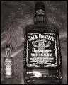
| 04/28/2004 06:08:53 PM |
Good Day vs. Bad Dayby tito79_98Comment: You should pay more attention to your background. That pebbly, vinyl texture does nothing for this. The glares on the bottles, particularly on the smaller one, really subtract points from this. The static, boring arrangement is the final blow. I don't understand why you chose to lay the bottles flat like this. |
| 04/28/2004 06:04:57 PM |
Fiddo Diddoby koksoonComment: An image like this needs greater contrast to make it really pop. Otherwise I like it. It could be improved in PS. |
| Photographer found comment helpful. |
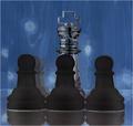
| 04/28/2004 05:57:18 PM |
Chess Proportionsby s4nd3r99Comment: This just doesn't do it for me. I think it might be the weird swirly blue background with the glowing spheres. I'm also not thrilled with the arrangment of the pawns in relation to the king. |
| 04/28/2004 05:51:07 PM |
Mother how I've grownby ClangdonComment: This photograph is way out of focus and really should not have been entered for consideration. Good editing is an important part of good photography. |
| 04/28/2004 05:48:43 PM |
|
| Photographer found comment helpful. |
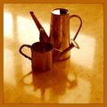
| 04/28/2004 05:47:12 PM |
Tin Tangoby AlexHugelComment: I don't find this a pleasing arrangement of these two watering cans. If it weren't for the title I would wonder why you chose to place them like this. This just doesn't work for me. |
| Photographer found comment helpful. |
| 04/28/2004 05:45:04 PM |
UNBROKEN CONSCIOUSNESS vs. MEDIAby i_skyComment: If I understood the culture I might have a clue white this picture was about. I like the strong contrast of red, white, and black. I also like the interesting negative space created by the sillouhettes of the men. |
Home -
Challenges -
Community -
League -
Photos -
Cameras -
Lenses -
Learn -
Help -
Terms of Use -
Privacy -
Top ^
DPChallenge, and website content and design, Copyright © 2001-2025 Challenging Technologies, LLC.
All digital photo copyrights belong to the photographers and may not be used without permission.
Current Server Time: 08/24/2025 03:15:30 AM EDT.