| Image |
Comment |
| 04/28/2004 07:54:08 PM |
"not my slice"by sevenine0Comment: Meets the challenge but it doesn't wow me. The composition looks top heavy and the light shining from beneath the pizza slice just confuses me. |
| 04/28/2004 07:52:26 PM |
Little Tree on a Big Treeby postoakinversionComment: A nice idea which does illustrate proportion. This image fails asthetically, however. It lacks impact and visual interest outside of the interesting texture of the bark. |
 Photographer found comment helpful. Photographer found comment helpful. |
| 04/28/2004 07:51:01 PM |
Preferred pocket proportionsby dodeeComment: Is this an MP3 player? I can't tell because the details are completey washed out from overexposure. Are you comparing differently sized music formats? This meaning is obscure without the title to explain it. The title should not be doing the work of the photo. It fails as an abstract composition. |
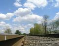
| 04/28/2004 07:47:57 PM |
near & farby laybackComment: Without the title, which doesn't really convey much, the idea of near and far isn't really apparent from this photo. As an image it lacks a focal point. The railroad tracks just point to a drab landscape of washed out looking trees. |
| 04/28/2004 07:46:01 PM |
|
| 04/28/2004 07:44:51 PM |
Proper proportion isn't always as simple as black and white (or) proportion or the lack thereofby cainnComment: Are they checking out the size of his penis? He is looking directly down and she is looking down toward him so that's my guess based on this challenge. But why such high key contrast? The girls face and the guys shirt disappear into the background. Was this the intention? What is it saying about proportion? Why are they holding grey paper in front of themselves? This is really just a confusing jumble and doesn't say much about proportion. The title isn't working too hard for you either. |
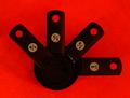
| 04/28/2004 06:33:35 PM |
A Cook's Fractionsby TommyMoe21Comment: Another person chose to show proportion through measuring devices. This one works better. I'd just like to see it in sharper focus. |
| Photographer found comment helpful. |
| 04/28/2004 06:32:06 PM |
Reaching for a dreamby bobdaveantComment: I can't really tell what this is a statue of. The sun flare in the top left is very distracting. Is the statue reaching for the sky? If so, a different view point to simplify the background would have helped. The tall building just gets in the way unless you intended to frame the statue so she looked the same height as the building. Forced perspective can be fun but it only works when the background isn't distracting. |
| Photographer found comment helpful. |
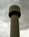
| 04/28/2004 06:29:04 PM |
Gigantic Drum Stickby dirtkahunaComment: Without the title I don't think I would have made the connection to a drumstick and I'm married to a professional drummer. Even with the title it's a bit of a stretch since drumsticks have round, tapered tips not flat, cylindrical tips. The tower makes an imposing subject but this shot lacks tonal interest. Perhaps on a day when the sky was blue, or the clouds spectacular colors? A bit more focus on the colum would reveal more detail in the ridges and add textural interest to make up for the lack of tonal interest. |
| Photographer found comment helpful. |
| 04/28/2004 06:24:46 PM |
walkway to harmonyby xburnerxComment: The placement of the two fenceposts frames that tiny railing, giving it far more prominence then it deserves. The huge expanse of concrete in the foreground does nothing considering it takes up a third of the frame. Moving in closer would have eliminated that and possibly eliminated the railing as well leaving the fence posts to act as a framing device for the ocean which should then be focused much better to allow for more eyepopping color and detail. Judging by your title you meant to include the concrete walkway and the railing but a concept does not automatically translate into a pleasing composition. |
Home -
Challenges -
Community -
League -
Photos -
Cameras -
Lenses -
Learn -
Help -
Terms of Use -
Privacy -
Top ^
DPChallenge, and website content and design, Copyright © 2001-2025 Challenging Technologies, LLC.
All digital photo copyrights belong to the photographers and may not be used without permission.
Current Server Time: 08/24/2025 08:26:57 AM EDT.