| Image |
Comment |
| 05/03/2004 12:09:09 PM |
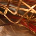
Red & Goldby imolaavantComment: Well, I definitely have no idea what this is. I would suggest a less shallow depth of field. The blurred metal wire in the foreground is distracting. It detracts from the overall design the intesecting wires create and lessens the impact of the red and gold. I'm guessing all that foreground is some kind of shiny gold cloth. It is out of focus and the color is washed out (due to flash is my guess). The overall color isn't so much gold as blah. A suggestion for lighting shiny fabric is to arrange it so that there are folds and then light it from the side and take the shot with a tripod if you need to, to avoid using the flash.
|
| 05/03/2004 12:03:45 PM |
All Mimsy Were the Borogrovesby JesuispeureComment: First let me just say, I love your title. Is it from a poem? This is a really pleasing abstract. I like the feathery verticals and the softly blurred pastel background. This one works for me. |
 Photographer found comment helpful. Photographer found comment helpful. |
| 05/03/2004 11:52:41 AM |
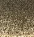
Light to Darkby scottwilsonComment: This is a nice attempt. I don't find the transition from light to dark is quite as striking as it could be. The darkest darks aren't very dark. On my monitor, this image has lost a lot of detail in the file compression. I'm probably responding to that. I like the texture of whatever this is (fish eggs? water droplets?). |
| Photographer found comment helpful. |
| 04/30/2004 02:09:14 PM |
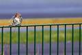
Straw Hunterby russiComment: This is a nearly perfect wildlife shot. I would suggest cropping it at the point where the road meets the strip of grass. I think it meets the challenge. I like that the bird has plenty of detail; you can tell what it has in it's bill and you can see the ruffling of the feathers quite distinctly. Good job! |
| Photographer found comment helpful. |
| 04/30/2004 02:05:51 PM |
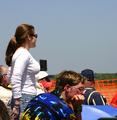
Proper Proportionsby dixonp1Comment: This shows you how much guys love their games. Not one of them is looking at this girl's beautiful proportions! My husband (not a sports fan) would have a hard time tearing his eyes away.
This is a humorous and well-done candid and I like it. I'm inclined to think that without the suggestive title this would not meet the challenge. |
| Photographer found comment helpful. |
| 04/30/2004 02:03:22 PM |
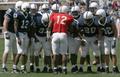
These Gladiators: Larger Than Lifeby jjr152Comment: This is a nice candid. I like the one red jersey in the field of navy. Your title suggest other intentions but I'm going to accept the color proportions as meeting the challenge (I don't think the title suggest too much of an abstraction to count toward meeting the challenge). |
| 04/30/2004 01:56:51 PM |
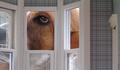
Ollie in Wonderland by rileyComment: This is funny and makes for an original animal portrait. It effectively meets the challenge. My favorite of all those I've seen so far. |
| Photographer found comment helpful. |
| 04/30/2004 01:54:59 PM |
Ship Ahoy!by coolharComment: Maybe if there were less distracting details this would be successful. I would suggest cropping the edge on the right to include only the street and some of the tree (which can't be helped), and cropping the bottom to exclude the parking lot. |
| Photographer found comment helpful. |
| 04/30/2004 01:52:13 PM |
Life Sized Marinesby BAMartinComment: The real marines should be a bit more focused. Overall, I think this is a successful shot. I like the placement of the marines in the furthest edge of the frame. |
| Photographer found comment helpful. |
| 04/30/2004 01:49:04 PM |
Sun is shiningby DiscraftComment: This is a really nice portrait. It definitely evokes a certain mood. I think it stretches the notion of proportion. |
| Photographer found comment helpful. |
Home -
Challenges -
Community -
League -
Photos -
Cameras -
Lenses -
Learn -
Help -
Terms of Use -
Privacy -
Top ^
DPChallenge, and website content and design, Copyright © 2001-2025 Challenging Technologies, LLC.
All digital photo copyrights belong to the photographers and may not be used without permission.
Current Server Time: 08/24/2025 02:04:09 PM EDT.