| Image |
Comment |
| 05/10/2004 12:47:14 AM |
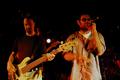
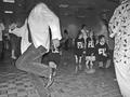
Global Village at Ricks American Cafeby TooCoolComment: This got a 5 from me because there is a mike growing out of the bass player's head and he has a second head growing from his shoulder. The color is too orangey. I realize this is nightclub lighting but I feel it could be toned down some. I like the blurring of the singer's hand. |
 Photographer found comment helpful. Photographer found comment helpful. |
| 05/10/2004 12:30:09 AM |
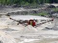
Screening Plantby amsmythComment: This would have been more of a 'wow' for me if all the green background had been cropped allowing for the red machinery to really stand out amongst all that light sand and stone. |
| 05/10/2004 12:25:15 AM |
Seaside Eclipseby marboComment: Lovely, really captures a mood. I like the way the picture plane is broken up by strips of beach, water, and sky. |
| Photographer found comment helpful. |
| 05/08/2004 07:39:43 PM |
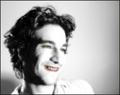
selfseek-5.jpgby theodor38Comment: I like this portrait. The expression is great, he's a good-looking guy (you?), and it's a nice perspective. I absolutely do not like the weird colorization. It just gives me the creeps (and not in an interesting way).This photo is good enough that it doesn't need tarting up with tricks. |
| 05/08/2004 07:27:25 PM |
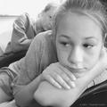
Mokie and Kirstyby pramComment: This is a really nice, pensive portrait. I like the 'in your face' perspective. I wish I could see more of the girl's face in the background but that is really just a nit. |
| 05/08/2004 07:22:34 PM |
Purple Hazeby pramComment: I like how you captured the liveliness of the dancer in this shot. The problem is, the kids are all looking in the other direction at something else. The moms behind the kids are talking to each other and also not looking at your subject, the dancing man. What this does is take the viewer's eye away from your subject. The person with the floral shirt at the side of the frame is cut off too much to add any focus or interest. If you had positioned yourself more to the right of the man, facing the people who are watching him, it would have made for a more telling shot. You could try cropping out the kids,moms, and floral shirt person but I'm not sure that would be much more succesful as it would leave the dancer without context. One last nit; your title Purple Haze, doesn't say much without your explanation. You might want to consider changing it to something that makes sense to a viewer without an explanation (The Wedding Singer, for example). |
| 05/08/2004 07:06:55 PM |
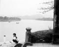
gazing upon the perfume riverby highpriceComment: This is an excellent composition. It really evokes a peaceful mood. Much as I love black and white, I would have liked this in color better. You might consider getting rid of the handlebars. My eye keeps going right to them. There could be a bit more contrast between the water and the dock as the two areas blend almost invisibly into each other. There isn't a lot of detail in the water due to overexposure. Out of context it could be almost any surface--concrete, snow, sand. I'd also suggest cropping it to exclude the branches and bring a bit more focus down to the boy. You would still have quite an expanse of landscape, including the mountains. You might have to crop most of the branches and then PS the lowest ones to avoid placing the mountains at the very edge of the frame. Another idea would be to zoom right in on the boy (if your original is a large enough file to retain sharpness) and only show the water in the background and omit the architectural details. This would only work if the original were in color because of the issue I mentioned with the water and the dock obscuring into one plane. Message edited by author 2004-05-08 19:11:41. |
| 05/08/2004 06:46:50 PM |
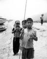
lord of the fliesby highpriceComment: This is a nice shot. I like the subject matter and the choice of black and white. Overall, it's a good composition. Some problems I have with it (outside the rather sinister implications of the title) are that you cropped the foremost boy's legs at an awkward spot and it looks like an amputee. If you had moved a bit to the right, you might have avoided splitting the second boy's face in half with the fishing pole. |
| Photographer found comment helpful. |
| 05/05/2004 08:48:45 PM |
Baileyby timj351Comment: This is such a great dog shot. The pose and the eyes are expressing so much. I really love it. |
| 05/05/2004 04:14:53 PM |
|
| Photographer found comment helpful. |
Home -
Challenges -
Community -
League -
Photos -
Cameras -
Lenses -
Learn -
Help -
Terms of Use -
Privacy -
Top ^
DPChallenge, and website content and design, Copyright © 2001-2025 Challenging Technologies, LLC.
All digital photo copyrights belong to the photographers and may not be used without permission.
Current Server Time: 08/25/2025 01:39:24 PM EDT.