| Image |
Comment |
| 05/10/2004 08:33:31 PM |
The Souls of My Feet (New Type of Self Portrait)by JesuispeureComment: I gave this a six. I like it quite a bit but somehow I didn't feel I wanted to give it a higher rating. I can't quite put my finger on why. I voted yesterday and am commenting today. I may have given it a higher rating today so it just may have been my mood. I think I just don't care for the saying. I like the idea. |
 Photographer found comment helpful. Photographer found comment helpful. |
| 05/10/2004 08:29:53 PM |
Road to paradiseby pitsamanComment: I like this composition a lot. I gave it a six, however, because I really dislike this color technique. You had a good shot without the tricks. |
| Photographer found comment helpful. |
| 05/10/2004 08:28:31 PM |
|
| 05/10/2004 08:27:32 PM |
Homeby photoqwestComment: This is a powerful image. It's certainly an all to common site in Providence, where I live. It's extremeley high key which is why I gave it only a six. It looks like you got an exposure reading from the wall instead of the guy's skin so the great colors (like that red wheel and his blue blanket) got a bit washed out looking and we really aren't seeing enough detail in his face.The yellow blanket on top of the carriage is so overexposed it almost seemlessly blends into the wall behind it. |
| Photographer found comment helpful. |
| 05/10/2004 08:23:28 PM |
Dropping byby asijComment: Cool looking bug. Nice color and detail. Nice background blurring. I gave it a six because I didn't really love it. |
| Photographer found comment helpful. |
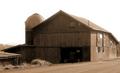
| 05/10/2004 08:21:35 PM |
My First Barnby NeuferlandComment: Really nice composition. Good use of sepia. It's a bit overexposed. Notice the lack of details in the shadows. It would be nice to see more of that tractor, for instance. The sky is blown way out. I gave it a six. |
| Photographer found comment helpful. |
| 05/10/2004 08:18:52 PM |
Shy Saltby justineComment: I gave this a five because of the nice clean composition. It is bit to contrasty--the lights are really overexposed and high key. One way you can tell when this is the case is by looking at the highlights on the wood. The grain detail is completely washed out in that area. If your camera has a function allowing you to use a lower ISO rating, or a lower contrast, or a darken image---any of those---you would have a better exposure and a much more successful image. |
| Photographer found comment helpful. |
| 05/10/2004 08:15:57 PM |
Babyby JackoComment: This is a really nicely focused shot and that is some expression you've captured. I gave it a five though because, honestly, this image creeps me out and I don't think it's meant to. The baby's head looks weirdly huge because of this perspective combined with the naturally disproportionate head infants have. The eyes make me think of those creepy CGI commercials using babies and animals in unatural ways. I'm sure this is a really cute baby. This shot just isn't flattering him or her. |
| Photographer found comment helpful. |
| 05/10/2004 08:11:36 PM |
model trains (or "the world through a little boy's eyes")by tomzinhoComment: I gave this a five. Mainly because I couldn't tell if this is a real scene (I think it is) or a model train with a poster in the background. It was mostly just confusing to me because of the title. I don't understand the choice of blurred background. The reason I gave it as high as a five is because I like the composition if the background wasn't all blurred. Also, I'm guessing I'm missing some element that would enlighten me. |
| 05/10/2004 08:07:48 PM |
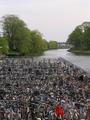
Lots of bicycles:-)by Bela45Comment: I gave this a five. I think it has a lot of potential. I really like the composition for the most part. Unfortunately, the colors are rather drab where they should really be popping. There seems to be an awfully large expanse of overexposed sky taking up the top of the frame. |
| Photographer found comment helpful. |
Home -
Challenges -
Community -
League -
Photos -
Cameras -
Lenses -
Learn -
Help -
Terms of Use -
Privacy -
Top ^
DPChallenge, and website content and design, Copyright © 2001-2025 Challenging Technologies, LLC.
All digital photo copyrights belong to the photographers and may not be used without permission.
Current Server Time: 08/26/2025 05:02:17 PM EDT.