| Image |
Comment |
| 05/12/2004 09:28:18 AM |
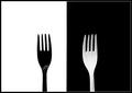
Bon appetiteby arnitComment: Good composition. Clever. The borders detract from the smoothness of the transition from white to black. |
 Photographer found comment helpful. Photographer found comment helpful. |
| 05/12/2004 09:16:15 AM |
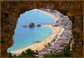
Blanes from the castleby AlexysComment: Nice use of the stone wall/window as a framing device. Good color. Nice detail in the darks and lights considering the difficult lighting situation. |
| Photographer found comment helpful. |
| 05/11/2004 02:38:43 PM |
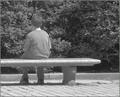
bad boy gets a time outby coolharComment: I gave this a five. The framing is decent (although without the title, I would have problems with the subject looking away from the camera at a boring shrub). It is a bit overexposed. I don't think black and white helps this image. For instance, if the boy had been wearing a colorful t-shirt it might have made a nice visual contrast with the neutral colors of the shrubs, walk, and bench. |
| Photographer found comment helpful. |
| 05/11/2004 02:35:08 PM |
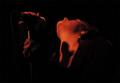
First concertby Mad-DComment: I gave this a five. The composition is nice. I like the line her jawline creates in contrast with the black background. I would have given it a higher score but most of the image is unfocused looking. |
| Photographer found comment helpful. |
| 05/11/2004 02:32:46 PM |
WTC-Amishby Herblacklist12Comment: I gave this a four. This isn't a great perspective. Much of the visual impact of the blue and yellow sign is lost because of poor focus.That large section of overexposed sky creates a huge hot spot. The lower right corner has some distracting clutter going on also. |
| Photographer found comment helpful. |
| 05/11/2004 02:30:37 PM |
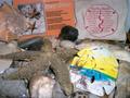
My vacation!by tolovemoonComment: I gave this a four. It's a nice idea in terms of a theme but the lighting is very poor (looks like you relied soley on flash) and a great deal of the foreground is blurry. It looks like the sharp focus begins at the furthermost arm of the starfish. More care could have gone into arranging the still life. For instance, that book on Sea Star does not hold much visual interest. Nor does the souvenir Footprints sack. the starfish, a few shells, pebbles, and perhaps the painted sand dollar (to represent the souvenir aspect) would have been a much more pleasing arrangment. |
| 05/11/2004 02:26:48 PM |
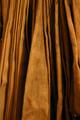
Emergency fire hoseby borisonComment: I gave this a four. There just wasn't enough visual interest in this compostion to grab me. You had an interesting start with the folds of the hose but that one section in the middle just detracts from the
pleasingness of the design. |
| 05/11/2004 02:24:25 PM |
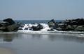
Water Breaking on the Rocksby mirdonamyComment: I gave this a four. You are too far away from your subject, the breaking waves, to make a strong visual statement about it. What remains is a decent snapshot but not a great photo. You might try to get as close as you can on your belly to capture the waves in a visually exciting way. I live in a state surrounded by ocean (Rhode Island -- the Ocean State, natch) and this isn't giving me a visual sense of the power of waves breaking over huge rocks. |
| Photographer found comment helpful. |
| 05/11/2004 02:14:57 PM |
Ensalada de frutaby photomComment: This may have been better with just the kiwi slices. The strawberry is just kind of sitting there detracting from the simple composition. I gave this a four. |
| Photographer found comment helpful. |
| 05/11/2004 02:13:42 PM |
Magnoliaby michael_pComment: That pink, thin border within the image plane is really distracting. The image itself is rather poor in terms of technical quality. The bud is very overexposed, washing out all the details that make close-ups of flowers beautiful; the texture of the petals (you need to almost be able to 'feel' the silkiness of the petals), the translucent color from light shining through the petals, the subtle variations in color (in this case from deep pink to nearly white), and the separateness of the individual petals in relation to the overal form of the flower. In this instance, the bud is so overexposed that the petals blend into each other nearly invisibly creating a blob of white, losing all the qualities I just mentioned.
In terms of composition, you need to get much closer to such a small, delicate flower, isolating it from a visually overwhelming background. The overexposure was likely due to your camera's meter adjusting for the dark background rather than the pale bud. Tighter framing will help in this case also. If your camera allows for manual shutter speed or aperature settings, you can try using a large aperature with a fast shutter speed (the large aperature to create shallow depth of field, the fast shutter speed to make up for the extra light that the larger aperature will let in). |
| Photographer found comment helpful. |
Home -
Challenges -
Community -
League -
Photos -
Cameras -
Lenses -
Learn -
Help -
Terms of Use -
Privacy -
Top ^
DPChallenge, and website content and design, Copyright © 2001-2025 Challenging Technologies, LLC.
All digital photo copyrights belong to the photographers and may not be used without permission.
Current Server Time: 08/26/2025 07:19:52 PM EDT.