| Image |
Comment |
| 05/19/2004 11:13:00 AM |
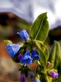
Mountain BlueBellsby dacrazyrnComment: The white space in the background is visually distracting. You could have cropped it and still kept the bluebells centered (except for perhaps the most dogmatic voters). |
 Photographer found comment helpful. Photographer found comment helpful. |
| 05/19/2004 11:11:35 AM |
Blue Smartieby ErnstComment: Interesting idea. The shadow of the blue candy is very distracting to the overall color scheme. |
| 05/19/2004 11:11:01 AM |
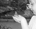
fly away with meby mamabear5612Comment: The child's skin tone is rather washed out (from flash, I suspect). I'm baffled by the choice of black and white for a butterfly garden. The background could have used a bit more blurring. The fence in the lower left corner is distracting. The composition is really nice (with a teeny bit more cropping of the left side of the frame). I gave it a 5. |
| Photographer found comment helpful. |
| 05/19/2004 11:07:57 AM |
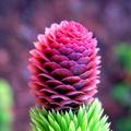
New Pineconeby scrum8Comment: Great color, sharp focus. It's only horizontally centered, not dead centered. My eye is meant to be drawn to the very center of the frame in this challenge but what is drawing my eye is the top of the cone which is actually at the top of the frame. I gave it a five because I felt it didn't fairly meet the challenge. |
| 05/19/2004 11:04:51 AM |
Untitledby oksamitComment: This is horizontally centered but not dead center. To my eye, dead center is about where the green dot on the egg cup is---not the main visual element of this photo. The focus is excellent. That dark corner of tablecloth is pretty distracting. Nice blurred background. The subject is kind of dull. |
| Photographer found comment helpful. |
| 05/19/2004 11:00:09 AM |
Very thirstyby camelotnorthComment: I'm not understanding the choice of placing the flower upside down in the frame. I think that is a blur of water underneath it but that's not clarifying anything. |
| Photographer found comment helpful. |
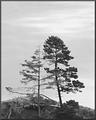
| 05/19/2004 10:58:41 AM |
Embraceby LucidLotusComment: I'm thinking the darks could have more detail. There is almost too much contrast between the trees and the sky. The meter read for the sky, thus overexposure. I would only call this horizontally centered. The challenge guidelines specified dead center. Outside the challenge, I like your composition. I gave this a 5. |
| Photographer found comment helpful. |
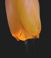
| 05/19/2004 10:53:37 AM |
|
| Photographer found comment helpful. |
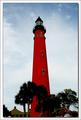
| 05/19/2004 10:52:09 AM |
Ponce de Leon Inlet Lighthouseby GallatinComment: I like the red and the blue. I also like the slightly blurred trees. I'm trying not to be a stickler about the guidelines of the challenge but they did say specifically, 'dead center' and this isn't. It is only horizontally centered. I gave it a five because of that. Otherwise I would give it a 6. |
| Photographer found comment helpful. |
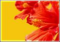
| 05/19/2004 10:49:32 AM |
Hibiscus Center Centeredby JeileenComment: The stamen is centered, yes, but it isn' t really the main visual element of this photograph. I had a hard time seeing it against the background. The main visual element of this photo seems to be color. |
| Photographer found comment helpful. |
Home -
Challenges -
Community -
League -
Photos -
Cameras -
Lenses -
Learn -
Help -
Terms of Use -
Privacy -
Top ^
DPChallenge, and website content and design, Copyright © 2001-2025 Challenging Technologies, LLC.
All digital photo copyrights belong to the photographers and may not be used without permission.
Current Server Time: 08/27/2025 12:45:42 AM EDT.