| Image |
Comment |
| 05/21/2004 06:56:50 PM |
Cops Habitby hallswelComment: Visually cluttered background (flowery, striped wallpaper, horizontal lines of the mini-blinds, vertical line of the moulding) which doesn't really go well with the image of a cop (it looks like the cop is in his kitchen). This would have worked better if the cop was eating the donut on duty somewhere since you are working from a stereotype. The image itself is very contrasty.That bite isn't really convincing. It looks very set-up. On the plus side, the cropping is good for a candid portrait if you lose the cluttered background. |
 Photographer found comment helpful. Photographer found comment helpful. |
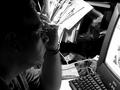
| 05/21/2004 06:51:00 PM |
Eating Habits: Good or Bad?by pique_moiComment: This is too small to really get much out of it. The man in the plaid shirt in the foreground has a strange orange halo around his head. It looks like he is holding a frisbee in front of his face. This is basically a poor snap shot. Consider spending more time waiting for an interesting moment and framing your subject so that there isn't so much visual clutter. Some examples of visual clutter are the disembodied head which seems to have its nose stuck in the denim jacket person's butt, the aforementioned orange halo man, the woman with the bright turquoise shirt in the foreground and whatever that black and white thing is coming out of her shoulder. |
| Photographer found comment helpful. |
| 05/21/2004 06:46:25 PM |
Pondering Picsby banmornComment: The main subject is much to dark and my eye is drawn to all that clutter in the background which, unfortunately, is very brightly lit. This just has the look of a poor snap shot. The slightly elevated angle makes me wonder if you held the camera over your head and off to the side to get the shot. This would account for why the backgroun dis lit so well and the face isn't. |
| Photographer found comment helpful. |
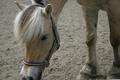
| 05/21/2004 06:41:43 PM |
Horseby maelmsComment: Nice pony but not a habit. Riding is a hobby not a habit. I'll grant that someone can have a habit of taking a daily ride but then why not show someone riding? This is really stretching the boundaries of the guidelines. Astheticallly, the background is very blah. There is very little visual contrast between the color of the pony and the dirt.
If it is some habit of the pony's you are depicting (eating dirt?) it isn't very clear from this shot because its muzzle is falling out of the frame. I know equines can have some very bad habits but this really isn't showing it. I upped this by a point after reevaluating it but I'm still sceptical about it meeting the challenge. |
| 05/21/2004 06:35:09 PM |
Sweet Salvationby amblaineComment: The lighting on this is flat and uninteresting. The candy isn't focused very well. The hand (I suspect yours) isn't focused at all, accept in the index and middle finger. This is a very literal depiction of a habit. It doesn't really show us anything new or interesting about sugar cravings and it is not visually appealing. |
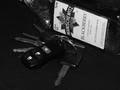
| 05/21/2004 06:29:45 PM |
Cheap Habitby shadowangelComment: This is just way too dark. The key chain practically disappears right into the background. |
| Photographer found comment helpful. |
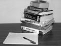
| 05/21/2004 06:13:12 PM |
Procrastinationby Duke22Comment: While this depicts a habit, it does so in a rather dull, literal way. You have to work a bit harder to make a still-life of economics and calculus text books visually appealing. |
| Photographer found comment helpful. |
| 05/21/2004 06:11:21 PM |
I need my chocolate evey morningby gedumbakComment: This isn't lit particulalry well and the details aren't crips enough. This should look lucious and delicious but it isn't tempting me. It looks rather dewey for some reason (frozen, hasn't had time to thaw?). The composition isn't bad but the cake is falling off the lower edge a bit. |
| Photographer found comment helpful. |
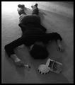
| 05/21/2004 06:08:51 PM |
Overdoseby ltjmanComment: This is a bit too dark. I like the perspective. I generally don't like goofy, set-up shots but this one isn't bad. I upped my vote by one after looking a second time to write this comment. |
| Photographer found comment helpful. |
| 05/21/2004 06:07:25 PM |
No Wonder He's Singleby doveyComment: This is just a snap shot of a toilet with the seat left up. While it does depict a habit not a lot of thought went into showing us something new in this photo. Meeting the challenge is more than just depicting the idea but depicting it in a way that is visually pleasing and interesting. |
Home -
Challenges -
Community -
League -
Photos -
Cameras -
Lenses -
Learn -
Help -
Terms of Use -
Privacy -
Top ^
DPChallenge, and website content and design, Copyright © 2001-2025 Challenging Technologies, LLC.
All digital photo copyrights belong to the photographers and may not be used without permission.
Current Server Time: 08/27/2025 04:25:03 AM EDT.