| Image |
Comment |
| 05/25/2004 11:46:17 PM |
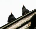
Up on the roofby indianzfanComment: I like this nature shot. It is refreshingly different from the plethora of nature photos on this forum. Some might complain about a little bit of fuzzines but I say, "Who cares?" The viewpoint works and the starkness enhances the otherwise homeliness of these birds (are they grackles? it's hard to tell from this angle). |
| 05/25/2004 11:41:06 PM |
|
 Photographer found comment helpful. Photographer found comment helpful. |
| 05/25/2004 11:38:12 PM |
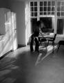
His Viewpointby grigrigirlComment: I love this for a few reasons. It's funny without being condescending to the little person. I don't know if it was intended but his small bum, protruding a bit is a direct diagonal to her bum. This harmony is strengthened by his obvious relish of her assets. :D My only suggestion is crop a bit off the top to eliminate the row of paintings and make her appear even taller in the frame, emphasizing his smallness. |
| 05/25/2004 02:08:54 PM |
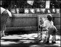
Vanishing Pointby mirdonamyComment: This a nice macro portrait of an eye but I don't see the unusual viewpoint. It is a pretty direct viewpoint, actually. I suppose one could argue that you were unusually close to the subject but that would be stretching the notion, in my opinion. |
| Photographer found comment helpful. |
| 05/25/2004 01:57:16 PM |
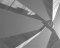
A sun monumentby cimarron98Comment: Nice strong planes and lines. It's a bit lacking in contrast. I wonder if it would have worked better in color against a blue sky? I like the tiny sun rays peeping over the rim of the round thing. |
| Photographer found comment helpful. |
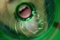
| 05/25/2004 01:55:49 PM |
Mountain Dew... Good to the Last Dropby toddheadComment: Interesting idea. It might have been more successful with an infinite focus so the mouth isn't blurred out so much. The printing on the bottle has a way of drawing the eye. |
| Photographer found comment helpful. |
| 05/25/2004 01:54:37 PM |
Birds Don´t Ask For Freedom They Flyby MonaComment: I understand the idea behind the tilted format (bird's freewheeling point of view) but I'm not sure it's working with so much going on at the bottom. Perhaps if it were cropped to exclude some of the bottom portion? If you look at only the bottom half of the photo it is a very visually cluttered shot. The top half (from just above the light fixture) works a little better. I'm not a fan of tilted shots so I'm probably a bit biased. |
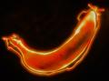
| 05/25/2004 01:13:25 AM |
Energy Foodby ImagineerComment: Interesting idea. You have a good start with the executiion but the banana is too out of focus. It should stand out in sharper contrast to the line of light. |
| Photographer found comment helpful. |
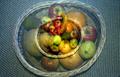
| 05/25/2004 01:03:37 AM |
Splitby KaDiComment: Nice arrangement but the lighting is a bit flat. There is a good start with the darking the upper part of the background but it could have been a titch darker to add a little more drama to the mundane subject. |
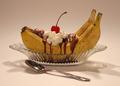
| 05/25/2004 01:02:15 AM |
Banana & Coby RUEDISCHMUTZComment: I think I got what you did here but it just is too unappealing with the wierdly transparent textured background and the flat lighting. The colors all look muddy and the fruit unappetizing. |
Home -
Challenges -
Community -
League -
Photos -
Cameras -
Lenses -
Learn -
Help -
Terms of Use -
Privacy -
Top ^
DPChallenge, and website content and design, Copyright © 2001-2025 Challenging Technologies, LLC.
All digital photo copyrights belong to the photographers and may not be used without permission.
Current Server Time: 08/27/2025 04:04:13 PM EDT.