| Image |
Comment |
| 04/24/2006 01:01:53 PM |
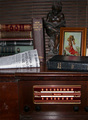
Bendixby codauberComment: Is that an fake old copy of the Pro-Jo I see? I understand the idea but to me it adds clutter rather than authenticity to this still-life. This definitely could have been lit better. It looks like it was lit from a light shone directly in front. There are too many distracting glares, especially on the white newspaper. I suggest lighting an arrangement like this from the side to create a bit more drama and contrast. This looks very flat---almost as if it were lit with frontal flash. Using a tungsten light source and setting your white balance to daylight would have given this an 'old-timey' warm glow. |
| 04/24/2006 12:52:02 PM |
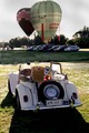
The MG Old but still elegantby kiwinickComment: The balloons in the background would have worked for me if it hadn't been for the row of modern cars. It might have been better to shoot the car from a diffreent angle to eliminate distracting elements. This looks kind of snapshot-y to me because it doesn't look like a lot of consideration went into the composition. |
 Photographer found comment helpful. Photographer found comment helpful. |
| 04/24/2006 12:49:34 PM |
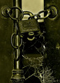
Locked and Forgottenby talikfComment: Nice subject matter. It is a bit contrasty to me--super-dark shadow and very bright highlights but little detail in the midtones. Where I'd especially like to see a bit more detail is in the area of the padlock. My other issue is the greenish-yellow color cast that I'm seeing on my monitor (Mac calibrated to sRGB profile.) I prefer the whites to look more white and the blacks to be pure black but that is more of a personal preference. |
| Photographer found comment helpful. |
| 04/24/2006 12:35:34 PM |
Transition... (The aging process!)by kbhatia1967Comment: Interesting concept. I don't find that this execution makes for a compelling image, however. I like the high-key quality but I'd like to see a bit more detail in the leaves and less glare. |
| Photographer found comment helpful. |
| 04/24/2006 12:33:54 PM |
senakulo :: old story, reenactedby blackenedwhiteComment: Interesing. With the graininess it has the look of an old movie still. It's a bit too tightly cropped, making it hard to make out the purpose of the people in the background. |
| Photographer found comment helpful. |
| 04/24/2006 12:17:38 PM |
Unveiledby librodoComment: I didn't enter this challenge or vote in it. This is the first time I've looked through the entries.
This is beautiful. The colors of her veil or perfect with her brown skin. Very striking portrait. |
| Photographer found comment helpful. |
| 04/21/2006 01:47:43 PM |
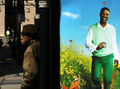
Man at Bus Stop with Advertisementby Keith ManiacComment: This got a 9 from me. This was clearly well thought out and composed. It's obvious that you had to wait for the perfect moment to present itself once you saw the sign. I liked the witty incongruity of the happy, young guy on the sign and the cranky expression on the elderly man. |
| Photographer found comment helpful. |
| 04/21/2006 12:43:24 PM |
Oldfield songby thelucasComment: I like the way the chipped paint form shapes which to my imagination look like a pair of disapproving Victorian auntie's. Very good eye! I wish I had seen this during the voting. It's going in my favorites. |
| Photographer found comment helpful. |
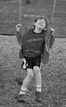
| 04/19/2006 05:19:50 PM |
Swing and Smileby swimmergirl4242Comment: Loved the expression of pure exhuberance you captured on the boy's face. No faking that. And contrary to what espy says this sort of capture is not all that easy.
I wasn't crazy about the vertical crop and I felt the b&w tone could have been tweaked a bit. Still, I gave this a 7. |
| Photographer found comment helpful. |
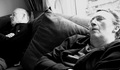
| 04/19/2006 05:14:50 PM |
Mum and Dad's afternoon snoozeby MacTComment: I gave this a 7. I like the wide angle view, the way their arms are unconsciously mimicking each other's positions says a lot about their familiarity and how long this couple has been together. I like their glasses and the bit of remote peaking out from behind Dad. It is a cozy scene and conjures up warm and affectionate feelings toward this couple in a way that is not easy to evoke for the unbiased viewer. I wish I had scored higher but their were so many in this challenge and I never got a chance to vote on them all, let alone go back and revise the way I like to.
I disagree wholeheartedly with espy that it was easy to capture. If you had come along earlier, their arms might not have been in the same position, or they might not have had their heads positioned conveniently to include both of their sleeping expressions. |
| Photographer found comment helpful. |
Home -
Challenges -
Community -
League -
Photos -
Cameras -
Lenses -
Learn -
Help -
Terms of Use -
Privacy -
Top ^
DPChallenge, and website content and design, Copyright © 2001-2025 Challenging Technologies, LLC.
All digital photo copyrights belong to the photographers and may not be used without permission.
Current Server Time: 08/24/2025 08:05:26 AM EDT.