| Image |
Comment |
| 07/08/2004 02:12:32 PM |
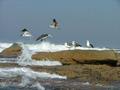
Seagullsby drjeggleComment: Advertisement?
It's a decent capture of the seagulls. I think it is interesting that there are three on the rock and three in the sky but the lighting isn't very dramatic and there is quite a loss of detal in the shadows and highlights. In the end, it is really kind of small to get much of an impression. |
| 07/08/2004 01:25:28 PM |
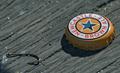
Catch of the Dayby Hye5Comment: Really effective! I think it would be better to show a frosty bottle alongside the cap, even if it is just the lower portion of the bottle (since the label is shown prominently on the bottle cap). Still, this is cleverness at its best and the composition is quite nice. There is a bit of shadow area in the corner below the hook. Also, maybe a bit more of the fishing line should be evident. As it is, it kind of looks like a found object. |
 Photographer found comment helpful. Photographer found comment helpful. |
| 07/08/2004 01:05:09 PM |
Frames by 'Red Or Dead'by TiNComment: My luck is turning! Another really nice effort! Great model, good expression, prominent product placement. It reminds me of some great ads for specs that appeared a few years back. Rufus Wainwright was in one of them. I can't remember the brand name. Anyhoo, I really like this. The specs could perhaps be in a bit sharper focus but when compared against the great composition (shows understanding of effective tight cropping and not just random tight cropping), the appealing model, the good makeup, the great lighting, that is a minor nit. A winning effort! |
| 07/08/2004 12:59:02 PM |
|
| 07/08/2004 12:58:17 PM |
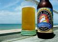
How Chicago spends the summerby ChasSourekComment: Wow, what a refreshing sight. And I don't mean the beer, although that looks nice. But this looks like an real honest attempt at advertising (forgive the contradiction in terms). The product is prominently placed against a simple but attractive (and appropriate) background. The beverage actually looks refreshing in it's frosty glass and I can read the label. The glass itself is attractive and harmonizes with the environment. A winning effort! |
| Photographer found comment helpful. |
| 07/08/2004 12:51:42 PM |
Pre-Lovedby chookieComment: The idea was to make a photo that looked like an ad not a photo showing advertisement. This looks like what you would see on a yard sale table. Not real appealing product. Photographically, it just seems to be a point-and-shoot snap shot. |
| Photographer found comment helpful. |
| 07/08/2004 12:48:53 PM |
|
| 07/08/2004 12:40:08 PM |
|
| Photographer found comment helpful. |
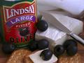
| 07/08/2004 12:38:36 PM |
Lindsay Olive - A Tradition of Qualityby bledfordComment: Not a bad effort at all. The cheese and crackers look tasty (it is hard to photograph food well). I think the knife was overduing it a tad. The viewer knows how that one slice of cheese got there and the knife doesn't add anything aesthetic to the composition. It actually leads the eye toward the napkin in the background. |
| Photographer found comment helpful. |
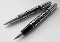
| 07/08/2004 12:35:40 PM |
'Stypens' - For Stylish Writersby DianaBComment: It might have been more effective if you wrote that copy on the paper in flowy (but readable) script, showing the output of the product and adding a bit more flair to the composition. It is rather static and dull, as it is. |
| Photographer found comment helpful. |
Home -
Challenges -
Community -
League -
Photos -
Cameras -
Lenses -
Learn -
Help -
Terms of Use -
Privacy -
Top ^
DPChallenge, and website content and design, Copyright © 2001-2025 Challenging Technologies, LLC.
All digital photo copyrights belong to the photographers and may not be used without permission.
Current Server Time: 09/03/2025 01:45:53 PM EDT.