| Image |
Comment |
| 07/11/2004 03:11:10 PM |
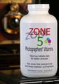
Best Productby graphicfunkComment: Funny idea. I'm not sure about the bacgkround and the surface the product is sitting on. It looks rather haphazard and not as well thought out as the labeling. The background, although blurry, still looks a bit complicated and distracting. I keep trying to figure out what the object at the top of the frame is. The surface appears to be some sort of old metal case or box. I shouldn't be wondering about this kind of thing. The crop is a bit too severe at the right and there seems to be a slight tilt. |
 Photographer found comment helpful. Photographer found comment helpful. |
| 07/11/2004 03:08:12 PM |
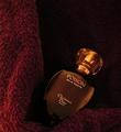
Dangerous Seductionby airaticComment: A bit small to get a good feel for the image quality. The label is easily red so it looks like your focus is pretty good. I like the color, lighting and composition. I'm not sure about the background which appears to be either a towel or fleece blanket. Velvet would have worked much nicer. I just wish it were a bit bigger. |
| Photographer found comment helpful. |
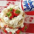
| 07/11/2004 03:06:38 PM |
All Naturalby briphotoComment: A little dark at the edges but overall very nice. Good composition, product display, color, mood. Very nice effort! |
| Photographer found comment helpful. |
| 07/11/2004 03:04:13 PM |
Jewelleryby letheComment: Her fingers should not be cropped. It looks odd and disturbing. |
| Photographer found comment helpful. |
| 07/11/2004 03:03:17 PM |
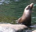
Ummm...by yoxyoComment: Advertisement?
Photographicaly, it's a cute, well-framed subject but it is quite fuzzy and the seal isn't really engaging the viewer. Kind of dull. |
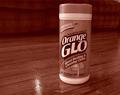
| 07/11/2004 03:00:38 PM |
GLOby DianaComment: Duotone doesn't seem appropriate for this. Because of the name of the product, we really should see some orange (presumably in the label). The composition isn't bad. The product is a bit tilted. |
| Photographer found comment helpful. |
| 07/11/2004 02:58:58 PM |
Cod Liver Oilby marboComment: Interesting composition but I'm not really getting the idea of advertisment from this. |
| Photographer found comment helpful. |
| 07/11/2004 02:58:25 PM |
|
| Photographer found comment helpful. |
| 07/11/2004 02:56:46 PM |
|
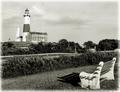
| 07/09/2004 08:27:18 PM |
The View of Decadesby LtHousLadyComment: What I liked quite a bit about this shot (and I did look at a few times) is the shadow in front of the bench. That is actually what raised it from a 5 to a 6 for me after looking at it for about the third time. I really liked the bit of graphic and tonal contrast it added. Which leads me to think that what may have been lacking for me in was a bit more dynamics in tone. I like the scene and it should appear somewhat serene but perhaps it is a bit too restful. I wonder if perhaps a bit of dodging and burning to add some drama to the sky might improve things. I can already see a section of sky that could be darkened a tad by judiciously burning some middle values and brightening the highlights at the edges of the clouds. This would add depth and drama to the sky which now appears rather flat. |
| Photographer found comment helpful. |
Home -
Challenges -
Community -
League -
Photos -
Cameras -
Lenses -
Learn -
Help -
Terms of Use -
Privacy -
Top ^
DPChallenge, and website content and design, Copyright © 2001-2025 Challenging Technologies, LLC.
All digital photo copyrights belong to the photographers and may not be used without permission.
Current Server Time: 09/03/2025 05:05:14 PM EDT.