|
|
|
Showing 151 - 160 of ~434 |
| Image |
Comment |
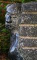
| 11/07/2003 03:21:06 PM | Romancing the stone?by visitorComment: Hi Visitor. Here are some quick thoughts:
As an entry in the Grace challenge, this is an OK subject. I can see it fitting in the graceful lines of the sculpture. But those lines don't stand out very well, and aren't the most striking features in your shot, so that hurts it somewhat as a challenge entry.
Two things stand out as problematic with this shot: composition and light. The angle is pretty square from the side. That might have worked OK, but I think would have been help by including less of the brick wall and/or more negative space to the left. The negative space would have helped accent the lines of the statue over the bold roughness of the bricks. Granted, I can see that the problem with doing that probably would have been the backgroud - it may detract from the effect and in fact minimize the statue even more. So, perhaps a different angle, more straight on to the statue (from the left of this view), still including the brick, but making it less central, would have helped. Of course, without being able to be there and see myself, I can only guess.
Lighting caused a couple of problems for you. It looks like the whole scene was more or less in shadow, so you lost a lot of tonal range right off the top. And because you have a dark wall, with a dark statue, in front of a dark background, nothing really pops to the forefront. If you could have gotten the picture at a time of day when the sun was on the wall and/or statue, but the bushes were still shaded or shadowy, I think you would have gotten the best effect - a dark background, with a well-lit subject. Then add in that the statue is a bit glossy, if you could have dealt with any reflections, the statue would have shined a bit, but the wall would probably still be a bit dark since it's rough, and the contrasts might have really come out then.
I know a lot of these possibilities may be unrealistic - the background is what it is, and the sun may never be in a really good location reletive to this scene. But those are the things that come to my mind as ways to maybe improve the results. Hope this helps. :)
Scott. |  Photographer found comment helpful. Photographer found comment helpful. |
| 11/04/2003 04:56:48 AM | Gracious Guidelinesby jfaulknerComment: Guidelines? Gracious? I'll try to avoid a theological debate... Lots could have been done to improve this, starting with center the magnifying glass better. Lighting, angle, perspective - it's just all pretty standard. It needs some more effort. | | Photographer found comment helpful. |
| 11/04/2003 04:41:10 AM | | | Photographer found comment helpful. |
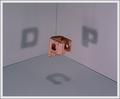
| 11/02/2003 11:53:39 PM | DPCby wdebeau1Comment: Great idea, and as far as the shadows go, carried out great. Unfortunately, the photography's sort of mediocre. A couple of small things would have helped - rotating slightly so the vertical line is straigt (even better, figure out a way to hide or eliminate the lines), clean up the background (some sort of hairs there). Other things, like the focus, may be limits of the lighting and/or your camera, making the block a little more "presentable" (maybe paint it). But I'm definitely giving you extra points for a clever idea, and for pulling it off as far as the shadows go. | | Photographer found comment helpful. |
| 11/02/2003 12:02:02 AM | Sighby BlurryComment: Excellent shot. Very emotive, and the softness is wonderful. And I'm very impressed with the interaction you achieved with the light and shadows. |
| 11/01/2003 12:11:03 AM | |
| 10/29/2003 02:47:57 AM | Love by KonadorComment: What an excellent idea. Very creative. The only thing I personally would change is the book or passage - maybe I'm not getting it, but I don't see a meaningful connection between the text and the image. Other than that, flawless. 9 | | Photographer found comment helpful. |
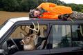
| 10/08/2003 01:19:21 AM | Deer's Revenge! by buzzrockComment: Way to go, Buzz! Great idea, and you did a real good job with it. And a Best Supporting Actress to your Mom - a very dramatic performance! ;) | | Photographer found comment helpful. |
| 10/03/2003 08:31:53 PM | Bad Moveby vtruanComment: Might have been ironic if the slogan on the truck had something to do with safety or promised to take special care of your possesions. | | Photographer found comment helpful. |
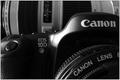
| 10/03/2003 08:29:48 PM | Lower Scoresby jimmythefishComment: I'm gonna check afterwards. If your scores weren't really lower after getting this camera, I'm gonna withdraw my vote! ;) A nice, somewhat low-key shot. A couple of glares, but they're pretty well controled. I like the composition and the cropping. Nice effort overall. Assuming those lower scores... | | Photographer found comment helpful. |
|
Showing 151 - 160 of ~434 |
Home -
Challenges -
Community -
League -
Photos -
Cameras -
Lenses -
Learn -
Help -
Terms of Use -
Privacy -
Top ^
DPChallenge, and website content and design, Copyright © 2001-2025 Challenging Technologies, LLC.
All digital photo copyrights belong to the photographers and may not be used without permission.
Current Server Time: 08/26/2025 05:21:54 AM EDT.
|