| Image |
Comment |
| 11/19/2003 09:10:20 PM |
A Proper Gander ....by tonywComment: Alright, someone had to do it. A more interesting presentation might have swayed me to be pro-goose. But this didn't do it. |
 Photographer found comment helpful. Photographer found comment helpful. |
| 11/19/2003 09:08:19 PM |
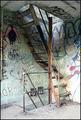
Weapon of Mass Destructionby e301Comment: If I could tell what it is, I might have a better feel for how this fits the title and/or challenge. It\'s an interesting display of lighting, lines and textures, but it doesn\'t seem to say anything to try to sway me. |
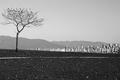
| 11/17/2003 12:35:57 AM |
The Thirteenth Moonby zeuszenComment: Bummer. I wrote about a 100 word critique on this one, but somewhere the critique and my vote were lost. :( To sum up, I loved the image, the lines, the tones and the contrasts. I would have liked the tree not cut off, but it wasn't a big deal. I spent nearly an hour trying to figure out the title (based at least somewhat on your "interchange" in the rant forum), and honestly didn't find anything related to the description you gave. But I did find several wicca, wizardry and new-age references to 13-moon cycles/systems, though nothing that seemed to relate to the image. I tried to give you a 6 - but it didn't take. Nice piece of work. |
| Photographer found comment helpful. |
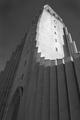
| 11/15/2003 02:57:34 AM |
Hallgrimskirkjaby heidarthorComment: Scandinavian or Icelandic? Nice perspective and framing, great contrast of light and shadow. |
| Photographer found comment helpful. |
| 11/15/2003 02:55:41 AM |
Remembrance Dayby PatztComment: Poignant, nice tone and lighting. I think that I would have liked a little more context though - pulled back just a couple of feet maybe. One of the better monument/graveside shots in the challenge. |
| Photographer found comment helpful. |
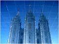
| 11/15/2003 02:39:40 AM |
Reflections on Eternityby dsidwellComment: This one had me confused. At first I assumed it was the Mormon temple in Salt Lake City, UT (USA). VERY similar architecutre, and we just happened to be visiting there this past Monday. But going through some of the pictures I took, it appears I was mistaken. I'd appreciate it if you'd let me know where this is. :)
Back to your photo... Nice, interesting perspective. I assume it's rotated 180%, and this reflection is off something on the ground. The lines give an interesting effect. I generally like it OK, though it doesn't really wow me. Nice, different entry. |
| Photographer found comment helpful. |
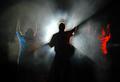
| 11/15/2003 02:25:53 AM |
Sacred Worshipby jmark53Comment: Ya know, since I lead worship, at heart my first response is to want to favor this shot. But a couple of things bother me about it, primarily revolving around the fact that 1) it looks very staged (if not, sorry, but that's how it comes across), and 2) it looks more like performance than worship (the smoke and lighting in particular). Though, the lighting is very striking and well captured. Nice effort, but emotionally it just doesn't deliver for me. |
| Photographer found comment helpful. |
| 11/15/2003 02:21:05 AM |
sacred and profaneby SeanachaiComment: Aesthetically, something just doesn't quite click for me. Not sure if it's lighting, perspective - maybe contrast or tone? Just feels a little flat. But a sort of bold idea for the challenge, though to be picky, there's nothing particularly sacred about this place, just some of the references. But it's unique. |
| Photographer found comment helpful. |
| 11/12/2003 01:11:48 AM |
|
| Photographer found comment helpful. |
| 11/11/2003 03:32:02 PM |
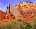
On Solid Rock I Standby ArtifactsComment: I can't wait to find out where this is. Very cool looking structure - good choice of subject for the topic. The picture's pretty good. The lighting could maybe be a little better - more vibrant. It looks just a little flat - like maybe the bottom part is in a cloud's shadow. Horizontally, the composition's OK, but a little more sky might have helped it vertically - it feels a little closed-in. |
| Photographer found comment helpful. |
Home -
Challenges -
Community -
League -
Photos -
Cameras -
Lenses -
Learn -
Help -
Terms of Use -
Privacy -
Top ^
DPChallenge, and website content and design, Copyright © 2001-2025 Challenging Technologies, LLC.
All digital photo copyrights belong to the photographers and may not be used without permission.
Current Server Time: 08/26/2025 05:24:17 AM EDT.