| Image |
Comment |
| 02/04/2004 02:15:25 AM |
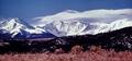
Colorado and Mountainsby vtruanComment: I had several ideas like this - the one thing is visual (the mountains), the other is implied or conceptual (Colorado). In the end I didn't pursue it because to pull it off, both "things" I think really need to have impact in the shot - here, Colorado doesn't. Nice mountain shot though. |
 Photographer found comment helpful. Photographer found comment helpful. |
| 02/04/2004 02:12:25 AM |
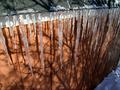
Snow and Iceby PoobaComment: Nice ice - not enough snow. The shadows might have been interesting, but in the end, for me, they clash with the vertical icicles and become a distraction. |
| Photographer found comment helpful. |
| 02/04/2004 02:08:44 AM |
Love at First Biteby ColeyComment: You really sold this one well. I almost overlooked the finished product, then the purpose of the arrow sunk in - the layout is brilliant. Nice job. |
| 02/04/2004 02:05:13 AM |
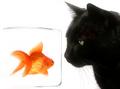
And the plot thickens... by kosmikkreeperComment: Great picture, bad title for the challenge theme. (How can they be partners - the cat would eat the fish. What crime would they commit toghether.) |
| 02/04/2004 02:00:44 AM |
Titanicby sherComment: Good picture, odd title (I presume I get it, but detracts from the challenge theme). |
| Photographer found comment helpful. |
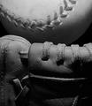
| 02/04/2004 01:57:43 AM |
Ball & Gloveby MJENNIComment: Good idea, good lighting. Composition could have been better - the tight framing could work well, but it's so tight it has a bit of a square, blocked off feel - you don't get the feel of the ball in the glove, the two together, but the ball to one side (vertically), the glove to the other. A real baseball would have photographed better. Good effort. |
| Photographer found comment helpful. |
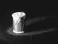
| 02/04/2004 01:53:43 AM |
granny's needle and thread spotlightedby camelotnorthComment: Good idea, composition and lighting setup are great. Lighting on the spool is a bit intense. I'd have prefered a bit of a simpler title. Choice of background could have been better. Overall, good shot. |
| Photographer found comment helpful. |
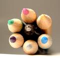
| 02/04/2004 01:51:10 AM |
Pen and Pencilsby NeuferlandComment: OK, for the theme, though to me, pen and pencil seem a bit more contrasting than going together (you use a pen OR pencil), but that's a bit nit-picky. :) The setup is really interesting - how you got the bundle balanced on the one pencil. DOF is a bit too narrow I think, since the tip of the pen is out of focus (again stressing the contrast, not the togetherness, though I assume unintentionally). Lighting and use of colors are good. I think this would really stand out in a "one of these things doesn't belong here" type competition. Still, a good entry. |
| Photographer found comment helpful. |
| 02/03/2004 06:44:31 PM |
Fantasiaby GordonComment: Well, it took you nearly two years, but you've finally managed to show some improvement since starting at DPC. ;) Awesome shot, it's going straight into my favorites. |
| Photographer found comment helpful. |
| 12/16/2003 08:55:07 PM |
|
| Photographer found comment helpful. |
Home -
Challenges -
Community -
League -
Photos -
Cameras -
Lenses -
Learn -
Help -
Terms of Use -
Privacy -
Top ^
DPChallenge, and website content and design, Copyright © 2001-2025 Challenging Technologies, LLC.
All digital photo copyrights belong to the photographers and may not be used without permission.
Current Server Time: 08/26/2025 02:27:37 AM EDT.