| Image |
Comment |
| 01/13/2005 07:57:05 PM |
untitledby RemieComment: Thanks for the votes and comments.
In the photographers-comment, I mentioned that I hoped that the image would remind viewers of all the people missing after the tsunami-disaster in Asia. There's many ways to interpretate this image though (that's why I didn't give this photo a title in the first place), so I do understand that it made people laugh as well. I do have my doubts that being eaten by a shark is funny though :)
|
| 10/13/2004 06:45:41 PM |
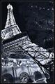
Paris, Las Vegasby Pep VentosaComment: I'm very surprised this image ended in the bottom ten.
I guess this wonderfull photo was voted down because a lot of the voters didn't realize their actual is a copy of the Eifel-tower in Vegas and therefor believed this was a photoshopped image.
|
 Photographer found comment helpful. Photographer found comment helpful. |
| 10/08/2004 05:23:50 AM |
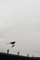
Megalomaniaby RemieComment: Thanks for all the votes and comments.
Although I hoped it would do better I realized this photo wouldn't score high, because it's a photo that one either likes or not. I submitted it anyhow, because I think it's a unique catch and a very interresting image overall. For me, that's worth more than a high ranking.
Personally I like this image very much, because its's kind of a "story-telling" image and the viewer can make up his own story. There are several ways to look at this photo and the mixed comments are a proof of that.
I titled his photo "Megalomania" because that's what I thought describes the photo best. "All we are is dust in the wind" as John Setzler mentioned in his comment might be a very good title too though. Funny I didn't think of that myself, because it's my favorite song :)
I've also been doubting if I should tittle it "Leonardo" or "Wright brothers" because of the old-fashioned pioneer-feeling of the image and I'm glad that others had that feeling as well.
|
| 09/13/2004 06:02:19 AM |
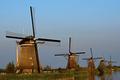
Landscapingby RemieComment: Thanks for the votes and comments!
In some comments it is mentioned that the photo isn't suitable for a Travel Guide. I don't agree with that, because the theme was "Travel Guide" not "Holiday Guide" and the purpose of photos in a Travel Guide is to give a good impression of a travel-destination. And that's exactly what this photo does :)
I've used a wide white border because I want the white to function as a background-color. IMHO The photo looks better on a white background then on the grey DPChallenge-background. After all paper in most travel guides is white too :) Message edited by author 2004-09-13 07:03:09. |
| 09/10/2004 04:54:54 PM |
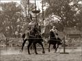
The Renaissance Festivalby MarjoComment: I think you captured the action very well, but the knight in the front is hard to see because of the shapes of the ship in the background. Of course I don't know how the actual situation was, but maybe stepping a few feet to the left or right would have resulted in a more quiet background. |
| Photographer found comment helpful. |
| 09/10/2004 04:39:17 PM |
|
| Photographer found comment helpful. |
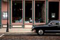
| 09/06/2004 06:56:49 PM |
Dinner in the Oregon District - Dayton, Ohioby stupidcatComment: Besides that it's a very nice composed and interresting photo, the first thing I noticed was that the top of the windows are not parallel with the top-border of the photo. Because of the alignment of the vertical lines, I can see why you didn't rotate the photo though. So, I think you should have made a tighter crop at the top.
I really do like the link between the old-fashioned looking car outside and the old people inside the restaurant. |
| Photographer found comment helpful. |
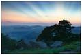
| 09/06/2004 06:31:19 PM |
Scenic Southwest Oklahomaby postoakinversionComment: The scenery is great, the sunbeams are beautifull and I think in total, it's a very good photo. After looking at the photo af couple of times I still kinda have the feeling that the tree bending towards the center of the image is blocking an important part of the view though. |
| Photographer found comment helpful. |
| 09/06/2004 03:29:31 PM |
Oregon Capital- Salem's Information Centerby lizzyc3Comment: I like the way the women contrast with the straight shapes and lines of the building as well as the conversion to B&W. I would have liked it even more if the the vertical lines of the building would have been parallel to the border of the photo. |
| Photographer found comment helpful. |
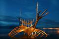
| 09/06/2004 03:16:28 PM |
The Viking ship at nightby arngrimurComment: Very nice. I like how the the colors of the statue stand out against the dark blue sky and how the lights of the town help to create a strong image. |
| Photographer found comment helpful. |
Home -
Challenges -
Community -
League -
Photos -
Cameras -
Lenses -
Learn -
Help -
Terms of Use -
Privacy -
Top ^
DPChallenge, and website content and design, Copyright © 2001-2026 Challenging Technologies, LLC.
All digital photo copyrights belong to the photographers and may not be used without permission.
Current Server Time: 06/29/2026 07:20:01 PM EDT.