| Image |
Comment |
| 07/09/2007 12:18:06 PM |
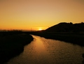
Pathway to the Seaby brad177Comment: I like the orange color from the sunset, thru the sky and on the water. Nice frame, but shouldn't this have been in the Sea (not land) challenge? |
| 07/09/2007 12:16:31 PM |
|
 Photographer found comment helpful. Photographer found comment helpful. |
| 07/09/2007 12:13:55 PM |
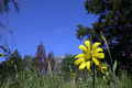
Life Turned Her That Wayby JutildaComment: Cool frame... The sunflower sets it off. I just wish there where a little more detail, and it almost looks like its a little dark (that might just be my screen)... |
| Photographer found comment helpful. |
| 07/09/2007 12:12:28 PM |
Flower time in the rockies.by jimsappComment: Thats pretty cool. Portrait of a flower... Wish there was a mountain poking up higher into the blue sky mid-left. The one thing that stands out that i'm not fond of is the sharpen lines around the yellow flower, almost looks like it was sharpened to make up for not being perfectly in focus... I wonder if sharpening the whole image would've worked better. Sorry, 4 |
| 07/09/2007 12:09:23 PM |
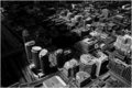
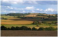
Countrysideby tembaComment: I like this a lot. One thing that stands out is the detail of the cloud blocking the sun on the ground in the middle. I think you've balanced the frame perfectly. The differen't shades of color throughout... the buildings distance helps give an idea of how far you can see from where your standing. |
| Photographer found comment helpful. |
| 07/09/2007 12:06:00 PM |
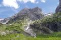
Mountain landscapeby AnabelleComment: Weird, almost looks like a miniature landscape. I don't like the sharpen lines between the mountains and sky. Other than that, the colors and frame are pretty nice. |
| 07/09/2007 12:03:48 PM |
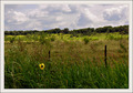
Bootlegby tooterComment: I like the frame... gives a feeling of "this is where we are, and thats where we're going"... Good saturation. Only critique is I almost which everything was a bit clearer... |
| Photographer found comment helpful. |
| 07/09/2007 12:01:27 PM |
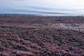
Abstract Coastline.by anwarranaComment: Kind of interesting shot, but sorry, it just doesn't look pleasing to me. Good depth of field and frame, but there's just nothing nice to look at. 4 |
| Photographer found comment helpful. |
| 07/09/2007 11:59:09 AM |
The National Mallby godzakkaComment: Nice composition. Thank you for not tilting your camera. The only critique (or more of an option) I can think of is to crop maybe portrait thru the center (you know, so you get the 3 white objects)... Anyway, cool shot |
| Photographer found comment helpful. |
| 07/09/2007 11:55:48 AM |
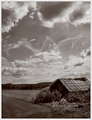
Reclaimed by the Landscapeby skewsmeComment: Nice... dramatic lighting, sepia toning works well for me. Only critique is I wish the building wasn't cut off the frame. I like the detail in the sky and the part of the structure that is visible. |
| Photographer found comment helpful. |
Home -
Challenges -
Community -
League -
Photos -
Cameras -
Lenses -
Learn -
Help -
Terms of Use -
Privacy -
Top ^
DPChallenge, and website content and design, Copyright © 2001-2025 Challenging Technologies, LLC.
All digital photo copyrights belong to the photographers and may not be used without permission.
Current Server Time: 08/02/2025 09:23:18 AM EDT.