| Image |
Comment |
| 12/29/2007 10:00:11 AM |
I am too young to cook.....by hotrollComment: I like the idea, but I think the picture is too dark in general, except for the door, which is too light. This makes the eye of the viewer turn to the door, instead of to the scene in front. |
 Photographer found comment helpful. Photographer found comment helpful. |
| 12/29/2007 09:57:21 AM |
Where is the manual of this Soap? BTW: Is it soap?by JaviZComment: In the darker days of the year, many photogs turn to artificial light, and not everyone of us has the money (or financial priority) to buy strobes or sophisticated flashes. Now, the onboard flash of the camera seems to come in handy. But they don't. Onboard flashes kill pictures: they create shiny skins and hars shadows. Your pic suffers from theze features as well. There are simple, cheap and fairly effective ways to handle this, for instance by putting a tissue in front of the flash to soften and diffuse the light. Other techniques to soften or reflect light may be helpfull too. |
| Photographer found comment helpful. |
| 12/29/2007 09:57:15 AM |
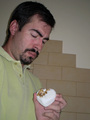
Little Debbie Cakes?!?!?!by jere2201Comment: In the darker days of the year, many photogs turn to artificial light, and not everyone of us has the money (or financial priority) to buy strobes or sophisticated flashes. Now, the onboard flash of the camera seems to come in handy. But they don't. Onboard flashes kill pictures: they create shiny skins and hars shadows. Your pic suffers from theze features as well. There are simple, cheap and fairly effective ways to handle this, for instance by putting a tissue in front of the flash to soften and diffuse the light. Other techniques to soften or reflect light may be helpfull too. |
| Photographer found comment helpful. |
| 12/29/2007 09:51:37 AM |
Broken Glassby harriobComment: Funny. Not a very good pic though: small, greyish and the highlights draw the attention away from the actual subject |
| 12/29/2007 09:51:24 AM |
Shower Caps or Food Storage?by jny1179Comment: I don't realy know where to begin my comment, so let me start by stating that I will vote this pic higher than I would based on technical aspects alone. Why? Because you managed to capture the fun and if a picture captures emotion, it can't be all that bad.
Now let me try and help you make a better shot next time. First of all, be very carefull using your onboard cam. The least you should do is diffuse the light by holding or taping a folded tissue in front of it. Other methods of relefecting and dicffusing light may also help to avoid shiny skins and harsh shadows. Second, try to keep your final composition in mind. A simple but very effective rule for portaits is to keep the eyes of the main person at 2/3 of the pic's height, width or both. Third, if you are shooting more than one person, use a slightly higher f-number in order to keep the second person in focus as well.
Hope this is of any use to you. |
| 12/29/2007 09:41:00 AM |
What's the duck for? by tgplummerComment: Looks a bit snapshottish to me. As if your dad/grandad/husband/whatever fell asleep and you took a sneaky picture with a rubber duckey. The picture lacks contrast and could have been enhanced by paying more attention to lighting and composition.
Oh, btw, the duck is for bathing. ;-) |
| 12/29/2007 09:38:30 AM |
For all the days you already missedby heavyjComment: Nice idea and styling, but the execution deserves a lttle more attention. Not quite sure what you did whith the bg for instance, but it looks messy, as if you dodged and burned it carelessly. Bot hands are in awkward position, and it seems your right hand comes from outside the picture. Other (minor) technicalities include the flash reflection on the magazine and the tight crop on the upper side. |
| Photographer found comment helpful. |
| 12/29/2007 09:33:17 AM |
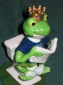
"A frog by any other name".by jjsmomComment: Yep, that's a silly gift. I don't like the harsh lighting and shadow though, nor the very central composition. This litlle item could hve been displayed in a much more spectacular way IMO. How about a low angle close-up for instance? That would have also given you the oppotunity to create a larger pic, which would have worked better. |
| Photographer found comment helpful. |
| 12/29/2007 09:16:18 AM |
missing pieceby csl_click79Comment: It's hard -if not impossible- to make a pleasant composition from things still in the box. I think you should have taken them out. That would also help the viewer to see there are only seven pons. Some of the whites are slightly blown in the picture and the whites have a blue cast, indicating that your WB is incorrect. |
| Photographer found comment helpful. |
| 12/29/2007 09:10:23 AM |
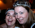
Very useful wigby kiskatComment: I like the idea and the expression is fitting, but the pic does not seem to be in focus and the (oversharpened?) glitters and glimmers are very distracting. They seem to move from right to left. |
| Photographer found comment helpful. |
Home -
Challenges -
Community -
League -
Photos -
Cameras -
Lenses -
Learn -
Help -
Terms of Use -
Privacy -
Top ^
DPChallenge, and website content and design, Copyright © 2001-2025 Challenging Technologies, LLC.
All digital photo copyrights belong to the photographers and may not be used without permission.
Current Server Time: 08/25/2025 12:11:57 PM EDT.