DPChallenge: A Digital Photography Contest You are not logged in. (log in or register
 
Browse Settings
Currently viewing:
Registered Userpncowley

Show comments:

Per page:

Order:

Comments:


Comments Made by pncowley
Pages:   ... ... [112]
Showing 281 - 290 of ~1112
Image Comment
Unknown
07/09/2003 11:59:36 PM
Unknown
by sher

Comment:
Well done... a very poignant image! I think the subdued tone of the headstones in the background emphasizes the overall mood, and I wish the front headstone were similarly exposed. A slightly different (higher) angle might also have allowed a crop that eliminated the slightly distracting stones at the top of the frame. Overall, though, a fantastic image that meets the challenge well. --9
Photographer found comment helpful.
Dear John
07/09/2003 11:55:04 PM
Dear John
by orussell

Comment:
Nice, visually interesting shot. Overall composition works very well; only problem in my opinion is the slight glare off the table at the top center of the frame.
Photographer found comment helpful.
Sea Beans
07/09/2003 11:52:14 PM
Sea Beans
by jab119

Comment:
Black / white adds a great deal of visual interest to this shot by forcing the focus to the textures and patterns. Very well shot! (And what exactly are 'sea beans'?)
Preserved
07/09/2003 11:48:40 PM
Preserved
by jillz

Comment:
Lighting is perhaps what I like best about the shot. And it definitely meets the challenge... I'm certainly wondering exactly what the heck it is!
Photographer found comment helpful.
Backdoor
07/01/2003 11:55:10 PM
Backdoor
by casualguy

Comment:
Very interesting contrasts between the smooth wall and the rough door, and the straight lines of the door and the smooth lines of the wreath and doorway. Nicely done!
Into The Great Wide Open
07/01/2003 11:53:16 PM
Into The Great Wide Open
by sher

Comment:
Great perspective, very interesting bridge, rich color, and a pleasing composition... did I forget anything? :-) Very well done!
Photographer found comment helpful.
B for Balloons
07/01/2003 11:51:24 PM
B for Balloons
by wsoo

Comment:
Interesting composition... the sun flare kind of ruins the shot for me, though. 5
Boaters
07/01/2003 10:51:17 PM
Boaters
by Alecia

Comment:
Beautiful shot! I love the choice of black/white with just a slight hint of sepia tone.
Photographer found comment helpful.
Dine -In
06/29/2003 10:54:39 PM
Dine -In
by Musicman

Comment:
Critique Club critique:

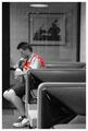
I'm not certain exactly where to begin, but I like the feel you have captured in this shot. You have created a very nice candid portrait that captures the essence of the moment; one of those shots that leaves the viewer on their own to 'write' the story behind the photograph in their own mind.

I agree with some of the commenters below about the red shirt. I don't think the selective desaturation works well with this shot-- I would have preferred seeing the entire shot in grayscale instead.

Your composition is very nice, with the subject off-centered, yet balanced within the frame. It fits the challenge well.

Overall, the lighting is generally adequate for the shot. It's not terribly noticeable (and does not detract from the shot in any way in my opinion) but there seems to be some motion blurring of the subject's right hand... likely due to the longer shutter speed required to expose the shot. Probably not much else you could do to address the lighting, though, since you were already shooting with a pretty wide aperture at f2.5, and again, I don't think it negatively impacts the shot.

I do find the reflection in the glass somewhat distracting, although not entirely overpowering. I'm not certain if you have it available, but a polarizing filter might help counteract some of the reflection.

I hope this critique is of some help; if you have any questions or would like clarification about anything here, please let me know and I will happily help out.

Paul.
Windmill at Night
06/29/2003 10:32:38 PM
Windmill at Night
by BobsterLobster

Comment:
Critique Club critique:

Overall, you have created a very striking and engaging shot within the guidelines of the challenge. In my opinion, a pure B/W with a fairly high contrast was an excellent choice due to the lighting and textures within the shot. The dramatic lighting really accentuates not only the blades of the windmill, but also adds a great deal of visual interest around the deck railing and accentuates the texture of the stone construction of the main structure. The shot is well-exposed, with a solid range of tones from white to black.

Given the perspective and constraints of the challenge (off-center subject), I think your composition works quite well. While the center of the blades is also the center of the shot, the visual weight of the subject is well away from center, thereby meeting the requirements of the challenge, in my opinion. The strong negative space of the upper left portion of the frame nicely balances the subject.

I'm sorry I missed this one during my limited voting for the challenge... it would have received a score of 10 from me. Very nicely done!

I hope I have been of some help with this critique. If you have any questions or would like further clarification on anything I have commented on above, please PM me and I will gladly help further.
Photographer found comment helpful.
Pages:   ... ... [112]
Showing 281 - 290 of ~1112


Home - Challenges - Community - League - Photos - Cameras - Lenses - Learn - Help - Terms of Use - Privacy - Top ^
DPChallenge, and website content and design, Copyright © 2001-2025 Challenging Technologies, LLC.
All digital photo copyrights belong to the photographers and may not be used without permission.
Current Server Time: 09/01/2025 03:54:39 PM EDT.