| Image |
Comment |
| 05/20/2007 02:23:15 PM |
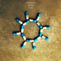
designing perfect livesby bdennyComment: This is a very cool idea and image ... reminds me of something the talking heads would do. Focus is too soft on the pills, or I would have scored this higher. 7 as it is. |
 Photographer found comment helpful. Photographer found comment helpful. |
| 05/20/2007 02:22:15 PM |
|
| Photographer found comment helpful. |
| 05/20/2007 02:21:37 PM |
|
| Photographer found comment helpful. |
| 05/20/2007 02:20:58 PM |
|
| Photographer found comment helpful. |
| 05/20/2007 02:18:17 PM |
Devotional Prayers Lightby yankoComment: Nice job ... really looks like something you'd see on the shelves. Picture looks a little washed out, but on this cover that looks like an intentional choice. 8 |
| Photographer found comment helpful. |
| 05/20/2007 02:17:25 PM |
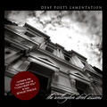
DEAF POET'S LAMENTATION by hotpastaComment: One of my top 2 picks from the challenge. Great picture and b/w tones, and a good job using it to create a very realistic looking album. 10 |
| Photographer found comment helpful. |
| 05/20/2007 02:16:31 PM |
|
| Photographer found comment helpful. |
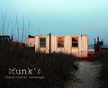
| 05/20/2007 02:15:36 PM |
Dfunk'd: Postmillenial Landscapeby noranekoComment: One of my favorites from the challenge. Great picture to start with, good title to fit the image and the album, and looks like a real album cover. My only quibble is the shape is a little too rectangular for an album cover, so I dinged you a point for that. 9 |
| Photographer found comment helpful. |
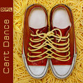
| 05/20/2007 02:14:16 PM |
Devoted Pasta Lovers by De SousaComment: My pick for the blue ribbon ... very creative, title goes great with the image, actually looks like an album cover, and where you found (or created) that super long noodle lace is anyone's guess! 10 |
| Photographer found comment helpful. |
| 05/10/2007 03:01:52 PM |
Watchmanby Nikolai1024Comment: Agree with Cutter ... editing really makes this one pop. Was this an HDR combination or straight from a single image? Either way, like to see the details of how this was done. |
| Photographer found comment helpful. |
Home -
Challenges -
Community -
League -
Photos -
Cameras -
Lenses -
Learn -
Help -
Terms of Use -
Privacy -
Top ^
DPChallenge, and website content and design, Copyright © 2001-2025 Challenging Technologies, LLC.
All digital photo copyrights belong to the photographers and may not be used without permission.
Current Server Time: 08/11/2025 01:49:24 AM EDT.