| Image |
Comment |
| 01/16/2008 12:07:38 PM |
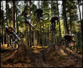
Clown Trash by HipychikComment: Wow Terry ... just noticed this was yours! Fabulous shot, and congrats on the well deserved ribbon! |
 Photographer found comment helpful. Photographer found comment helpful. |
| 01/14/2008 12:37:40 AM |
Pirouette by MAKComment: Well if I was gonna get SMACKED in the LoD, at least it was by this mighty fine shot. Congrats on the blue! |
| Photographer found comment helpful. |
| 01/08/2008 07:34:44 PM |
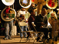
Paging Mr. Trombone Playerby BAMartinComment: I like the moment of capture, but the technicals brought it down for me ... in particular, I thought the main subject was too dark in comparison to the tuba (trombone!) players in the far background. A tighter focus or crop on just him and the guy behind him might have fixed that, and also eliminated some of the dead space and distracting elements on the left. With just those two subjects you have a nice tight composition, and a great juxtposition between the guy madly texting on his phone and the other emphatically oom pah pah ing on his horn. |
| Photographer found comment helpful. |
| 01/08/2008 07:18:24 PM |
Hot!by L2Comment: I also gave it a 5, and I remember why. There was something about his stance and his smile that made it LOOK a bit off to me, almost as if it were a posed picture. His expression just didn't seem to fit with the scene ... burning building in the background and he's sitting there posing for GQ. That was my true emotional response to the image ... whether posed or not really doesn't matter to me, its just that he appeared so out of context with his surroundings that I didn't like it. You'll have to be the judge as to whether that's a reaction to the photo or your subject. ;>P |
| Photographer found comment helpful. |
| 01/08/2008 07:12:26 PM |
Santa's Little Helperby KaliComment: I loved this shot ... it was one of my 10s. The funny expression on her face just makes the shot, and the processing nicely accentuates the overall feel of the image. I was one of your two 10s. I could easily see this on one of those funny, arty greeting cards. |
| Photographer found comment helpful. |
| 01/08/2008 09:57:21 AM |
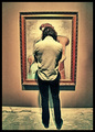
Art Appreciationby HipychikComment: I really liked this shot Terry. It has a great are museum feel to it, and the heavy processing works well with the subject matter. I'm surprised this didn't score higher, but for some reason a Free Study challenge never seems to reward shots like this. |
| Photographer found comment helpful. |
| 01/08/2008 09:54:51 AM |
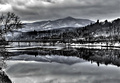
Stillness After the Snowby bassboneComment: I remember this shot, and remember thinking, wow, great image, too bad its so overprocessed. For me the harsh high contrast processing doesn't complement the scene. Looking at it a bit closer, I like the way the processing affects the distant mountains and sky (and their reflections), but the bridge, framing trees and opposite bank are all too high contrast for me.
Scanning the comments below I see I'm not alone in this view. But as Deb said it comes down to a matter of taste, so if you love it that's all that matters. |
| Photographer found comment helpful. |
| 01/08/2008 09:49:13 AM |
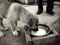
Man and Dogby MelethiaComment: This has a kind of street photography feel to it, where the moment of capture is more important than the technicals that may have brought down your score. As others have mentioned, the lifted foot adds a nice feel to the image. I also really like the movement in the milk where the dog is lapping it up, and the gritty feel to the overall setting, particularly the 2x4 pieces framing the bowl. There's a lot to look at here, including the other dog's feet behind the tapping shoe guy.
I can see this as a shot on a coffeehouse wall. It takes time to appreciate an image like this, and knowing the back story makes it fuller. Unfortunately, that's not the kind of image that does well at DPC, particularly in a challenge where people are voting 424 images. Guilty as charged -- I gave you a quick trigger 5 because the image didn't grab me right off the bat. On further reflection I'd probably give it an honest 7 -- the image doesn't have the pop or emotion for me that pushes it higher, but its a very nice slice of life that would fit well in a larger series of images. |
| Photographer found comment helpful. |
| 01/06/2008 04:48:23 PM |
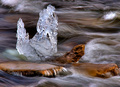
Icicle Magicby basssman7Comment: I love the shapes and forms in the water ... I think I would like this one even more without the icicle! |
| Photographer found comment helpful. |
| 12/17/2007 07:15:25 PM |
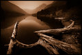
Majestyby APComment: Beautiful duotone; the detail on the water and the soft tones on the distant mountains are great. |
| Photographer found comment helpful. |
Home -
Challenges -
Community -
League -
Photos -
Cameras -
Lenses -
Learn -
Help -
Terms of Use -
Privacy -
Top ^
DPChallenge, and website content and design, Copyright © 2001-2025 Challenging Technologies, LLC.
All digital photo copyrights belong to the photographers and may not be used without permission.
Current Server Time: 08/16/2025 10:36:17 AM EDT.