|
|
|
Showing 101 - 110 of ~244 |
| Image |
Comment |
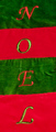
| 12/11/2007 07:08:21 PM | Happy Holidaysby travis_cooperComment: Greetings from the Critique Club :)
This did not score very well so let's see why.
Composition
It is a centered image which does not help with the drama of the photo. It is not clear that this involves multiple stockings. My first take was that it was a snapshot of an existing wall hanging.
A more interesting composition might be to lay the stockings randomly on top of each other while still spelling NOEL. Create a pattern, make it off center, make a design.
Lighting
The lighting is flat which does not help the colors. Given the objects I am not sure what could be done with the lighting as no shadows are really possible.
Please feel free to contact me via the PM system.
Ken
alexzen
|
| 12/11/2007 06:57:49 PM | Togetherby RosacalacaComment: Greetings from the Critique Club :)
It looks like your commenters put it very well. This image screams for contrast and color. There is much potential in this photo but it needs some post processing. Contrast and saturation would do wonders. Possibly some sharpening - it is hard to see whether it is in focus or not.
You seem to have done a good job with a shallow DOF as the background is nicely blurred. It would be nice to see this image after some procesing.
Please feel free to contact me via the PM system.
Ken
alexzen
|
| 12/11/2007 06:48:42 PM | Will the Real Pencil Please Stand Upby JLCComment: Welcome from the Critique Club :)
It looks like you had a good idea, but it did not score very well. Let me see if I can identify why. Your commenters have hit on several reasons.
Composition
It took me a awhile to find the 'alone' subject. Usually in this type of challenge you want to make sure your main subject stands out clearly. In this case the wooden pencil is quite hidden. Your image is centered. While the alone subject is on the thirds line, my eye goes right to the center where all the other pencils intersect.
Lighting
Very flat. The lighting does not allow the color to jump out and does not allow for any drama.
How could you improve this image?
Make sure you include all subjects in the image. Position the wood pencile such that it jumps out and that your eye goes right to it. Use a brighter light and then use levels to cause your white background to disappear, including shadows. Saturate your colors so they jump out. Make sure your subject is the center of attention, but not centered.
Please feel free to contact me via PM.
Ken
alexzen |
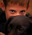
| 12/06/2007 05:47:48 PM | He Went Into Hiding...In Plain Sight!by 777STANComment: Greetings from the Critique Club :)
This image did not score too high so let's see what could have been improved.
Composition
There two large objects, pretty much centered. No tension or dynamics in the composition. You did place the main subject - the eyes - on the thirds line. Good. Otherwise the 'horizon' (so to speak) is dead center. Moving your camera or your cropping so that strong horizontal lines are not centered can help alot.
Focus.
Nothing in the image seems to really be in focus except the eyes, which I assume are that way via post processing. The background (ears, hair) being out of focus is OK, but the dog is also out of focus. Perhaps the slow shutter speed hurt you and it is not just a DOF issue. Some arifical light to boost your shutter speed and to help lower your ISO would have helped.
Eyes
I can see you worked hard to get the eyes to pop and they do. But....perhaps too much. Perhaps your selection around the whites was not feathered enough or you used the wrong selection tool, because the whites seem very straight edged and unnatural. Getting the eyes just right is very hard. I find using the color selction tool provides a more natural selection that allows the whites to fade at the edges. Try bringing out the reflections in the pupils as well. As in all post processing, the key is to do it so it is not noticed. Once an effect is noticable, then it is too much.
Please feel free to contact me via the PM system
Ken
alexzen
|  Photographer found comment helpful. Photographer found comment helpful. |
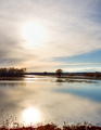
| 12/06/2007 05:33:49 PM | In the Treesby LoreneComment: Greetings from the Critique Club :)
What an interesting photo to critigue. It scored moderately so let's see what we can find that may be holding it back.
Composition
I think that the horizon is kind of near the thirds and kind of near the center. Perhaps a more dramtic position of the horizon on the lower third line would help. I am not sure that the horizon is straight. I think the water line is tipping down on the right.
Tone
This image is all about tone, and contrast or lack thereof. There are alot of subtle tones in the image, but the harsh sun burning through detracts. Such a November day. I would love to see more detail, more shadows, more emotion in the clouds. I am not sure if the details exist to pull out that texture in post processing. Otherwise, the mid day sun is creating very flat lighting.
I am not sure if the foreground helps or hurts. It does provide an almost necessary framing, but it also adds a harsh, more contrasting compoent that drags my eye away from the beauty of the sky and its reflection.
I almost wonder what this image would look like with the foreground removed and a complimentary border around it to give the subtly of the image some boundaries. I think this is one photo that needs a border to help offset it and create contrast, not within the image, but between the image and its environment.
Hope this helps.
Please feel free to contact me via the PM system.
Ken
alexzen
| | Photographer found comment helpful. |
| 12/06/2007 05:21:37 PM | Santa's Helper (The North Pole)by psartComment: Greetings from the Critique Club :)
Certainly a cute picture. First impressions are technical. There is a lot of noise in this photo, particularly in the shadows. Perhaps you could have used a tripod, brought down the ISO, and used a wider aperture. You might find that your camera does not do well with higher ISOs, particulary in low light situations. Arifical light or a tripod could help you stay at ISO 100.
Focus:
The christmas tree is almost out of focus, but it could be better it if were more out of focus. F4 may have allowed you to get better bokeh, with less grain, and bring the focus back to the main subject.
Composition
My eye finds the red hat to be the main subject, but I think you wanted the dog's face to be the main subject. In this case, you could desaaturate the red (which is dominating the image) and do some post processing (dodge and burn, curves, levels) to bring the dog's face more to the forefront.
Noise
I think the noise is the biggest factor disracting from this photo. Knowing our camera's limits is important.
I hope this is helpful.
Please feel free to contact me via the PM system
Ken
alexzen
| | Photographer found comment helpful. |
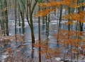
| 12/06/2007 05:10:36 PM | Drew Fell Through Thin Ice And Never Surfacedby EssAreDubyaComment: Greetings from the Critique Club :)
This received a moderate score so let me figure out why. The first thing I notice is that there is no main subject. There are lots of them, but my eye is not drawn to any particular part of the image. There is no anchor so my eye wanders, taking in the waterscape but never landing on anything that is really interesting.
The intrigue that Drew may have fallen through the ice is not supported by the image by showing a hole in the ice. Now that would have added a story and some drama.
The colors are nice, the snow around the base of the trees is nice, the orange of the leaves adds a great accent. But there is nothing that pulls me into the photo. The lighting is flat - overcast I assume so no highlights to exploit.
In advanced editing you could dodge and burn to bring out the detail and highlights on parts of the image to create a focal point. The leaves are a candidate for that, but otherwise there is no other candidate that could be highlighted.
But it is a nice, calming photo.
Please feel free to contact me via the PM system
Ken
alexzen
|
| 12/06/2007 05:01:03 PM | |
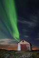
| 12/06/2007 04:57:32 PM | Living in an Old Shack on an Arctic Island Shooting Aurora by orvaratliComment: Greetings from the Critique Club :)
I am honored to be able to critique this photo.
Composition
This is a wonderfully composed with the barn anchoring the image and the way it appears that the Aurora is shooting out of the roof almost as if it is on fire. The Aurora is not just a background for the barn; they seem entwined.
The first time I saw this photo I noticed the fact that the barn leaning left bothered me. But your horizon is straight, so that must just be how the barn is.
Tonal range is excellent and the consistent lighting across the foreground adds much to this dramatic photo. The processing of the blue sky, green Aurora and orange city lights is very well done. I can assume they were not this complimentary to each other right out of the camera.
Nit Picky:
The stars appear oversharpend. From a distance they blend in nicely. At closer distance, on a monitor, they appear to be separate from the sky, as if placed on top of the image. They are not integrated into the sky. But a minor distraction.
Congratulations on a great photo and a great score with a ribbon.
Feel free to contact me via the PM system.
Ken
alexzen
| | Photographer found comment helpful. |
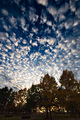
| 12/06/2007 04:40:22 PM | Walking in the Woodsby levyj413Comment: Greetings from the Critique Club :)
First impression is: great sky, boring foreground.
Composition:
The wide angle worked very nicely at making the sky quite dramatic. This is a unique composition by using it in portrait mode. I would be curious what the sky looked like horizontally. But in portrait mode the sky seems to be exploding upward. Wonderful.
Color:
Great color in the sky, good tonal range in both the sky and clouds. Focus in the sky seems good.
So why didn't it score better? Appears that the foreground really detracted from this image. The foreground does not add much other than a context. The trees are not particularly focused and they lack color. And since they are pointing into the center of the wide angle they in a way are fighting the exploding nature of the sky, almost trying to constrain the sky. It does create some interesting tension.
The objects at the botton of the image, by the road, do not add anything but clutter to the image and make it seem more like a snapshot. It is like the top 2/3rds of the image is a 6.3+ photo but as your eye moves down to the bottom it is anchored by a 5+ photo. Not sure how you can crop it to improve.
Execution and combining images is great. It is really only the composition and foreground that hurts this image.
Please feel free to contact me via the PM system.
Ken
alexzen
| | Photographer found comment helpful. |
|
Showing 101 - 110 of ~244 |
Home -
Challenges -
Community -
League -
Photos -
Cameras -
Lenses -
Learn -
Help -
Terms of Use -
Privacy -
Top ^
DPChallenge, and website content and design, Copyright © 2001-2025 Challenging Technologies, LLC.
All digital photo copyrights belong to the photographers and may not be used without permission.
Current Server Time: 08/25/2025 05:55:21 PM EDT.
|