| Image |
Comment |
| 01/01/2007 08:02:37 AM |
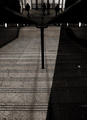
Christmas By The Bayby JeffryZComment: Fun image - the repetition of that more distant cone-shape (whatever it is, but it's the right shape) adds some depth to the composition. Good exposure, but could perhaps have used some human interest, or at least something more than is here to really hold attention. |
| 12/29/2006 07:45:19 PM |
Goodbye Blue Skyby jjbeguinComment: Ha ha ha. Ha ha ha again. Laughs himself to the point of not being able to drink any more of his St Emilion. Someone - and a fine judge at that - mistook your work for mine.
Interesting how the appearance of a line can so finely depend on your perspective - there's arguably a lesson for all those who'd like to change your point of view there. |
 Photographer found comment helpful. Photographer found comment helpful. |
| 12/29/2006 07:46:38 AM |
Chefby digitalknightComment: Interesting approach - I prefer something like Bob Carlos Clarke's studies of Marco Pierre White - he gets involved in the mess and apparent chaos of a kitchen, makes the mess of the place more real. A clean chef ... well, it feels posed, too tidy, not real. Technically good stuff though - your handling of white balance and exposure is good. |
| 12/29/2006 07:43:04 AM |
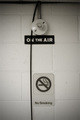
"On Air"by phototureComment: There's a suggestion of the work of Boltanski about this - the light bulb, and the trailing cable. I kind of like the weird focus, it lends some mystery to the image, and the odd composition makes for more strangeness. It also suggests a hospital to me - I was thinking of oxygen tanks, 'on air' as in survival ... |
| Photographer found comment helpful. |
| 12/21/2006 08:15:38 AM |
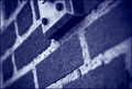
Another Brick in the Wall ...by soumya_sdComment: The hyper-shallow depth of field produces an intriguing effect - a slight disorientation. But the image lacks interest for me - I'm not finding the textures nor patterns interesting, and what is there beyond that, actually? |
| Photographer found comment helpful. |
| 12/21/2006 08:13:12 AM |
Shine On You Crazy Diamondby TwigComment: Lacks real detail and quality - either resolution, processing or cropping has lead to a blocky feel to this image. The composition is kind of effective - not as effective as it might be because of the green background image right, and your control of the reflections etc. in the stone is poor - to give a real sense of ping from a jewel requires careful lighting indeed. |
| Photographer found comment helpful. |
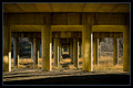
| 12/21/2006 08:09:54 AM |
Empty Spacesby shamerComment: The slight vignetting is effective - but perhaps not effective enough? I find I'm drawn to the areas outside the concrete - where the trees are, and I'm finding nothing to hold my eye amongst those pillars and slabs of concrete. Perhaps that is your point, but it has lead to a difficult viewing experience. The idea of making nothing your subject is difficult to carry off. |
| Photographer found comment helpful. |
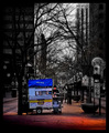
| 12/21/2006 08:06:53 AM |
Wish You Were Here (Pink Floyd)by LanceWComment: With the obvious implication of a postcard, of course. It would make a successful card, I think. A well taken shot, but it lacks a real sense of punch for me personally - it's just a competent cityscape. |
| Photographer found comment helpful. |
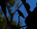
| 12/21/2006 08:04:29 AM |
Waiting for the Wormsby charlievComment: A nice approach, and almost a nice shot; if you'd been a bit either luckier or more careful with the arrangement of the silhouetted trees, and if the background weren't so half-light, perhaps this would do well. It has an impression of lack of sharpness to the bird silhouette. Working with odd shapes, like this - I mean the surroundings rather than the bird, requires a careful eye and some real consideration of composition, which you haven't achieved here I'm afraid. In the end, it just looks messy. |
| Photographer found comment helpful. |
| 12/20/2006 05:28:14 AM |
The Street Vendor by CutterComment: I'm pleased you're on the front page again Beau - your stuff's usually worth keeping an eye on. But selective de-sat ... just can't bring myself to even pretend to say I like it :-) Sure, it needs it - he'd have vanished into his background too much without that trick to give it effect - so points for visual understanding - but ... well, if it needed that, it isn't that great a shot, is it? |
| Photographer found comment helpful. |
Home -
Challenges -
Community -
League -
Photos -
Cameras -
Lenses -
Learn -
Help -
Terms of Use -
Privacy -
Top ^
DPChallenge, and website content and design, Copyright © 2001-2025 Challenging Technologies, LLC.
All digital photo copyrights belong to the photographers and may not be used without permission.
Current Server Time: 08/11/2025 09:48:37 PM EDT.