| Author | Thread |
|
|
01/02/2007 04:43:37 PM |
|
Honestly...I didn't like this one much at all...but a co worker convinced me to go ahead with it. Like I said...I had a hard time getting permission to take photos in the studio portion...I don't know why...it's seen everyday on air...why I cant take a picture beats me. |
|
Comments Made During the Challenge  |
|
|
12/31/2006 02:26:51 AM |
|
The glow and vignette effects don't really work for me. Interesting approach however |
|
 Photographer found comment helpful. Photographer found comment helpful. |
|
|
12/31/2006 01:55:13 AM |
|
an upward angle mighta made this shot really edgy. |
|
| Photographer found comment helpful. |
|
|
12/29/2006 01:25:13 PM |
|
| Photographer found comment helpful. |
|
|
12/29/2006 07:43:04 AM |
|
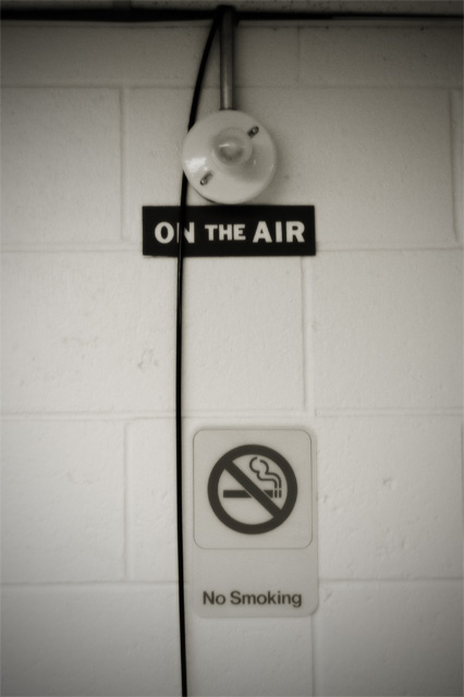
There's a suggestion of the work of Boltanski about this - the light bulb, and the trailing cable. I kind of like the weird focus, it lends some mystery to the image, and the odd composition makes for more strangeness. It also suggests a hospital to me - I was thinking of oxygen tanks, 'on air' as in survival ... |
|
| Photographer found comment helpful. |
|
|
12/28/2006 10:53:36 AM |
|
Maybe having the little red light on (selectively desatted so that the rest is still b&w) could have given it more punch? |
|
| Photographer found comment helpful. |
|
|
12/27/2006 04:56:47 AM |
|
The composition on this is a little weak. Perhaps off centering the main components would have given it a bit more life. |
|
| Photographer found comment helpful. |
|
|
12/27/2006 12:41:35 AM |
|
I think this would have been really strong if three things where done. One the light was on. Two the celing was cropped off, three, not have it centered. A little more contrast would be nice as well. |
|
| Photographer found comment helpful. |
|
|
12/26/2006 05:58:39 PM |
|
Sorry, this pic just doesn't grab me. Too centered, the "No Smoking" thing is distracting and overall, the subject is dull. |
|
| Photographer found comment helpful. |
|
|
12/25/2006 11:49:13 PM |
|
Looks out of focus to me. |
|
| Photographer found comment helpful. |
Home -
Challenges -
Community -
League -
Photos -
Cameras -
Lenses -
Learn -
Help -
Terms of Use -
Privacy -
Top ^
DPChallenge, and website content and design, Copyright © 2001-2026 Challenging Technologies, LLC.
All digital photo copyrights belong to the photographers and may not be used without permission.
Current Server Time: 06/28/2026 08:12:47 AM EDT.