| Image |
Comment |
| 04/14/2003 06:03:53 AM |
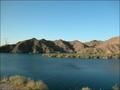
"Wind on the Water"by sfarrell23Comment: I would say this is slightly over-exposed: deepening those shadows on the hills would have added some drama to a quite ordinary shot. why did you not crop out the pylons? Or if you wanted them, frame tham more into shot? Seems like an ovver-sight. So little actual area of the shot is the wind patterns on the water that it's difficult to see exactly what it is you find interesting about it: wouldn't have known your point at all without the title. |
| 04/14/2003 05:57:33 AM |
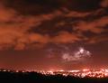
Electricby WarpComment: fabulous effect, but the composition distacts me. Would ove to see this cropped more closely to the lightning clouds - wouldn't lose those city-lit clouds (which are also interesting) completely. Way better than the other lightning shot (so far) though. The burnt out city lights are a shame too, |
| 04/14/2003 05:54:33 AM |
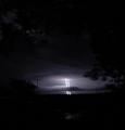
"Lighting Does Strike Twice"by Denise CataniaComment: Great capture, and so difficult to get lightning, but there are so many problems with the photo - darkness, the lightning is such a small area, focus, that I can't rate it very highly. |
| 04/14/2003 05:48:56 AM |
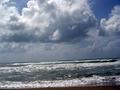
After the stormby vcosmaComment: Whilst there is a vague line in the clouds that IS horizontal, I don't think it's efeective enough to require the horizon to be tilted - and also, it's tilted so little it seems like a mistake. Like the light in the clouds, but you seem to have cropped that out just as it's getting really interesting. It's an OK shot, but looks rushed to me. |
 Photographer found comment helpful. Photographer found comment helpful. |
| 04/14/2003 05:45:40 AM |
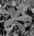
After the stormby xertionComment: The water drops that you've proritised with the composition are the ones that are out of focus - which detracts for me a lot. Also, the b&w ... why? Don't see a reason, and tonally all the greys seem the same. |
| Photographer found comment helpful. |
| 04/12/2003 07:10:18 AM |
Blue Springby kimacazieComment: Focus isn't quite there, and for me a contrat colour would help to emphasise the blue - this feels a little washed out almost - oughtn't there tp be green here too? |
| 04/12/2003 07:07:53 AM |
What better colors?by STEINRComment: Isn't it backwards? It's very difficult for many of us to vote clearly on such an emotive image, especially with that title. I think you've chosen an odd stillness of flag though - kind of half a ripple. |
| Photographer found comment helpful. |
| 04/12/2003 07:03:55 AM |
Rainy Dayby GussiComment: Bet you wish weather had been last week! Nice shot - compositionally, a pity the rainbow has flared out a little - I think you could have darkened the whole thing, but many won't agree with me. Small image too - though it still works. |
| Photographer found comment helpful. |
| 04/10/2003 05:44:52 AM |
Springby thatguyComment: all those artefacts are such a shame - given that that is presumably a camera thing, I think this is probably a very good shot. I'm afraid it'll never do well here because of those though. |
| 04/10/2003 05:42:05 AM |
|
Home -
Challenges -
Community -
League -
Photos -
Cameras -
Lenses -
Learn -
Help -
Terms of Use -
Privacy -
Top ^
DPChallenge, and website content and design, Copyright © 2001-2025 Challenging Technologies, LLC.
All digital photo copyrights belong to the photographers and may not be used without permission.
Current Server Time: 08/05/2025 04:53:09 AM EDT.