| Image |
Comment |
| 05/11/2003 05:18:36 AM |
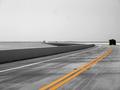
Round the Bendby BudweezerComment: Hi Max - critique club ...
I'm no great fan of the selective desaturation technique, but here it's effective and useful - emphasise the curves.
I'd back up the point about the horizon line - it seems a little arbitrary to put it dead centre: if you could have got a bit higher and placed the horizon further up the shot there might have been even more impact.
The other down-side is tha amount of noise in the sky, and those big blurry lumps. I wonder if you've over-processed the shot, or cropped out too much for the resolution of your camera. Worth trying a programme like Neatimage, which is excellent at getting rid of just that stuff.
The space and emptines you've caught is excellent though, good work.
ed |
 Photographer found comment helpful. Photographer found comment helpful. |
| 05/11/2003 05:10:20 AM |
Leader of the Packby bjc0001Comment: Hi Brad, your critique club moment is here ...
Well, I like this shot - after the shot I just had to crit I can't believe you scored a whole .8 lower.
Placing the focus on the second car seems to be a lot of people's bugbear with this, and I don't understand people's reactions to that: to me it seems a great technique to get a sense of both foreground and background, giving process to the range of distances rather than things just tailing off into the background.
I like the high-key lighting, and really technically I'd guess you pretty much achieved what you were after. So welcome to the odd world of dpc designer-photo preferences - because I've seen shots like this do very well, and I really don't think i can tell you why yours hasn't, because I don't know. I think i just don't 'get' this kind of shot - it isn't what I'm into photography for (I shoot 'found' situations in general).
Perhaps John Setzler is right with his comment about the background - things like this need to be really smooth technically to do well here: but I like the graininess in the surface the cars are on - my reaction ws that it might be texture rather than processing.
Without any commentws from you, it's difficult to know what you were trying to do though.
Good luck
Ed |
| Photographer found comment helpful. |
| 05/09/2003 03:18:13 PM |
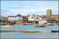
Shoreham-By-Seaby marboComment: Mark (this has to be you, doesn't it?) - what i really like about this is that it has the slightly over-exposed quality that so many postcards have (few shadows, very bright, no moodiness), and that you've cropped it to pretty much the right dimensions. You get a 6 - though tbh I haven't really decided what I'm looking for in the challenge - 'typical' postcard, or one that I'd buy ... Could certainly imagine this in one of the shops by the harbour there, or scribbled on with 'our holiday flat' and an arrow in biro. |
| Photographer found comment helpful. |
| 05/09/2003 07:38:27 AM |
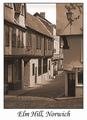
Elm Hillby GalinaComment: Not sure about the sepia - and I know Elm Hill very well indeed: used to drink round there often, a few years ago.Like the text and bordering though, and nice to see the place here. |
| Photographer found comment helpful. |
| 05/09/2003 07:36:04 AM |
Wakulla Springs: The Real Floridaby BudweezerComment: Good shot - as to postcard-ness, I think you could either have cropped just under where you've placed the text, or put the text lower down: it looks like a mistake being that far up the frame. |
| Photographer found comment helpful. |
| 05/09/2003 07:34:29 AM |
Groningenby RemieComment: Good work: think it would sell. You'd need to clean up some of that noise in the sky though - quite distracting. Have you tried Neatimage - it works wonders for that stuff. |
| 05/09/2003 07:31:38 AM |
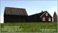
The old house'sby eikidigiComment: Nice shot, though I think perhaps too much contrast - though that's obviously difficult to keep the sky from burning out. Graduated filter might have helped? Don't like the text layout: I think perhaps there's too much of it. |
| 05/09/2003 07:27:45 AM |
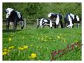
Milton Keynes - Home of the Concrete Cowsby pinbackComment: God, haven't seen these things in years - they must be pretty old now? Like the shot - DOF especially. Text doesn't read too well - I guess that's a function of the resolution of the upload more than the curly script. And what else is there to shoot in MK? |
| Photographer found comment helpful. |
| 05/07/2003 01:25:14 PM |
Land of 1000 Waterfallsby karmatComment: Not sure about the DOF putting the actual waterfall so out of focus when you've given it that title. Also wonder if you couldn't have reduced the exposure a little - the flowers are OK but perhaps a stop or two less wouldn't hurt, but there's too much light on the waterfall. Nicely composed. |
| 05/07/2003 01:23:04 PM |
Philadelphia Museum of Artby ClubJuggleComment: That big blank expanse of wall doesn't help this shot - as a postcard, that is. It makes me wonder if the view from 90 degrees to the left isn't better ... and the way the trees obscure the building also doesn't help. Also looks like a bit of over-sharpening has gone on around the top of the building, but other than that a good solid technical shot. can imagine it on a postcard stand - but I wouldn't buy it! |
| Photographer found comment helpful. |
Home -
Challenges -
Community -
League -
Photos -
Cameras -
Lenses -
Learn -
Help -
Terms of Use -
Privacy -
Top ^
DPChallenge, and website content and design, Copyright © 2001-2025 Challenging Technologies, LLC.
All digital photo copyrights belong to the photographers and may not be used without permission.
Current Server Time: 08/06/2025 12:06:13 AM EDT.