| Image |
Comment |
| 05/23/2003 06:05:57 AM |
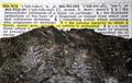
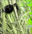
Definition of Matrix - Fossil of fernsby ladpupmoeComment: :-) Rather desperate attempt to put across your relevance. Like it. The photo - not enough definition on the fossils (lighting?), and the untidy positioning of the text is a pity. Made me smile though. |
 Photographer found comment helpful. Photographer found comment helpful. |
| 05/23/2003 05:57:15 AM |
Jackin into the Matrixby scab-labComment: Gee there's a lot of circuit-board shots in this challenge, and a lot of green shots. This is in the top half - but the high contrast is bugging me, and it took a while t see the jack. Actually it looks more blue than green now ... :-) |
| Photographer found comment helpful. |
| 05/23/2003 05:54:27 AM |
Neck Plug: Interface Detail by GordonComment: Like this very much. Not sure that there is quite enough DOF - the focus is just drifting on the far edge of the 'thing', but not enough to make it seem deliberate. Reflections are good, the lines and composition are excellent. The subject: perhaps too representative rather than interpretive for me. |
| 05/22/2003 12:20:33 PM |
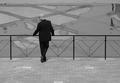
The Candidateby zeuszenComment: I;ve had to by-pass this shot twice while voting - I just can't make up my mind about it. Technically obviously completely accomplished. Artistically and compositionally ... hell, I don't know. I like the railings, the criss-cross patterns on the concrete beyond, the foreground brickwork, the very 'square' composition and the way it's broken up by those lines. Don't like the lighting much - whilst I guess it has helped the cleanness of those compositional lines, it's killed texture in any of those areas (I guess that is deliberate) and in the figure's suit. Like the pose, but it bothers me a lot that he's looking out of frame on the short side - ie why not have him looking right? This gives the idea to me that there is something going on that way that's deliberately excluded - I'd have placed him either to the right of the frame, or looking the other way. One more thing is the reflections in the top right corner/edge - they introduce an much more organis form into the image, and it doesn't seem quite in place.
Blimey, this has gone on a bit. really intersting shot, but there's something I don't like about it, and I'm clutching at straws. I'd love to know what the thought processes were. |
| Photographer found comment helpful. |
| 05/22/2003 12:10:34 PM |
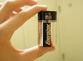
Energyby apriceComment: A good deal better than many of the 'hands holding things' shots. Lighting is good, though over-exposed for me (the flared out highlights on the fingers). The sraightness of the index finger looks unnatural to me, and the empty space to the right of the image serves no obvious useful purpose - you could have had mre of the hand and less of that space - not too far, but the battery this way is closer to the centre-line than the thirds line. Good detail, and that angle of light gives real shape and depth to the hand. |
| Photographer found comment helpful. |
| 05/22/2003 12:06:28 PM |
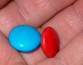
The red pill or the blue pill?by hawkidaComment: Lighting issues - that very direct light has killed all the contrast and texture. Also holding the hand so flat on to the camera removes most sense of depth from this. |
| Photographer found comment helpful. |
| 05/22/2003 12:05:00 PM |
|
| Photographer found comment helpful. |
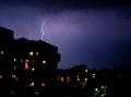
| 05/22/2003 12:04:39 PM |
Overloaded ... Coming ... Flash Matrixby gaja_tzComment: So much luck needed to get good lightning shots - I can see why you submitted it, but it isn't all that spectacular, and only has the title to give it a more than tenuous link to the challenge. Good work though, for all that - though it appears to be tilted a little to the right. |
| Photographer found comment helpful. |
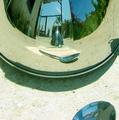
| 05/22/2003 11:52:39 AM |
It is only yourself.by caroleeComment: Neat way of keeping your camera out of shot. Get the spoon reference, but it doesn't particularly say anything about the film to me. |
| Photographer found comment helpful. |
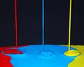
| 05/22/2003 07:59:26 AM |
Running Coloursby pinbackComment: Critique Club
Well, I'm going to go against the grain and I really don't like this shot, and more that I really don't understand the lighting compliments - seems to me to be very harsh, very very front-on giving those odd shadows immendiately behind the falls of paint. Given the great way you use light in your other photos i'm quite susprised you liked this enough to submit it.
That said, the other elements are fine - focus excellent, but there's a perspective issue with the falls of paint themselves, and the bubbling and intermixing of the paint is too chaoticc for my taste.
Of course, this is all just my opinion, and given that it scored higher than any shot I've ever submitted I'm not sure how much attention you'll want to pay to that in terns of challenges :-)
Ed
PS. A little later ... there isn't a system tat I know of for saying 'can't do this critique' through the critique club. I'm not really happy about what I've said - or perhaps the way I've said it - but if I didn't get something written I'd be at a stop. Message edited by author 2003-05-22 10:23:11. |
| Photographer found comment helpful. |
Home -
Challenges -
Community -
League -
Photos -
Cameras -
Lenses -
Learn -
Help -
Terms of Use -
Privacy -
Top ^
DPChallenge, and website content and design, Copyright © 2001-2025 Challenging Technologies, LLC.
All digital photo copyrights belong to the photographers and may not be used without permission.
Current Server Time: 08/06/2025 08:10:35 PM EDT.