| Image |
Comment |
| 07/21/2003 09:48:07 AM |
Garden Flowerby dphillipsComment: This is a cool shot - but really it\'s only of that flower: where is the other element to contrast it with? What other elements there are seem almost accidental - and the de-saturation has left arteffacts behind. |
| 07/21/2003 09:37:18 AM |
The black sheepby vignirComment: Lighting! This is flash, yes? if it weren't for the faint reflections of the white pieces in the black one I doubt it would be visible at all. even a couple of table lamps will provide enough light for digital cameras, position them to the sides of the subject and turn off that flash and compare the outcome. |
 Photographer found comment helpful. Photographer found comment helpful. |
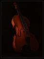
| 07/21/2003 09:35:24 AM |
Strings of Contrastby TurbotechComment: Seems over-sharpened - the lines of the strings have become jagged. Liek the idea of contrasting the two textures, but a lot of this image really is so dark I find myself struggling to see the rest of the instrument rather than concentrating on the subject. |
| Photographer found comment helpful. |
| 07/21/2003 09:31:46 AM |
Study in Contrastsby ursulaComment: Those petals that are just closer than the field of focus are unfortunately the ones right on the thirds line, which is what I think makes them stand out for me. The vase is perhaps under-lit compared to the flower also, especially inside the neck, and that reduces the visibility of the contrast - in fact the vase appears almost as a background element it's so much darker. |
| Photographer found comment helpful. |
| 07/21/2003 09:27:34 AM |
Structureby severinComment: Good shot: DOF really works well for me, though you may perhaps have included too much at the bottom of frame. |
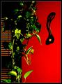
| 07/21/2003 09:25:52 AM |
Welsh Love Spoonby BobsterLobsterComment: Something has gone badly wrong with your processing here - bad sharpeneing and compression artefacts all over this. compositionally the red area bottom right is very out of place wth the interst of the blinds and the plant. |
| Photographer found comment helpful. |
| 07/21/2003 09:23:55 AM |
Back to Back - Old to Newby danwanComment: Nice idea; the framing seems a little obvious, and doesn't do much for the structural contrast of the two elements. Perhaps a touch or two over-exposed, and over-sharpened (lots of the lines have become jagged). |
| Photographer found comment helpful. |
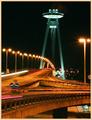
| 07/21/2003 08:58:19 AM |
Colors Of The Nightby origoComment: Your critique club moment ... Hi Joe
Nice shooting - really like the combinations of colour temperatures from the different types of lighting. My first reaction, especially given this is an 8 second exposure, is to wish you'd either had the patience to wait for no cars, or to wait for a moment with more - just those few light trails seems rather arbitrary to me.
As someone else has observed, there seems to have been some minor camera shake going on, just enough to blur everything very slightly, and just enough to distract from the image.
The composition is excellent though - the combination of shapes and colours and the positions of the lights work together wonderfully. The graininess, pleasantly un-excessive, really helps the urban quality of it too.
Obviously I don't know what else you tried, but had it been me I think I'd have had a go at a slightly shorter exposure, or perhaps I would have desaturated it all a little - it has the appearance of having had the colours brought out too much, causing some of the detail in some areas to disappear; or perhaps it's more processed than that - those rear-light trails are really too pink to be real.
Good shot, and 23rd is not a poor result. As I'm sure you'll find, the vast majority of winners here are very clean, very technical shots - with this kind of mood you'll need an exceptional capture to score much higher.
Ed |
| 07/21/2003 08:28:23 AM |
Independence Dayby MarkS224Comment: I guess this challenge running over the weekend of the 4th was bound to be too tempting for you Americans! The best critique I could offer would perhaps be to study moodville's second-placed shot and compare with your own: the capture of the motion of the fireworks, and the detail of them is completely comparable - indeed yours are probably more intersting in themselves. It's the other elements that have put that shot up where it is and yours down here: some context for the photo.
One fairly glaring criticism though: why have you left that enormous black area to the left of frame? If I brighten my screen an awful lot, I can just make out some smoke there, but at a normal setting it's absolutley blank.I would hazard a guess that either you need to check your own monitor settings, or to be aware that a lot of people here have theirs set reasonably dark.
It's a good moment that you've caught though - intersting to see the different stage of process of diffferent fireworks. Two reasons immediately come to mind for the low score though: there were so many firewirk photos in this challenge, and without some context it doesn't obviously meet the challenge.
Ed |
| Photographer found comment helpful. |
| 07/21/2003 08:01:27 AM |
Night into Dayby wsargenComment: When this shot came out of the queue i thought it must be a temperature shot, and then noticed that it was a night on the town shot.
As a documentary shot I really like it: the graininess and the over-exposure of the fire gives a great sense of danger and excitement, especially with the view of the back of that firefighter as he/she moves towards the flames.
I don't really want to get into technical discussion here - it isn't the kind of shot that 'follows the rules' as it were anyway. Were it posed then there are pretty obvious elements one would change, especially in composition, and extraneous elements.
In that 'technical' sense, it isn't a good photo - but as a record of a moment, it's fine. I would guess it scored as it did because most voters here appear to be looking for clean, controlled, well-executed shots, rather than the drama of this. Were it perfectly focussed, exposed, and not grainy at all I'd guess it would have done better.
ed |
| Photographer found comment helpful. |
Home -
Challenges -
Community -
League -
Photos -
Cameras -
Lenses -
Learn -
Help -
Terms of Use -
Privacy -
Top ^
DPChallenge, and website content and design, Copyright © 2001-2025 Challenging Technologies, LLC.
All digital photo copyrights belong to the photographers and may not be used without permission.
Current Server Time: 06/20/2025 02:02:55 AM EDT.