|
|
|
Showing 3121 - 3130 of ~3604 |
| Image |
Comment |
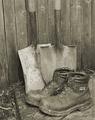
| 08/08/2003 05:16:44 AM | Done in the Gardenby OneSweetSinComment: hello from Critique Club Anna
Now, before I go any further I'm going to say that I don't like this shot: I'll try not to be overly harsh in my thoughts.
Not only is the broad range of tones very low, there's also remarkably little contrast - to the extent that the metal shaft of the shovels almost blends in with the wood behind them, and also with such even lighting any real sense of texture has gone. This leaves very little visual interest for me: I would think that some side light on the whole set-up is needed, because I think there probably IS good texture there, and contrast between wod, metal and leather. There's no depth here, no sense of the real shape of these things, of what they'd be like to hold.
Compositionally, I find it strange too: that empty space to the left of frame - why did you keep it there? And why place to boots so far toward the bottom of the image? There's an absolutely classic composition just waiting to be released here: move the spades a little to the left and you have a triangle between their shafts, and toes and the ankles of the boots: a very strong shape, and it would also allow you to place the shovels on one of the strong lines, rather than almost-but-not-quite central as here. And why shoot such an orthodix study at an angle to the fence, which brings that odd diagonal and edge of the step into the picture, but not in such a way that they contribute anything? Don't get your reasoning ...
And I don't really 'get' the sepia toning either: feels like an attempt to age the shot, but somehow those boots just don't look old or weathreed or used enough to be appropriate to that treatment.
I'd certainly have waited for light, or added some myself, to this situation. Sorry to be so negative, but it's a honest reaction to this shot - it feels like a wasted opportunity, like a very rushed submission.
There's the focus issue too, on the nearer of the boots.
But it's lighting, it's all about lighting. Looking through all your challenge entries, I'd say that's the one area your work could really use some guidance, or research, or just help: I think you'd be amazed how your scores would improve (presuming that's what you're after!) A lot of your shots are taken with a very front-on light, which flattens out all the textures and shapes in images - try shooting things with the light to the side, or just slightly behind - just try a couple of experiments: I think you'll be surprised.
Good luck
ed |
| 08/07/2003 05:06:37 PM | Triptychby zeuszenComment: Wonderfully odd capture: it bothers me slightly that in such a geometrric composition you've taken a slightly off-centre view-point, otherwise excellent work. |  Photographer found comment helpful. Photographer found comment helpful. |
| 08/06/2003 02:25:09 PM | almost, but not quite... rightby chalconeComment: beautifully shot - though obviously doesn\'t actually meet the challenge, despite your title. A good enough shot for me not to pull yyou down more than a single point for that though - 8. er ... 9 then. Any chance you could let me know about the lighting for this? | | Photographer found comment helpful. |
| 08/06/2003 02:23:02 PM | Going Up? by dsidwellComment: Whoa - knock out stuff. Nailed it - I'm hugely impressed. If this doesn't win I'll eat my hat.
PS. don't actually have a hat, but hey. | | Photographer found comment helpful. |
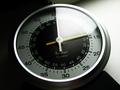
| 08/06/2003 02:18:40 PM | How Manyby KevinRiggsComment: I've no idea, though arguably the primary compositional element of this is the non-right angles. It seems to lack contrast, and depth for me though, which is more damaging to your score. Makes it look washed out, and it loses any immediacy. |
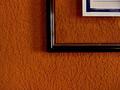
| 08/06/2003 05:36:02 AM | THE ORANGE HALLby postitComment: This almost works for me: though i think it needs more careful lighting for such a specific study: at least some fill from the left, to show some detail on the frame; if you could have softened the light from the right too, just to reduce the harshness of those glares that might have helped also. | | Photographer found comment helpful. |
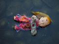
| 08/06/2003 05:32:21 AM | Sweet Dreamsby glimpsesComment: You get lots of points for a disturbingly odd photo - I mean that, this is very affecting. You lose some unfortunately because I don't see any relevance to the challenge | | Photographer found comment helpful. |
| 08/06/2003 04:44:12 AM | Empire State Building During Storm #2by dsidwellComment: Ah ha! I have a similar shot taken at night - though in fog, rather than storm. I like this, really works for tthe height of the building. I think I'd have rotated it right a bit though (if there aren't other buildings in the way), I don't think it's enough of a tilt to add anything. |
| 08/06/2003 04:35:06 AM | | | Photographer found comment helpful. |
| 08/05/2003 05:29:09 AM | Flip Flop Sandalsby stephanComment: Hi stephan - 'revenge' time? Your critique club moment ...
I think this was one of the more memorable photos from the trends challenge: it doesn't quite make it into my favourites, but very nearly.
I guess you won't be finishing things on that TFT screen again then, huh?
I'm not really sure what I most like about it - it's one of those shots that somehow defies my powers of interpretation. The composition is different: using the thirds but in a vertical manner is an odd thing to do, but effective; the intensity of the grass' green is excellent, especially set against the washed-out look of the flip-flops; the slight progression from dark to light up the image is intersting too - allows a dynamic contrast around the subject and still keeps the background as an important element. I did, and still do, find the border hugely distracting: whether that's just me, but I absolutely loathe coloured borders - they feel like they're cheating my eye, saying 'look at this colour', or 'isn't this clever, I can choose a colour from my picture', or more seriously an attempt to fool the eye into processing the colours of an image differently (in which case why not do that in processing?). I can see the use (and use them myself) of black or white borders to emphasise the overall feel of an image - like being able to choose the colour of wall for your art to hang on, but these coloured tricks ... anyway, drifted off-topic a little there.
48th place isn't so bad, I guess. I think that's because it's a pretty static image - besides the points I've mentioned (and I'm not sure a lot of people appreciate that stuff here), there isn't a lot to it: the lighting is very good, but not immediately eye-catching, the composition isn't orthodox, and it has a feeling of your having over-processed it (where did all the red go?), without producing an effect that will really nail people.
Good luck in future
ed | | Photographer found comment helpful. |
|
Showing 3121 - 3130 of ~3604 |
Home -
Challenges -
Community -
League -
Photos -
Cameras -
Lenses -
Learn -
Help -
Terms of Use -
Privacy -
Top ^
DPChallenge, and website content and design, Copyright © 2001-2025 Challenging Technologies, LLC.
All digital photo copyrights belong to the photographers and may not be used without permission.
Current Server Time: 06/20/2025 12:14:13 PM EDT.
|