| Image |
Comment |
| 08/22/2003 05:25:03 AM |
Sign of the Timesby ImagineerComment: Got to be the worlds best road-sign, huh? Apart from one I saw in Italy that is. Subject is a bit loose for me - the past? To an extent, and it is at least a different approach from others. |
 Photographer found comment helpful. Photographer found comment helpful. |
| 08/22/2003 05:22:14 AM |
Geopolitical Pastby amonteforteComment: I can see the point with the DOF here, but I really don't like the effect it gives: somehow it pulls my eye away from the obvious subject toward the out of focus lower left area - have no idea why that it, but it's what happens. Can't see a good reason for not having the entirety of the flag image in focus either. Not bad work, for all that. |
| 08/22/2003 05:15:01 AM |
|
| Photographer found comment helpful. |
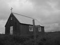
| 08/22/2003 05:05:36 AM |
Where only one was burriedby russiComment: love the bleakness of this shot - though i think I might have shot to place the grave cross against the sky: would make a stronger parallel with the cross on the church. |
| Photographer found comment helpful. |
| 08/20/2003 03:55:54 PM |
Togetherby jimmythefishComment: from the critique club, Hi Jimmy
One of the best wedding photos I've ever seen. The detailing and contrat os first class - especially on the flowers. The highlighting of the rings is absolutely wonderful - this would win all sorts of competitions, I'm sure.
The reason it didn't win this one is because of the subject, obviously. Whilst it could quite happily be the future for many, it isn't specifically so. Can't say I'm sad about that - else you'd be way up above my shot :-)
Ed |
| Photographer found comment helpful. |
| 08/20/2003 09:56:55 AM |
Oh..oh. Is this my future?by camelotnorthComment: Hi from the CC, Betty.
Ooh. Didn't see this one - didn't vote. I love the effect, but I would imagine you were done for taking this too far away from photography, and into more art areas. Whilst that was obviously within the rules, I still think people were looking for stuff that was more clearly photos.
I'd be very interested to see the original - did it still manage to have that intensity of heat that you've caught with this? If so then I'd agree with the comment about the brush filter.
It fots the challenge clearly though, and there's certainly a quality to it that deserves far more than it's score or placing. Without the greyness at the bottom of frme it would be nothing though - very well done there.
Good luck
Ed |
| Photographer found comment helpful. |
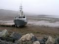
| 08/20/2003 09:49:12 AM |
for saleby ursulaComment: hi from the Critique Club Ursula
Lucked out? Guess so. difficult to make any really useful points about this - technically its absolutely fine, and it has some outstanding points: love the composition - the three lines of distance from the rocks, the beach and the fog line, the balance of the boat and the disappearing line of the fog, all excellent. Minor point - think I'd have tried to keep the top of the aerial in shot, but that's very minor indeed.
For me it lacked a real feeling of desolation - not quite that strong an emotion I thought - though your assessment of the voters ideas is clearly more accurate than mine :-)
Love the light, the contrast, the progresion of tones here too.
Ed |
| Photographer found comment helpful. |
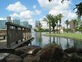
| 08/20/2003 05:44:10 AM |
Summer in Orlandoby jcvenComment: You seem to have caught a great quality of light here - there's a real natural feeling to it that many people struggle to get. The artefacts and pixelation are a bit of a nightmare though - especially on the distant details. What happened? A real shame. |
| Photographer found comment helpful. |
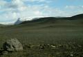
| 08/19/2003 02:34:13 PM |
Barrennessby stebbi76Comment: This just has to be one of you Icelandic gang, doesn't it? great work - especially to include that little clump of flowers to contrast the rest of it. I like alsi the fact that it's full colour - way too easy to go black and white for this challenge it seems. Whilst the light is excellent, the bulle sky lets things down a bit - just a touch too pleasant really, and you already have the flowers to add an edge. On a grey day ... |
| 08/19/2003 02:30:30 PM |
Desolatedby RemieComment: Sky tones, the steam (?), the disorganisation of the wind turbines - it's like a landscape out of Terminator, only they never had this sophisticated an imagination. All that stops you getting a ten from me (a rare thing indeed) is the feeling that it's all a little too distant - I'd have tried less sky, perhaps losing the turbines to the left, and cropping closer to the 'islands', just to see how that felt (of course you may have, and may have rejected it). Still the most desolate shot this week :-) |
Home -
Challenges -
Community -
League -
Photos -
Cameras -
Lenses -
Learn -
Help -
Terms of Use -
Privacy -
Top ^
DPChallenge, and website content and design, Copyright © 2001-2025 Challenging Technologies, LLC.
All digital photo copyrights belong to the photographers and may not be used without permission.
Current Server Time: 06/20/2025 06:08:17 PM EDT.