|
|
|
Showing 3081 - 3090 of ~3604 |
| Image |
Comment |
| 09/03/2003 04:40:07 AM | Used tools by jjbeguinComment: Congratulations JJ - this is like your 84th ribbon or something, yes? :-) |
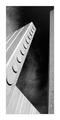
| 09/02/2003 04:25:22 AM | Served and Fallenby OneSweetSinComment: This is getting ridiculous - I only ever get your photos for the Critique Club Anna.
This is such a very literal shot, so very straight-on, and I think it's suffered for that. Sure, it gives a sense f place to the monument, but the windows and the brickwork of the building behind really draw the eye away, and make it difficult to discern any detail in the statue.
As with Pisaman's comment, I feel that you might have sacrificed too much to keep the flags in shot: and what also annoys me is that the figures in the statue look so intersting that I want ot see more detail there. I wonder if you tried a shot looking up at the figures, with the flags in the background?
I think it may be a touch over-exposed too - the highlight area, and there are a lot of them at that time of day, seem too white, blown out to me. There is also some barrel distortion around the edges - the linews of the building, and of the outer flagpoles are curved, presumably due to shooting at the widest angle: try using a touch of the zoom to correct that.
All the best
Ed |
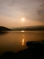
| 09/02/2003 04:16:04 AM | Night at the Lakeby OneSweetSinComment: Critique Club time. Hi Anna.
A technically accomplished shot - you've done well with the exposure: not so easy to get a shot into the sun and yet keep some detail in that upturned kayak, and the progression of the far hills receding into the haze.
One of my first feelings was that this wasn't specifically seasonal, bu then I DO get a summer evening feel from the picture - I think it's the reflections on the water.
Compositionally I think its good too: there's a movement from the kayak, to the large hill on the left, to the clouds in the upper right that keeps the eye intersted.
Good work here. |  Photographer found comment helpful. Photographer found comment helpful. |
| 09/01/2003 12:26:08 PM | November 22, 1963by crabappl3Comment: People don't understand you see. Or perhaps, they don't see. Wonderful photography, and I'm no sentimentalist about JFK whatsoever. This is just how taking photos should be.
Ed | | Photographer found comment helpful. |
| 09/01/2003 12:22:15 PM | Don't Cry For Meby ShiiizzzamComment: No favourites yet - well I'll correct that at least. An unearthy wonderful shot, though i think very few made the visual connection with that crack and the path of tears - more pity them. Mesmerisingly good work Shizz. How it didn't score above 14th is beyond me.
Ed | | Photographer found comment helpful. |
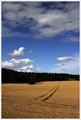
| 08/30/2003 01:48:49 PM | Summer Field by agwrightComment: congratulations on this Tony - it seems to me a very 'British' photograph, and I love the feel of it. Now for a blue, eh?
Ed | | Photographer found comment helpful. |
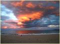
| 08/27/2003 08:24:33 PM | Cold winter sunset by ozthunderComment: Hey, congrats on your ribbon. So there's competition in Nikon 5400 wrld now, is there? We need to get beyond these reds though :-)
Excellent work |
| 08/26/2003 06:53:18 PM | I dropby ursulaComment: Hello (again) Ursula, from Crituque Club
By my definition, negative space is that area of a phtotgraph that isn't the main or subsidiary subject: so by that definition this qualifies admirably - and was one of the more memorable shots from the challenge. And an intersting take on a common theme too.
All the details are great - focus, sharpness, just a perfect level of non-focus on the background. I'm not sure I'd have used such a shiny object to drop the water - I'm no fan of that reflection - and i think also I'd have cropped the white area at the bottom of frame. But who am I to comment? 6.4 is a very respectable score. Pleasant also to see a shot where the negative space wasn't black, or simply plain: a more daring attempt than my own, for instance.
The refc=raction within the water drop is intersting here too - more so than such refractions are always intersting visually: appealling the way the loops of those black lines have almost completely changed to curls.
Ed | | Photographer found comment helpful. |
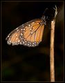
| 08/26/2003 06:33:24 PM | Home to roostby GordonComment: Hello from the Critique Club Gordon
I ... well, I don't quite know what to make of this image, certainly for this challenge. Ordinarily I wouldn't like the lighting at all - that harsh flash flattening everything - and my first reaction was to be perplexed about the negative space aspect.
What I see now is quite a mournful photograph - the darkness that surrounds the insect suggests the end of the day, and somehow one doesn't expect a butterly to survive the night (I've no idea of their actual lifespan, but I'm sure it's numbered in days rather than weeks). The broken stick adds weight to that impression. So in that sense it's almost an ideal photograph - the three elements combine perfectly to produce the impact of the picture, no wasted information, little complexity: a declarative statement.
But I do dislike the lighting: almost all texture has gone from the wings, they could almost be cut out of paper, and likewise for any depth to the twig/stick. Any improvement would be tricky to achieve for sure - what possibility of using a handheld flash in that situation? Something at least to get the light away from the plane of the camera, to give some light and shade to the subject?
Good work nevertheless - and for me a very good score for the image.
Ed | | Photographer found comment helpful. |
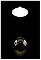
| 08/25/2003 01:56:55 AM | Coffee and lightby e301Comment: Thanks for the comments - yes, basically I agree that it would be better without the light, but the negative space wouldn't be such a strong element of it without the light. Without the glare from the light that would just be a white oval.
Wish I'd had time to re-shoot - I'd have lit the shade of the lamp a little too, just to give some definition. Ah well.
Ed |
|
Showing 3081 - 3090 of ~3604 |
Home -
Challenges -
Community -
League -
Photos -
Cameras -
Lenses -
Learn -
Help -
Terms of Use -
Privacy -
Top ^
DPChallenge, and website content and design, Copyright © 2001-2025 Challenging Technologies, LLC.
All digital photo copyrights belong to the photographers and may not be used without permission.
Current Server Time: 06/21/2025 12:31:46 AM EDT.
|