|
|
|
Showing 3041 - 3050 of ~3604 |
| Image |
Comment |
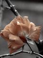
| 10/24/2003 05:11:42 AM | Fading Memory of Summerby OneSweetSinComment: Tonally beautiful, though I'm not convinced by your placing of the focal plane here - and I'm always distracted by this desaturation trick, which I have a personal loathing for. To genuinely communicate a feeling of solitude or loneliness ... I think you need a wider view, more context for the flower. |  Photographer found comment helpful. Photographer found comment helpful. |
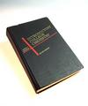
| 10/21/2003 04:01:13 AM | My Bible, 47 years ago.by jimsappComment: A pretty good study - the not-blown-out background area top left bothers me a little - given that the rest of the background is SO white. |
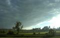
| 10/20/2003 07:00:27 PM | The Edge of Stormby DiamondPeteComment: Whilst this IS a beautiful moment you've captured, I really think I'd like to see it darker overall - a good two stops shoter exposure, I think - to emphasise the blackness of clouds, and to lessen the blow-out area: it doesn't really look like an approaching storm, just an approaching bunch of clouds. Good work though, and the light on the fields and trees is excellently caught. | | Photographer found comment helpful. |
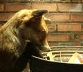
| 10/20/2003 06:45:55 PM | Not Your Normal Oilfield Roughneckby SimplicityComment: Pretty neat, though not exactly subtle lighting. You've over-done the sharpening considerably, in my book - all those jagged lines - though I can appreciate what drove you to it. Not bad stuff though. | | Photographer found comment helpful. |
| 10/20/2003 02:42:27 AM | The Midnight Thiefby PaulkComment: Interesting that so many people need to know whether or not this is a live fox before giving their score ... |
| 10/20/2003 02:38:12 AM | A rare privilege by jjbeguinComment: I'd love to believe this was opened just to get this photo ... what better reason could there be :-) |
| 10/17/2003 08:24:15 PM | Prelude to a Dreamby ChaszmyrComment: Hi from the Critiqure Club
I don't know ... lighting a shot like this with a flash onyl is like mixing all your colours together and then throwing them at the canvas in an attempt to paint a landscape: you're just starting from the wrong place. Try this: arrange flowers as desired. Point anglepoise, or desk light, or anything, at said flowers, but absolutely not from the same direction as the camera, and preferably at ninety degrees to it. Fix camera to something solid; really solid. If you have no tripod, then use a bag, or a table, anything, but don't hold it in your hand whatever you do. Set your aperture and exposure; if you use the automatic settings (and why would you, with that camera of yours?), set the focus and exposure from a half release of the shutter (unless the camera is to professional for that, in which case tough). Shoot photograph. Done. A thousand times better than this.
And seriously, PLEASE try this, and think about it. It'll improve your scores no end, I promise, and alos improve your enjoyment of photography. Really. Corss-lighting is everything in still lifes.
Ed |
| 10/17/2003 08:10:35 PM | The Great Pumpkin Will Rise Againby silverleafComment: Hello from the Critique Club, Michael.
First off I'm a fan of this kind of shot. There are those that'll tell you that you mustn't have a foreground element out of fofus in a pictture, or that the dof is too shallow here, etc. etc. but boy are they wrong, IMO. There's a marvellous sense of from to back distance here, a real idea of an expanse of Pumpkins. Likewise those who tell you your primary subject should never be centred in your image are only those who completely misunderstand the 'rule' of thirds. Those old tricks alone are enough to explain your low-ish score for a very good photo.
I would agree with Gordon's assessment of the light though - something a little more directional would ahve helped the depth and definition even more, though i;d guess you didn't have so much choice: that or not enough patience (which is, in itself, one of the primary resources a photographer needs, I believe).
I don't get the reference, I'm afraid (at least, from the comments, I presume there's some sort of Charlie Brown reference here), so can make no comment on that front, other than to point out that it's perhaps not as universal as you thought.
Technically, compositionally, it's a shot that can 'break' the thirds rule because of the varying weight of the foreground elements - the heavier, more present on the right, the less present on the left, which lead the eye across the image, almost forcing the gaze to travel back towrd the centre of the image again where one finds the subject of the photo. That works, and also takes one eye on past the subject off into the background filed of pumpkins - so that there's a real progression to the process of looking at this. Just a little more dynamic to the light, or something less random in the composition would perhaps add a deeper impression to it. Good work, nevertheless.
Ed |
| 10/17/2003 07:56:33 PM | sweet dreams, my pretty-prettyby ursulaComment: I once had a huge appreciation for very pure staurated colours, like the blue in this photo, Ursula; but i've kind of given myself an ongoing task to investigate duotone/b&w photography, and so my mind is perhaps more focussed on contrat and formmal content than is reasonable to jusge a photo. All of which is mentioned because I think this would have made a wonderful black and white image: a marvellous range and variety of contrast, from the immediate black vs. white of moments in the statue, to the gentle graduation of the reflected sky and the clouds.
I like the parallel of the blown-out steel in bot the window frames and the statue, and the contrat of the fluid shapes of the art and the rigid regulated structure of the window franes. I'm kind of surprised to see it score so low ... though i think I have an idea why.
The reflected building: especially ggiven tha challenge topic. If the were no reflected structure, i think it would hav score considerably higher - I think that building adds an element of everyday reality that takes away from any feeling of the unusual, the non-humdrum, that's hurt this image in terms of the challenge. Likewise if you'd included more of that building, the efffect would have been different - some kind of comment on office life, or city life, set against the evident freedom of that sculpture. With just the qurter-view of it present, I think the pic falls between two stools a little, and I think that hurt your score.
Still, an intersting image, and a pleasure to think and to write about for fifteen minutes.
Ed | | Photographer found comment helpful. |
| 10/15/2003 07:43:49 PM | Progression by zeuszenComment: Great work, congrats. Beautiful light here, and the sun in the misty air is fabulously caught. One of my favourites from this crop. | | Photographer found comment helpful. |
|
Showing 3041 - 3050 of ~3604 |
Home -
Challenges -
Community -
League -
Photos -
Cameras -
Lenses -
Learn -
Help -
Terms of Use -
Privacy -
Top ^
DPChallenge, and website content and design, Copyright © 2001-2025 Challenging Technologies, LLC.
All digital photo copyrights belong to the photographers and may not be used without permission.
Current Server Time: 06/21/2025 03:51:24 AM EDT.
|