| Image |
Comment |
| 10/29/2003 11:46:20 AM |
Star Spangled Bannerby natorComment: I'm afraid you're getting a 1 from me. This has a number of faults; detail is absent, the particular frozen moment you've chosen is ugly and actually grace-less, it appears over-compressed, or cropped from too small an orignal image, something has caused compression artefacts all over this. Then there are those white blotches, whatever they are. Compositionally , it's just a flag, absolutely dead centre of frame: conveys no feeling of anything much. All this is besides the issue of subject matter, and the fact that the nation this flag represents has little in my mind to do with 'Grace' at all. |
| 10/29/2003 04:54:14 AM |
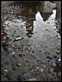
Smoking in the rainby jjbeguinComment: Meant to come back and leave more of a comment, but time ran out (as ever). I like the mood here, and your capturing of it - we've not had so many rainy days in the UK recently, and this summons up that greyness and reflectiveness of the world, without resorting to black and white. The deception is pretty subtle too - it so looks like a cobbled street, but that would make it the world's largest cigarette. |
 Photographer found comment helpful. Photographer found comment helpful. |
| 10/29/2003 04:31:15 AM |
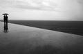
Grado, Italyby paolobnrComment: No no no. This was the winner, honestly: those other ten shots are an illusion, created by the masters of un-challenging images to decieve you. Though it's a given of dpc that the more complex the image the better it's going to have to be to penetrate everyone's brain.
I'd consider Kiwi's point though - about space to the left of the figures. Not so much for their placement though (I like that you only show the world they're moving into), but to complete the junction of sea and walkway. Great work. |
| Photographer found comment helpful. |
| 10/28/2003 05:50:21 AM |
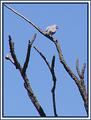
Doveby sulamkComment: Sharpening artefacts here are quite intrusive, and the processing (I'm not saying it isn't in camera, but they're still present) has lost you a lot of detail. |
| Photographer found comment helpful. |
| 10/28/2003 05:49:03 AM |
Grado, Italyby paolobnrComment: Just fabulous. Do you know a photo by Andre Kertesz called The Balcony, Martinique? It uses the same construction, though in a more abstract manner than this (but then if this were THAT good, you'd BE Andrre Kertesz, wouldn't you?). Great composition, textures, shapes. The ultimate leading line, perhaps. |
| Photographer found comment helpful. |
| 10/28/2003 05:44:57 AM |
Breakdownby TooCoolComment: Too posed - or at any rate, too posed-looking - to be truly affecting. Quite like the way the subject isn't lit, if you see what I mean. But it feels too obvious. Looks like someone with a hangover, more than someone deperate. |
| Photographer found comment helpful. |
| 10/28/2003 05:40:47 AM |
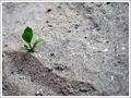
Hug Me!by KhalidComment: Peculiar title :-) I'm not sure you've got enough of the surroundings of this shoot to give a great feeling of solitude - the impression is of clever framing rrather than a real one-off plant in a wilderness. Technically perfectly fine - and I like the progression of focus against the grain of the soil/sand whatever. |
| Photographer found comment helpful. |
| 10/28/2003 05:38:11 AM |
|
| Photographer found comment helpful. |
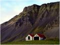
| 10/28/2003 05:36:21 AM |
Alonenessby eikidigiComment: Is this one of the Icelanders? The blackness of those rocks... Wonderful landscape work, though I'd have been tempted to crop out the slightly over-exposed sky - just contrat the buildings with the rock face, which would give you a bit more dynamic range to bring out the texture of that rock even more ... but it's a great light that you've found here. |
| 10/28/2003 05:29:44 AM |
Still single!by ParentxComment: Nice effort. Not sure about the focus on the pot rather than the brush, and the lighting is a touch harsh. Looking at the focal depth you have here, I'd guess it would have been possible to get both the brush AND the pot cleanly focussed: after all, it's the combination of the two that tells the story. Imaginitive work though, and makes a great change from some of the more obvious shots. |
| Photographer found comment helpful. |
Home -
Challenges -
Community -
League -
Photos -
Cameras -
Lenses -
Learn -
Help -
Terms of Use -
Privacy -
Top ^
DPChallenge, and website content and design, Copyright © 2001-2025 Challenging Technologies, LLC.
All digital photo copyrights belong to the photographers and may not be used without permission.
Current Server Time: 06/21/2025 08:12:12 AM EDT.