|
|
|
Showing 2921 - 2930 of ~3604 |
| Image |
Comment |
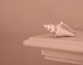
| 12/29/2003 07:02:15 AM | Pale Outlinesby readmeComment: Almost, almost ... my questions would be: cropping - why so much negative space (or alternatively, why so little)? Why so little contrast range ... I understand what your title implies, but would a touch more light and shade really hurt it so much? the curves and planes of these objects ought to allow for a wonderful range of shade, and I think you've bleached that out of it a little with the lighting. |  Photographer found comment helpful. Photographer found comment helpful. |
| 12/22/2003 07:08:41 PM | colours by imagesloyolaComment: Yay! This SO deserved a ribbon, and I'm very pleased (with a few misgivings for the DQ's) that you finally get there. And your first ... here's to many more. Us Ed's need to stick together :-) |
| 12/22/2003 11:11:44 AM | | | Photographer found comment helpful. |
| 12/19/2003 06:11:45 AM | lights outside my windowby DieHappyComment: from the Critique Club
There's real mystery here - and eye-pleasing colour combinations, at least to my eye. I'm not convinced by the size at which you've decided to submit this, I don't think it would have been hurt by being a bigger image and more compressed (it ain't like there's fine detail to be damaged). I also wonder if your cropping is quite the best presentation of this - given that you've chossen to have the lower right area going out fo frame, I think you could have brought the white and blue circles more into the image - cropping out the left a bit perhaps, but to my eye more definitely the upper area, which seems to impose its weight too heavily on the main interest ...
Good score for an in-your-face abstract shot though.
Ed |
| 12/19/2003 05:55:31 AM | Hard and Soft of Rural Lifeby kayceeComment: No comments? Outrageous ... so here's one.
Intersting to read your comments on the shot - and an interesting idea, and approach. Like the variable soft focus of the misted lens trick.
The composition lets you down somewhat though - as much in that the farm implement isn't recognisable at all, and the dead-centre positioning of your main subject. This way the flower becomes the sole sibject of your image, and the rusted thing merely the background - if you were to include enough of the rusted thing to make it recognisable, and place the flower at a stronger part of the frame I think you'd have a more successful photograph - put simply, there'd be more going on to hold interest: the tric being to compose the image so that the areas of interest are prioritised to your audience.
Ed |
| 12/19/2003 05:43:31 AM | Shape of Leaves to Comeby kayceeComment: from the Critique Club
A suggestion: turn off the on-board flash on your camera. Light the scene with one or two desk lights (one from each side); put camera on tripod (a tripod is the one essential for this kind of stuff, unless you have really bright lights available), lock focus and exposure on an area with both the white background and some leaf, and press shutter release - make a note of the settings your camera chose, and then switch to manual mode: set aperture and shutter speed accordingly, adjusting to a smaller or wider aperture and faster or slower aperture depending on whether you think your first shot is over- or under-exposed. Play with different angles of light, and lighting from different distances. One of the great benefits of digital is that you can keep shooting and ahooting, and see your results as you change things. I guarantee you'll get a more pleasing photograph...
Because I think it's the light that more than anything lets this shot down. With the source of light being directly from the camera, it leaves very little, if any, graduation of light across the leaves for the camera to read - and that is where the definition of the shapes and texture of a subject comes from. Texture only becomes visible when side-lighting is used, as texture, in a photograph, is only the fact of there being small areas of shadow and highlight where the light shines against hollows and lifts in your subject - with light coming from the same angle as you shoot, all those areas are equally bright, and thus appear the same to the camera.
There are a few other points: was it really more effective to have the leaves going out of frame than keeping everything in shot? Whilst the contrast of shapes is interesting, perhaps there's too many varieties present here? Would a simpler composition have been more effective?
Hope some of this helps
Ed |
| 12/18/2003 01:24:00 PM | Sunrise by dan_pendletonComment: Well done Dan - the purity and cleanness of that blue is quite extraordinary: and you scored more tens than mine - not enough 9's then? Message edited by author 2003-12-18 13:25:24. | | Photographer found comment helpful. |
| 12/18/2003 12:08:11 PM | Waveby ShelleyComment: from the Critique Club
The strongest point to make here is to echo the comment of timmi below: this is such a small image, in terms of file size: only 34K of the allowed 150K. And I'm sure this has hurt your scoring here - and given that you finished 8th with it ... I can only, of course, suggest spending some time on the computer, because it's a great shame to let down a great image with a poor reproduction of it.
Reducing the image to pure shape and colour is well achieved - the technical side of the actual photography is faultless. I do wonder though if some people found it to be more about colour than about shape. Not sure how one would separate the two in any meaningful way, but I think you may have been here long enough to know that some can be pretty pernickety in their interpretations of challenges.
For mtself (and I should say that I'm not a fan of this 'kind of thing' particularly), I find it too abstract - if you like, it's pure unfamiliarity. If, for instance, it were a recognisable object with that play of light on it, that combination of the familiar and unfamiliar would be the more striking. But that's just an opinion, of course.
Ed |
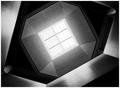
| 12/18/2003 11:48:38 AM | Skylightby HavokComment: from the critique Club
Hi Bryce ...
I never found the time to vote on all the images in this challenge, so didn't seee half of them, and this fell into that category ...
I adore this: almost perfect of its type. The progression of tone and shading, and reflection is superbly controlled - I'd guess that all 256 shades are present somewhere or other (OK - just checked, and I'm right). Only two things to suggest, really: have you tried this kind of work in a partially de-saturated (as opposed to wholly desaturated) image? The reason is that it gives you so much more tonal range to play with - as an example, in my Spoon shot there are 10003 colours used - in this, as I've said, there are 256.
However, the graininess in the areas of the balconies and the skylight surround is so effective here that it doesn't actually matter.
The only other comment is about the symmetry of the image: I think I'd have tried to get an exactly symmetrical framing - here the skylight and its frame are placed a little high in the frame - so that the lower right wall that breaks that symmetry is that much more effective.
But those are minor points really: this is top work, and you should be disappointed with your finish for it. I might just put it straight into my favourites now.
Ed | | Photographer found comment helpful. |
| 12/18/2003 11:35:01 AM | Not Aloneby vtruanComment: from the Critique Club
Thing you achieve best of all here is the positioning of the tree within the framing of the shot: it bridges the transition from foreground to distance nicely.
Focus and depth of field and all that technical stuff is pretty well done - though there seems to be a lack of detail: I wonder if it's perhaps cropped slightly too far?
The image suffers most, IMO, from an indecisiveness about what the true subject is: the tree? the peak and the openness of the view? the progression of hills into the distance? If it's the tree, then I think it would need more careful placing against this background (obviously, by moving the photographer, not the tree itself): perhaps at least to exclude the town visible in the valley. There are too many small elements that compete for attention here for this not to suffer in voting in a simplicity challenge.
Ed | | Photographer found comment helpful. |
|
Showing 2921 - 2930 of ~3604 |
Home -
Challenges -
Community -
League -
Photos -
Cameras -
Lenses -
Learn -
Help -
Terms of Use -
Privacy -
Top ^
DPChallenge, and website content and design, Copyright © 2001-2025 Challenging Technologies, LLC.
All digital photo copyrights belong to the photographers and may not be used without permission.
Current Server Time: 06/22/2025 12:46:02 AM EDT.
|