|
|
|
Showing 2881 - 2890 of ~3604 |
| Image |
Comment |
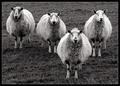
| 01/30/2004 05:52:15 AM | Four of a Kind by KonadorComment: your critique club moment
Hi Ben.
Very tempted to leave this blank, as there is almost definitely nothing I can constructively say about this shot. What would you have different, either in the image or the result? Only one thing that i thought immediately on seeing it, and still think on re-consideration of it, is that if one could move the second sheep from left forward a couple of paces, and to its right half a step, the balance of the composition would be improved - it almost goes without saying that this is a ridiculously small criticism (but this is the Critique Club)
Can I think of anything else to say ... ? Black and White works for this shot for a very specific reason: I can imagine it in colour - even quite liking it so (the green grass would presumably be a satisfying colour). Removing that element brings the emphasis to a different place - the graphic element provided by the line-up of the animals: and that is where the humour is, of course: the apparently 'posed' quality: 'OK now, everyone point your ears out'
Top work, mate.
Ed
|  Photographer found comment helpful. Photographer found comment helpful. |
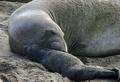
| 01/30/2004 05:41:56 AM | Elephant Seal greets her newborn pupby sfaliceComment: Critique Club
Hi Alice
Good score - pity that the standard was so high for that challenge, else you'd have placed so much better.
For me there was something not quite satisfying about this shot - I mean that it didn't quite get me as I though it might have been able to. I know it's a tricky shot to get, but I don't think that should sway opinions of it. I think I felt that the framing of the shot was not good: I'd rather have seen a touch more location, perhaps. Also I wonder about your placement of the seals' heads in frame, and relative to the bodies: maybe showing more of the mother would enable you to contrast the relative sizes of the two and to put the real subject (that moment of contact) into a stronger place compositionally. I can imagine then the lines of the bodies forming a happier graphic element to the image. Just thoughts and imaginings, or course.
More purely technically, of course, there is nothing to criticise. And of course, its absolutely fitting for the challenge: I just feel that you slightly missed the 'art' element that NG seems to like in its nature shots.
Ed | | Photographer found comment helpful. |
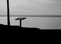
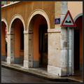
| 01/30/2004 05:20:56 AM | Tableauby zeuszenComment: Staggeringly poor score here, but I think your own post-challenge comment is correct. Likewise I'd like to re-inforce what JJ says.
To add to my earlier comment, I meant to say that I appreciate compositionally the almost perfectt banding into the 'thirds' lines image right ... it was more a question of weight, really. That's what lost you the one point from me that would have given you a ten otherwise.
Ed | | Photographer found comment helpful. |
| 01/30/2004 05:14:52 AM | Four of a Kindby KonadorComment: Very happy for you Ben - can't believe this is your first blue ... surely you must have about 6 by now :-) Excellent shot, one of my two top picks from this challenge. | | Photographer found comment helpful. |
| 01/29/2004 05:32:55 AM | blue skies beyondby ScantyNebulaComment: Your Critique Club moment
got to agree with the noise comments - an image tidying programme would help no end: but I should also say that that's as much to do with the challenge as anything. I think of NG photography as being technically highly assured - clean, exact, quite high contrast - and this is almost the opposite.
Which is not to say I don't quite like it, just that it was never going to do so well in this challenge. I like the gentle toning of the pic, the movement of colour in the skies - I think I'd almost like it more without the lump of land in it, so that it would be more abstract.
That land is perhaps part of the problem - or rather your placement of it within frame. It isn't forming a major part of the composition, not being far enough into frame for that, but also it's not working to frame anything, balance anything, and of itself it's pretty dull to me - a lump of rock and snow.
Your title confuses too - I'd expect to see a storm cloud, or some more present threat with blue skies, whereas your entire image is blue, with just a hint of gentle pink.
Ed | | Photographer found comment helpful. |
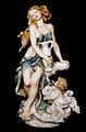
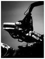
| 01/29/2004 04:50:54 AM | Aquarius - by Giuseppe Armaniby brettdComment: Whilst this is a wonderful technical shot of this statuette, there is a rule about 'artwork' which refers to literal photographic representations which this infringes blatantly. Technically, though, highly competent work. | | Photographer found comment helpful. |
| 01/29/2004 04:33:16 AM | | | Photographer found comment helpful. |
| 01/28/2004 07:46:26 AM | Vehicle Graveyardby jonpinkComment: Meant to comment on this at the time, Jon, and never got round to it, and then remembered it yesterday whilst out and about so I've come back to find it. Do those noise/too dark comment rile you like they do me - the presumption that you've made a mistake, rather than a choice? I liked this a lot, and still do.
What makes it for me are two particular complementary elements you have going on: the sky disappearing to black top left balances that white car bottom left, and also the darkness of the pile of scrap bottom right: the white car and the scrap also balance each other, which provides great natural framing for the main subject: the crane coming in from the 'vacant' corner, neatly brings the eye to the main car, which process makes the centred composition work well.
I guess I'd have tried to reduce the sharpening artefacts around the edges of the crane arm, but in such grainy (noisy!!) work it doesn't really offend. I guess you knew it was going to get slammed, but I think it's a very strong shot.
Ed |
| 01/26/2004 07:37:34 PM | Warning!by jjbeguinComment: An object lesson in walking around with your eyes (properly) open, Monsieur. | | Photographer found comment helpful. |
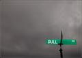
| 01/26/2004 07:34:01 PM | "Sign of a Dulled Existence"by Nowhere_ManComment: Wonderful shot. The angling of the road-sign bothers me a touch (a very small touch, I should add) - had I taken it, I'd have tried to get a sqauer-on view, to lose the angle of the other arm of the sign at least, and to give a more regular shape to the two visible arms: in a composition this oddly geomatric, that distortion becomes quite important I think. 9 | | Photographer found comment helpful. |
|
Showing 2881 - 2890 of ~3604 |
Home -
Challenges -
Community -
League -
Photos -
Cameras -
Lenses -
Learn -
Help -
Terms of Use -
Privacy -
Top ^
DPChallenge, and website content and design, Copyright © 2001-2025 Challenging Technologies, LLC.
All digital photo copyrights belong to the photographers and may not be used without permission.
Current Server Time: 06/22/2025 05:13:23 AM EDT.
|