| Image |
Comment |
| 02/04/2004 05:17:53 PM |
The Tarnished Reputation of the Unicorn Hotelby e301Comment: Originally posted by Jaguar:
Brilliant; as long as the story and history matches the statement you're making. |
Interesting comment - I must presume that therefore this is not, in the end, interesting. The 'story and history' could be anything ... but the story and history I've tried to add to this ... isn't that a different matter? |
| 02/04/2004 03:07:48 PM |
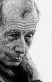
Hard Lives & Stories Untold.by jjbeguinComment: Great portrait, though somewhat forced as a fit for this challenge, as your very explicit title acknowledges. Still a great portrait, though. |
 Photographer found comment helpful. Photographer found comment helpful. |
| 02/04/2004 02:55:14 PM |
Salt & Pepperby puyaComment: I don't se what the negative space top of frame adds to this shot - your cropping is otherwise so close to the edges of your subjects. After a long look, I actually think it detracts - it serves to remove some interst from the progression of those reflections. |
| Photographer found comment helpful. |
| 02/04/2004 02:50:20 PM |
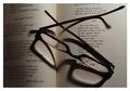
Reading Glassesby CatherineComment: Great lighting. Lacks something, for me - perhaps only that the truly interesting moment of light is where the page fold is - and that's weak compositionally. Certainly one of the more intersting entries so far though. |
| 02/04/2004 02:39:16 PM |
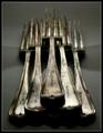
Silver-wareby admart01Comment: I think i can claim to have some experience of photographing shiny cutlery ... compositionally I find this a touch weak - the relationship between the two things is rather arbitrary. The points of real contrast are in weak areas of the frame - either too low or too central, the balance of the 'weight' of them is heavily skewed in favour of the fork, the sharp lines are too sharp resulting in 'jaggies', and the reflections, in balance with the background, are so busy and not terribly well placed. All of which is, naturally, my opinion only. |
| Photographer found comment helpful. |
| 02/04/2004 02:32:22 PM |
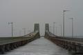
DUAL BRIDGESby TLL061Comment: Compositionally I find this kind of obvious - sure it's an interesting scene, architecturally, and I actively like the irregularity of the lamp-posts, but such a grey day, such very very flat light has wiped out any real interest, visually, from this. Had it been my own shot, I'd either have tried to go back another day, or probably not submitted it. I think it's lacking in mood, is what I'm trying to express. |
| Photographer found comment helpful. |
| 02/03/2004 10:14:07 AM |
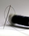
needle and threadby snsComment: This is so similar to another shot (no accusation implied). bound to happen once in a hwile, I guess. This one suffers from either over-sharpening or some other processing problem - the lines of the needle are very jagged. DOF might be too extreme for a really pleasing image, to my eye. |
| 02/02/2004 06:51:53 AM |
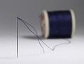
Needle & Threadby agwrightComment: Good clean shot - very DPC:-) Slight barrel distortion affecting the needle, perhaps? |
| Photographer found comment helpful. |
| 02/02/2004 06:35:08 AM |
Fantasia by GordonComment: Congratulations Gordon - were you aware of your score throughout the week? You must have been going mad :-) A clear and obvious winner from the moment if=t first came up on screen |
| Photographer found comment helpful. |
| 01/30/2004 06:00:05 AM |
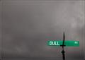
"Sign of a Dulled Existence"by Nowhere_ManComment: If there were an 'almost but just fractionally not quite' favourites thing here this would be in. Just that little element that keeps it out of there for me. Great submission though, and quite a standard you've set yourself. |
| Photographer found comment helpful. |
Home -
Challenges -
Community -
League -
Photos -
Cameras -
Lenses -
Learn -
Help -
Terms of Use -
Privacy -
Top ^
DPChallenge, and website content and design, Copyright © 2001-2025 Challenging Technologies, LLC.
All digital photo copyrights belong to the photographers and may not be used without permission.
Current Server Time: 06/22/2025 09:53:45 AM EDT.