|
|
|
Showing 2851 - 2860 of ~3604 |
| Image |
Comment |
| 02/11/2004 07:04:46 AM | Dubliner Cheese with Cabernet Sauvignonby kayceeComment: from the Critique Club
Well, I've submitted a very very similar shot in the past, which fared pretty well in its challenge, so I guess I've got some genuine grounds for a critique, at least in terms of dpc :-)
Contrast: in terms of luminesence, there is not a great deal of distance between the areas of the photo that most matter. Sure, the white points are white (reflections in the glasss), and the black points (the wine, pretty much) are at least nearly black, but I'm talking about the shadowing on the drape, the edging of the tray, and so on. It's these areas where the texture of your shot should most show, and that lack of range from dark to light removes a lot of that potential.
Light: what light there is seems very hard - the shadows from the glass and the edge of the tray are visible, yet you've not made a feature of them - especially that from the glass on the drape. It would repay more work, I'm sure: try lighting a subject with just a single desk lamp from the side and photographing it, and then try holding a piece of plain white paper over the desk lamp, and pay attention to the way the edges of the shadown change, and the lighting on the edges of the subject. Also this seems t have all the hallmarks of an underlit scene that's been over-brightened to get it all into a useful range: that lack of contrast, and the way the detail of the reds has disappeared. Some of that is no doubt due to exposing for the candle - but if you're going to shoot with a light source in shot then a lot more work is entailed to balance the lighting first: the bright point of that light source limits the range of correction available enormously.
Another impact of that low light is that the cheese has been made to look a very peculiar colour - it seems to me to have almost a green cast to it. A successful score with a shot like this dpends almost entirely on making things look appetising, and really that colour is quite off-putting.
Compositionally, there are two problems - the first being the candle, which disturbs the balance of the shot for me. Your title and comments almost give the truth away - referring only to the wine and the cheese, and never mentioning the candle. Why not? The brightness of that flame makes it the single thing that most draws the eye in the frame. I think it's presence is actively working against the rest of the image - it isn't necessary to add interest: without it you could have worked so much more succcessfully on the texture of the glass and the cheese and the drape.
It's a very vertical composition, posed this way. The candle is upright, the wine-glass naturally so, and even the cheese has been placed upright. The angling of the cheese-parer disrupts this, not necessarily in a bad way, but it confises matters. You have one very strong graphic element in that parer - both tonally and physically it has a very definite form, but the placing of the remainder of the objects doesn't do anything to complement that. Put the cheese on its side, move it a little further from the wine, and you'd have an echo of that overall shape of the parer that would give a much more eye-pleasing balance to the image. Also you've crropped very tightly to the subject (or perhaps, as it's so nearly a 4:3 aspect ratio, you've actually framed it that way in camera), which gives no breathing space for them.
Composition in these images is a tricky matter, and one not necessarily to be learnt from 'rules' - which can make it very intimidating to approach and learn about. If you think of the subjects and the areas of your photographs as having weight I find it helps - I mean all areas of a photograph, including those where there is 'nothing', because even if it's dead black or bright white there's still something there. One aim with a successful shot is to achieve some kind of balance within the frame - I don't mean by centrally placing your subject, as that tends (to follow this analogy) to give the impression of precariousness, to look like it might collapse at any moment. If you distribute the elements of your composition carefully throughout the frame, you'll find a point where you get the idea, looking at it, that there is an evenness throught the shot - that is you really turned those elements of the shot into weight, yoour photo wouldn't slip off your finger if you tried to balance it in the middle of the frame. This is why the rule of thirds works - that sense of balance: an image seems more 'stable' if the weight is taken away from one central point.
The reflection of the room in the glass here is also a distraction.
I hope this helps some. I write so much and in such detail firtly because you asked for an 'in-depth' critique (and I just received one that was unbelievably shallow), and because I think there is real potential in this shot and some of your other work that just isn't getting through.
All the best
Ed
my similar submission |
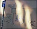
| 02/10/2004 05:53:12 PM | Me, Myself, and Iby leafComment: Critique Club
Well, you obviously mis-read the challenge details.
I kind of get your point, what with the reflection and the shadow, but it never stood a chance, really, did it?
Your lack of entry of comments doesn't help my task here, as I have nothing to go an as regards your intentions.
Presuming you were trying to shoot what you have shot, then the main issue is quality: there is little or no detail in this photo. A lot of noise in the red, which is itself a muted version of the colour.
Beyond which i've no idea what to say to be constructive about this ...
As an abstract, then I simply don't like it - which is fair enough, I suppose. It doesn't work on any level in which I find interest. So I can't really critique it properly.
E |
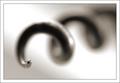
| 02/10/2004 10:50:49 AM | Cork Screwby JackoComment: Exytaordinarily un-sharp, when seen so close. I like the graphical element to this image - the contrasting weight of the curves and the straight line in the background. DOF is obviously correct, perhaps even too extreme, or at least maybe too sudden - the fringe of field seems very abrupt to me. |  Photographer found comment helpful. Photographer found comment helpful. |
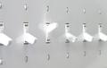
| 02/10/2004 10:37:23 AM | Dissentby ScottKComment: I like the idea: find the execution of it a bit lacking however; somehow the impact of that single reversed switch has been lessened - probably by your choice of crop and composition. The obvious placement would, of course, have been to exclude the left-most switch entirely, which would have given the odd one out a stronger position within frame - however, as you've also cropped across the right-most switch, I guess you were trying for an impression of continuity - as though there were a vast bank of these switches. I think also you could have been more creative with your lighting - the first thing I'd have tried would be some kind of soft light from beyond the switches - to give a greater degree of light and shade to the individuals - basically, more contrast. That said, you've achieved a suitably anti-septic, 'scientific' feel here, which is by no means out of place - I just think that you could have used the reflectiveness of the surface to good effect also. DOF os effective, though in an ideal world might have been even shallower - but I guess one doesn't necessarily have the means ... definitely an above-average shot, though. 6 from me, for now. | | Photographer found comment helpful. |
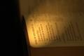
| 02/10/2004 10:29:32 AM | Solomon's Songby LafaminitComment: I'm kind of surprised there weren't more text-based entries for this challenge - it seemed a quite obvious subject to illustrate DOF. Some good stuff here - I love the (presumably torch) light, and the exposure. I do find the positioning of the book in frame a bit arbitrary - gives me an intense desire to turn it, to angle it more into shot, which might allow a more pleasing placement of the important text, perhaps. You seem almost to have cropped more for the light than for the subject, here. But interesting work, nevertheless. A 6 from me. | | Photographer found comment helpful. |
| 02/09/2004 07:45:27 AM | | | Photographer found comment helpful. |
| 02/09/2004 07:31:04 AM | Light and Shade: Paint on Canvasby ImagineerComment: Take heart from the quality of the people that bothered to comment, Jon; and thanks from me for putting up something more intersting than the run-of-the-mill. I was one of the 7's, but I scored nothing higher in this challenge. Good to see challenging stuff. | | Photographer found comment helpful. |
| 02/09/2004 07:16:54 AM | Watching Otter Anticsby banditis53Comment: Score 1: outside the challenge, in fact diametrically opposed to the challenge, as this is a wonderful example of hyper-focal distance in action. Other problems: lack of definition between dog and background, the half-capture of that footprint (?) in foreground, and quality problems. |
| 02/09/2004 07:09:10 AM | Lazy Susanby Crafty SueComment: There are one or two areas that just about get out of focus, adn to a kind eye just about validate it for the challenge - a very kind eye, I should add. The background, the lighting (that horrible over-exposed section) and the very ordinary presentation of a pretty ordinary subject lose you marks - the randomness of the cropping doesn't help either - it isn't centred, it isn't very far off either - all give the impression that no care has been taken with this shot at all. For all those reasons, and because it really doesn't fit the challenge, I score you a 1. | | Photographer found comment helpful. |
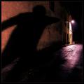
| 02/09/2004 07:03:53 AM | Lonelyby loboz33Comment: A magical image, apart from two things. The Border, the contrast of which ruins the delicacy of the image for me (and did you add one border, sharpen and then add the other?) - as I look at this that big white rectangle constantly imposes itself on my eye; and it njust doesn't sem to be applying the technique at all. |
|
Showing 2851 - 2860 of ~3604 |
Home -
Challenges -
Community -
League -
Photos -
Cameras -
Lenses -
Learn -
Help -
Terms of Use -
Privacy -
Top ^
DPChallenge, and website content and design, Copyright © 2001-2025 Challenging Technologies, LLC.
All digital photo copyrights belong to the photographers and may not be used without permission.
Current Server Time: 06/22/2025 09:52:34 AM EDT.
|