| Image |
Comment |
| 02/18/2004 03:46:12 PM |
Rest Stopby MazerComment: Nicely done. Doesn't have the real presence of detail that the top shots have, and sense of texture is a touch diluted by that. |
 Photographer found comment helpful. Photographer found comment helpful. |
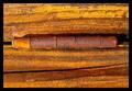
| 02/18/2004 03:19:32 PM |
Textureby TiberiusComment: Very satisfying colours, good light. Just a touch, well, dull as far as subject goes? That colour and texture alone aren't quite enough to bring this into the realm of the extraordinary. Nevertheless, a solid entry - way above most. 6 |
| Photographer found comment helpful. |
| 02/18/2004 03:16:13 PM |
Up to par?by WhiskeyComment: Excellent detail ing - even perhaps a suspicion of too much sharpening around the logo. Really brings out the shape and the 'imprintedness' of that patterning. Even the blown out right top of the ball works with your positioning of it. Just a touch unremarkable however ... not that the sheer competence of it doesn't put it in a league above the majority of shots here. |
| Photographer found comment helpful. |
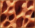
| 02/18/2004 01:38:28 PM |
carton tileby undieyatchComment: Good photography - and an interesting graphic. The pitted nature of this stuff is interesting. Perhaps too purely formal to make a great impact, but its wonderfully executed. |
| 02/18/2004 01:36:50 PM |
evening at an airportby michel14Comment: Strong image, and a refreshing take on the challenge. I just feel it lacks some punch, some point of interest, or some process to hold the eye but also let it wander. Minor point - the trees - in or out of frame, but like this seems like indecision. Hope others give you some latitude in challenge terms. |
| 02/18/2004 01:33:51 PM |
dustersby whiteroomComment: Way too small to consider, really. Some suggestion of spininess and featheriness, but I would make the point that the displaying of your images is as much a part of the trick of entering competitions as is the taking of those images in the first place. |
| Photographer found comment helpful. |
| 02/18/2004 01:32:32 PM |
Unused Spongeby ChrisW123Comment: Good lighting, exposure. Would like to see something to grab the eye more - some point fo focus within this near-abstract image. Still, a pretty good demonstration of texture. it'll be worth my reconsidering after I've got through them all, thus 7 for now. |
| Photographer found comment helpful. |
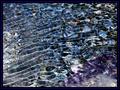
| 02/18/2004 01:30:22 PM |
Rough Wavesby surajbharComment: Nice patterns. and good colours, but that's about it. The small disturbances in the rhythm of the centre area do amke for a good composition, but I think there isn't really enough - just enough to take it away from being a good wallpaper, but not enough to make it an image that would happily stand on its own. For me, of course. |
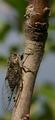
| 02/18/2004 01:28:23 PM |
Pricklyby SkiJumpNoseComment: I've written on another shot that silhouette is the antithesis of texture - and here you go and prove me wrong. This has some strength compositionally - triangles in the stalking of that plant lead the eye around nicely. The blurred background bush is a pity, especially against such a colourful sky - as soon as the attention goes from the silhouette, its lost. |
| Photographer found comment helpful. |
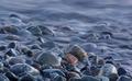
| 02/18/2004 01:25:36 PM |
Velvet Tideby ccraftComment: Like the idea, as suggested by your title, of a created texture - the look of that blurred water, as opposed to the reality of it. Combines well with the hard stoniness you've captured in the stones. Has a magic, fantasy landscape feel. Would like a touch more depth to it, maybe - something to hold the eye, which is lacking here - you let the gaze wander out of frame too easily with this. |
| Photographer found comment helpful. |
Home -
Challenges -
Community -
League -
Photos -
Cameras -
Lenses -
Learn -
Help -
Terms of Use -
Privacy -
Top ^
DPChallenge, and website content and design, Copyright © 2001-2025 Challenging Technologies, LLC.
All digital photo copyrights belong to the photographers and may not be used without permission.
Current Server Time: 06/23/2025 03:02:47 AM EDT.