| Image |
Comment |
| 02/19/2004 05:58:17 AM |
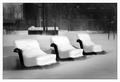
Colorsby manuComment: Good sense of shape and feel, excellent saturation of colours: would like a capture that didn't take so many of those lines out of frame, it would feel more complete. Balance of the major areas of white paint is perhaps not terribly harmonious. |
| 02/19/2004 05:56:27 AM |
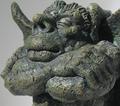
Sleeping on the Jobby seancgn68Comment: Some fine detail seems to be missing from this, which gives a feeling of fake-ness to it, if you follow me. Background makes it look like a studio shot of a statue, but your lighting has filled too much of the stonework (metalwork?) to really emphasise the texture. Competent though. |
 Photographer found comment helpful. Photographer found comment helpful. |
| 02/19/2004 05:51:48 AM |
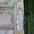
Neglectedby TerryGeeComment: Good work - good sense of feel. Positioning of the edge of the door frame in your frame i aarbitrary-seeming. With something bordering on the abstract - as in it's more about the textures and shapes, rather than the objects as such, I think you could have been a little less rigidly orthodix regards the thirds 'rule' to good effect. Like this, the shadowy world of the window behind the door (?) becomes too important to the image. |
| 02/19/2004 05:46:55 AM |
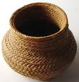
Wovenby wetlandComment: Elegantly done - wonderful wonderful lighting, which is enough to stand it out from the crowd alone. Communicates a great sense of feel. Beyond that, though, just a bit straightforward, perhaps? Sure, it's fabulously photographed, but it remains just a woven bowl/vase/thing. 7 for now. |
| Photographer found comment helpful. |
| 02/19/2004 05:39:42 AM |
Adrift in a Shallow Field of Snowby mariomelComment: You have managed to please almost all of the really great photographers on this site with this image - as consolation for not getting a deserved ribbon - well, it's more than that, isn't it? great list of comments there. |
| Photographer found comment helpful. |
| 02/19/2004 05:31:45 AM |
The structure of a drop of waterby mannjuditComment: Like the small world going on inside the drop. Positioning of same in your framing is a bit odd, leaving so much of that bizarrely smooth background as dead space - it doesn't serve to isolate, and yet takes up so much of your image. There;s extraordinarily little progression of tone within that shade, very odd looking (and I've even checked it, and found that there is some small change of intensities in there - excellently well done technically). |
| Photographer found comment helpful. |
| 02/19/2004 05:27:06 AM |
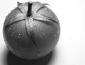
All Wetby HavokComment: Good sense of feel and shape - a touch of the bizarre added by excellent b/w conversion, really masterful use of digital imaging. Framing is satisfying too. Good work indeed. |
| Photographer found comment helpful. |
| 02/19/2004 05:24:33 AM |
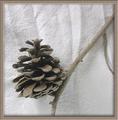
Pineconeby CDSComment: Great sense of feel. Tonal work is fabulous, lighting perfect - though some might argue that a less creased background would be preferable in such a controlled composition. The slightly strange 'extra' bit of twig on the right gives a kind of 'alien' (in the sense of 'strange') fel to the composition, adds just that touch needed to balance the cone itself.
Missing some detail in the cone itself - your focus is far better on the background and the twig - which loses some sense of texture from it.
The border - especially the shading added with it, is quite posibly outside the rules I would think - you've used it to add a degree of three-dimensionality to the image which was not there out of the camera I would suggest. If you had placed the shading from the border in the same direction as the shading in the image it would be more convincing. |
| Photographer found comment helpful. |
| 02/19/2004 05:15:14 AM |
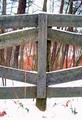
Fenced inby MattBL34Comment: Lacking detail it's very hard to communicate a sense of texture - it's those very small shadows, only revealed in a well detailed photograph, that fool the eye into percieving texture. Quite interesting composition, graphically - the absolute symettry almost works in such shapes. Such a poor quality image though. |
| 02/19/2004 05:13:12 AM |
Guitar Playerby Geo_GriffinComment: The strong lines of the hand/arm and the guitar strings make a difficult composition here. White outline of instrument moving in and out of frame, especially on the right, is disruptive: the real area of texture is the fold of the jacket and the othe bit of clothing, but that isn't composed to be very important in this image, and ther's not much sense of the smooth, shininess of the guitar's laquering. |
| Photographer found comment helpful. |
Home -
Challenges -
Community -
League -
Photos -
Cameras -
Lenses -
Learn -
Help -
Terms of Use -
Privacy -
Top ^
DPChallenge, and website content and design, Copyright © 2001-2025 Challenging Technologies, LLC.
All digital photo copyrights belong to the photographers and may not be used without permission.
Current Server Time: 06/23/2025 07:15:16 AM EDT.