|
|
|
Showing 2661 - 2670 of ~3604 |
| Image |
Comment |
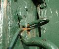
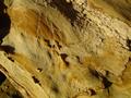
| 02/19/2004 02:09:28 PM | Old Dairy Doorby WoodieComment: Good sense of the rough paint job, but compositionally weak and disorganised I'm afraid. Colour is good, but it seems an odd moment of light that you've chosen for this entry., doesn't seem to amphasise the texture at all. |  Photographer found comment helpful. Photographer found comment helpful. |
| 02/19/2004 02:07:46 PM | Little Fuzzy Creatureby ericwoodfordComment: Some texture rmains, despite what appears to be very flat lighting. Some work needed on web presentation too - this is asmall image and avery small file, and that lack of inormation would hurt a great shot in the voting, and this isn't that good. |
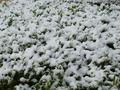
| 02/19/2004 02:04:42 PM | Light Snowby kposeyComment: Quite dull - the snow only seems the same grey as the dpc background. and there's very little variety across the image to hold the eye. |
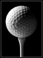
| 02/19/2004 01:56:55 PM | Teeing Upby D-ManComment: Excellently lit, really produces the texture, both the pits and the plasticity of the ball, and what appears to be a wooden tee. Very simple, though the areas of shading that really might appeal to me are quite small, and perhaps the shade too dark for a a wow factor - or too sudden maybe: constrained mid-tones. | | Photographer found comment helpful. |
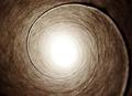
| 02/19/2004 01:54:49 PM | Upward Spiralby dustin03Comment: Don't suppose the tube came from dpcPrints, huh? Tonihng is effective, composition is good - abstract enough to suit a centred set-up, and exposure is fine. Great on the texture of the inside of the tube too, but a touch on the mundane side, without being radically different enough of a view to grab my attention. Competent though. |
| 02/19/2004 01:50:27 PM | textureby slonkoComment: Indeed, and nothing but texture, perhaps. Compositional rules pretty much go out the window with this kind of thing, but I feel to create a pleasing image from it there must be some sense of flow within the picture, ir a strong balance of elements, or some process going on. Here, whilst the illustration of texture is admirable, I find a very static image, with no one element to anchor the eye and let the attention, whilst tied, roam through the image. Exposure, colour, light is all excellently done, but some of the more artistic elements of a great photograph are absolutely missing. | | Photographer found comment helpful. |
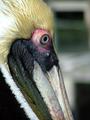
| 02/19/2004 01:47:45 PM | Pelican Feathersby RacaryuComment: Thaty background really is a shame - pulls the eye very hard. I'm just aware of those shapes all the time I try to look at the capture of teh bird. Good work on the exposure, and it's a very accurate rendition, good sense of the construction of its beak, and the differing textures there. But that thing in the back is murdering what might have been a top image. A shame, too. |
| 02/19/2004 01:45:52 PM | Five O'Clock Portraitby JPRComment: I've ad trouble with all the facial hair shots so far - just can't decide where to place them in this challenge. Sure it fits the challenge, and is a perfectly acceptable portrait in a certain style - I'm no fan of that slight wide-angle look to this shot, but that's your choice. Well composed though: that edge of the sweater and the hat make a useful balance, and it's very well liut, though perhaps too much inclassic portrait manner, and not enough with an eye to bringing out the texture of the face. Not that you've removed it all - as some others have - but it's certainly reduced, I would say. Borderline 7, but presently 6. |
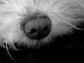
| 02/19/2004 01:42:35 PM | Dog Noseby qwerty_314Comment: I'd seen the thumbnail, and was looking forward to the appearance of this shot - but unfortunately I find it a touch disappointing now. B/W is useful, always, to communicate texture, but I don't see much in the image, and the composition is not a strong as I would like - really, the nose is very much centred, and without the flow of patterns and shapes to constantly bring the eye to that point. 6 |
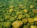
| 02/19/2004 01:40:24 PM | Natural water textureby anshalin1Comment: Another interestingly different approach. as with a couple of similar shots, my first reaction is that I might like them as a wallpaper - which in itself tells you what I find wrong with it as a challnge entry - there just is't a point which holds the interest, that arrests the eye. I do very much like the tonality, and that use of light as a means of transmitting the idea of a ruffled surface of water, however. |
|
Showing 2661 - 2670 of ~3604 |
Home -
Challenges -
Community -
League -
Photos -
Cameras -
Lenses -
Learn -
Help -
Terms of Use -
Privacy -
Top ^
DPChallenge, and website content and design, Copyright © 2001-2025 Challenging Technologies, LLC.
All digital photo copyrights belong to the photographers and may not be used without permission.
Current Server Time: 06/23/2025 08:00:38 PM EDT.
|