| Image |
Comment |
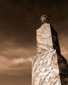
| 02/20/2004 09:57:36 AM |
woundby ritaardComment: Suggestions of symbolism here that I just don't get. Photographically intriguing, but ultimately for me unsatisfying. Basically, it doesn't make any sense to me. |
| 02/20/2004 09:55:22 AM |
Ropeby briphotoComment: Very good on the sense of feel. I'd maybe suggest that the light is touch too even - that you've filled a little too far and removed any sense of the dramatic from the image by that. Minor point though. |
 Photographer found comment helpful. Photographer found comment helpful. |
| 02/20/2004 09:54:23 AM |
Trapped Airby MarieWComment: Exquisite shot of the glass, great use of the paper background, though perhps that low quality paper gives too grainy and confised looking a patterning to complement the smoothness of the glass. Like the depth of field on the bubbles enormously, and your control of this exposure. Very clean too, and the black surface of the water is marvellous. I would perhaps have suggested just using a single light panel to one side of the glass, not for illumination, but perhaps too provide a clean reflection to suggest the three-dimensionality of the glass a touch more - just in consideration of this challenge topic. Such a pure silhouette doesn't really give a reat sense of texture; but it remains an excellent shot. |
| Photographer found comment helpful. |
| 02/20/2004 09:49:54 AM |
Timeby frateComment: Some impression of the quality of these surfaces, though really quite an ordinary illustration of the clock face. Lacks that dynamic that comes from good lighting, from a less straightforward approach. Good exposure, and accurate colours and sense of the object itself, but the shot hasn't placed the emphasis on the textures really - would need more careful consideration of the affect of light on a surface in that area. |
| Photographer found comment helpful. |
| 02/20/2004 09:46:34 AM |
Work Hatby PopcornheadComment: Oh - there is some feel of surfaces here, hough almost despite the shot rather thanbecause of the way you've done it. It's a very dull exposure - quite accurate to life in a way, I would suggest, which doesn't necessarily make for a good shot. Bland compositionally - there's just no sense of the dramatic to it, though in its sense of the absolutely mundane it has some appeal. |
| Photographer found comment helpful. |
| 02/20/2004 09:29:35 AM |
Concreteby weavercComment: Interesting trick - to have found ameans of communicating that texture pof the concrete, and the shape of the fleur-de-lys without any seeming variation in the brigher areas of the stone, just by shadow. Other than the bang-centre placing of the device. I rather like this. Perhaps fractioanlly heavy on the contrast - or rather perhaps fractionally too intensely direct a light to have chosen, but pretty good nevertheless. |
| Photographer found comment helpful. |
| 02/20/2004 09:24:59 AM |
Garden Potpourriby perempuanComment: Such a small image size makes it difficul to comment, indeed it's half the allowable maximum dimension. Nevertheless, some texture shows, albeit in what seems quite a disorganised composition. |
| Photographer found comment helpful. |
| 02/20/2004 09:17:00 AM |
End of winter on a roof...by RebTheRebelComment: Challenging shot, and shows great competence. Not sure i completely go for that enormous progression of focus into the foreground, really -it provides a blalnce to the composition in therms of weight, but there's just so very little information going on there that is seems almost completely arbitrary. gret subject though, and excellent detailing and at last some texture in your main subject. veru good on the fascination of the very ordinary. |
| 02/20/2004 09:14:25 AM |
1887 Graniteby cbellerComment: Good composition - very strong on graphic elements. The light is too harsh, too directional to promote a sense of texture though - simply enough, with the inscription being barely distinct you're harly likely to have captured a feel of the surfces of that stone. |
| Photographer found comment helpful. |
| 02/20/2004 09:12:46 AM |
Layers.....by DrakeComment: Some degree of texture comes through, despite the lack of finer detail and the overall blurriness of it - it seems like you might have used too close to a 1:1 magnification of your original image, has that kind of quality to it, |
| Photographer found comment helpful. |
Home -
Challenges -
Community -
League -
Photos -
Cameras -
Lenses -
Learn -
Help -
Terms of Use -
Privacy -
Top ^
DPChallenge, and website content and design, Copyright © 2001-2025 Challenging Technologies, LLC.
All digital photo copyrights belong to the photographers and may not be used without permission.
Current Server Time: 06/25/2025 07:31:21 AM EDT.