|
|
|
Showing 2511 - 2520 of ~3604 |
| Image |
Comment |
| 02/20/2004 12:24:31 PM | A Modest Vegetable.by jjbeguinComment: And a beautifully photographed one at that. Great sense of texture - I almost took the same shot myself. Great light, perfect exposure, functions well in black and white, though might still function well in colour I would think - has the look of being that very dark green that is so appealing. I do feel you might have allowed a touch more room between it and your frame, it feels just a bit cramped to me. Top work |  Photographer found comment helpful. Photographer found comment helpful. |
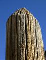
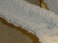
| 02/20/2004 12:21:35 PM | "50 yr. old fence post."by jimsappComment: very straightforward presentation of a pretty simple idea: not necessarily a bad thing, but it is lacking a touch of inspiration i think. Perhaps it might have been a touch more successful with some sense of location, though you have attained some degree of a sense of texture with the shot. |
| 02/20/2004 12:19:42 PM | Worn & Weatheredby jonpinkComment: Splendidly battered subject. Good work on the looming out of the trees trick, great exposure for me too (I suspect many won't like the darkness) Works very appropriately in black and white. Doesn't quite do the texture thing, in a oure sense - I don't get a strong sense of the feel of the thing, rather of the look and location, and of course a wonderful mood. |
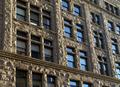
| 02/20/2004 12:16:00 PM | facadeby fluxnComment: Ah, You se, people can understand the subject of the bloody challenge. Forgive my cursing. Excellent demonstration, enhanced by the blueness of that reflected sky. Suffers a touch from that optical illusion of making the corners of the images not appear quite square, qhich confuses the eye a bit. Like the balance of the transparent windows and the reflective ones too, and all of which complements that excellently photographed facade. | | Photographer found comment helpful. |
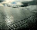
| 02/20/2004 12:13:06 PM | Muddy Watersby geewhyComment: Like the steely grey tones, and that patch of blue; like the compositional shaping of this too. There's a solidly triangular construction through the frame, and that always makes for a satisfying process for the eye. Good sense of texture throughout too. Not quite making it to the top if the list for me, I suspect, but very close | | Photographer found comment helpful. |
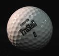
| 02/20/2004 12:10:35 PM | Golf Planetby frodobagginsComment: Neat idea, not great execution. The warmer top-side light is effective, but your fill from the right is too general, and perhaps too far to the front of the subject to provide real shaping. Those bright white reflections of the lamps are a shame too - might be worth experimenting with covering them a sheet of paper, to make the light softer, or even to reflect the light off apiece of white board (styrofoam, as the Americans term it, works very well for that. That should give you a more pleasing illumination, and even if there are still reflections, they should have that more professional feel to them. You have caught some texture here - follow the line of the text to the left and it's really quite well shaped there - if you could get that effct everywhere you'll really notiv=ce the improvement, Finally, it's a pretty ordinary subject, no? Great for experimenting with light actually, but in terms of a photographic presentation, not one of the more intriguing things. | | Photographer found comment helpful. |
| 02/20/2004 12:04:13 PM | Wooded Area Barkby 3rdigitalComment: For me this could use a little more punch in the colours, or a higher level of contrast - something to bring it away from the entirely everyday look that it has. You've captured the texture of that nearer tree very well, and your composition is promising - but its in the tonality of the image that it falls down i think. Also the light was very general, very non-specific at the time - perhaps a touch more directionality in that light would help to enhance the sense of depth. a promising scene, but perhaps not under these lighting conditions. |
| 02/20/2004 12:01:18 PM | Anglesby pitsamanComment: Nice shooting. There is some sense of the smoothness of what you've caught here, but little actual sensation of texture, for me. Not to say it isn't a very good image - just not quite doing what was asked for. Stilla worthy entry though. | | Photographer found comment helpful. |
| 02/20/2004 11:34:11 AM | Deadly Warmthby littlegettComment: Don't know what's going on here, so I'll ahve to treat this as an abstract shot. There is a little sense of texture, despite your use of flash here, which has taken away a lot of the sense of depth and feel to this shot. That diagonal is a classic compositional technique, but there really isn't enough going on here to hold my attention for very long I'm afraid. I'm certain you had some sort of impact in mind, but it isn't clear to me. | | Photographer found comment helpful. |
| 02/20/2004 11:31:27 AM | Pillow Softby relgraphicsComment: The tonality workd well with the theme and subject - a real sense of bedside light. You've caught a good sense of the osftness, and yet the patterened texture of that pillow; however its quite a bland scene really, isn't it? Nice feel, but not a great deal going on to really grab the attention. | | Photographer found comment helpful. |
|
Showing 2511 - 2520 of ~3604 |
Home -
Challenges -
Community -
League -
Photos -
Cameras -
Lenses -
Learn -
Help -
Terms of Use -
Privacy -
Top ^
DPChallenge, and website content and design, Copyright © 2001-2025 Challenging Technologies, LLC.
All digital photo copyrights belong to the photographers and may not be used without permission.
Current Server Time: 06/25/2025 11:28:58 AM EDT.
|