|
|
|
Showing 2231 - 2240 of ~3604 |
| Image |
Comment |
| 05/26/2004 05:43:26 AM | Lightsby thumperComment: 3. Intriguing image, though I'm not a fan of your post-processing - those blown out whites appearing inpatches is kind of unflattering, and doesn't add to what is already a quite bizarre feel. In simple terms of the challenge details, it's impossible to score you more. |
| 05/26/2004 05:39:59 AM | exoticby xripollComment: 2. So small, so compressed, very difficult to see that there might be more than one light source. The one point above minimum you score is for having some sense of composition in the image. |
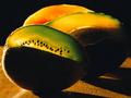
| 05/26/2004 05:38:37 AM | All it needs is a bit of lightby elykComment: Like the progression of colours here, but can't get on with it as an entry for this challenge. Good work to make the centred subject function with that background, and blalnce the shot - not easy to do. The colours are the only thing I find interesting here, apart from a possible suggestion of the poisonous nature of Coca-Cola, but that seems incidental. 3 |
| 05/26/2004 05:35:01 AM | Glow of Innocenceby starmackinComment: Small, in both size and usage of available bandwidth, which will hurt your score I'm sure. I find this composition clumsy too - there's only the single movement through the frame for the eye, and that takes it pretty quickly out of frame. The balance of the weight of the image is heavily to the left too, making it feel un-thought-out. 4 |
| 05/20/2004 05:55:41 PM | |  Photographer found comment helpful. Photographer found comment helpful. |
| 05/20/2004 07:54:38 AM | Life without Greenby FalcComment: Technically, near-perfect. The array of those small leaves gives good blance to the idea of a centred composition here, and allows this shot to work. The de-saturation of the leaves is a personal choice of course - but likewise, it's a personal bugbear for me (one of the things such techniques opens you up to in a peer-voted competition), and I cannot see a justification for it here, can't see what it adds, beyond a suggestion of shudder-value, of distaste. Makes it look like the thing is emerging from seware, rather than water. Great capture, for me let down by your processing. 6 | | Photographer found comment helpful. |
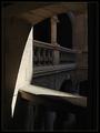
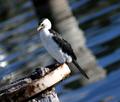
| 05/20/2004 07:41:56 AM | Wild Life Centreby mrblobbyComment: Couldn't work out what the apparent motion blur was at first, but I guess it's just the out of focus water, yeah? The tilt absolutely makes this: balances the composition nicely, allowing those shapes to give movemnt through the frame rather than blocking them all to one side and one edge. Good work there - wonder how many comments will criticise it? Either your processing or your exposure causes me some problems though - the eye is so dark it feels like a 'wrong' photo - and the eyes are essential in almost all wildlife photos. Perhaps if you'd under-exposed and then brought the highlights back in post-processing? Might give you more range of detail, without losing that level of contrast completely. 6 | | Photographer found comment helpful. |
| 05/20/2004 07:09:11 AM | Bee by JackoComment: Not at all sure about this. Obviously highly accomplished, there is little to criticise technically, if at all. Some of your choices confuse me though - the extreme shallow dof - and its affect on the attenae, coming in and out of focus ... also I keep wanting to see more detail in the hairs of it's head, but they're out of focus, and I'm not finding enough interest in the patterning of the eyes, which is where he focus is. It's confusing to my eye, but not challenging. 5 |
| 05/20/2004 07:01:44 AM | Moyer at Leisureby daisy77Comment: I think you fall into a slight trap here of just finding a subject and centring it, rather than finding a subject that benefits from being centred. Whilst there is some interest in framing him against pure grass, and the very slight leading lines of the cut pattern help, there isn't enough to suggest a demand for a centred composition. Technically accomplished though - and perhaps there are things here the British eyes miss. 5 | | Photographer found comment helpful. |
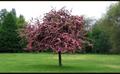
| 05/20/2004 06:58:10 AM | Treeby redmoonComment: I like the strange depth of field here - well, perhaps not strange, but kind of antique, if you follow me. Love the almost model-like sense of detail and tidyness: makes it look so small. Aided by that film-like border, this has a real subtletly that I fear will be lost on the 10 second voters. Not sure that I wouldn't personally have tried to avoid the blown-out sky, either with some kind of graduated filter or framing the subject against a solid background of other trees. But it's lovely work as it is. 8 | | Photographer found comment helpful. |
|
Showing 2231 - 2240 of ~3604 |
Home -
Challenges -
Community -
League -
Photos -
Cameras -
Lenses -
Learn -
Help -
Terms of Use -
Privacy -
Top ^
DPChallenge, and website content and design, Copyright © 2001-2025 Challenging Technologies, LLC.
All digital photo copyrights belong to the photographers and may not be used without permission.
Current Server Time: 08/29/2025 04:23:52 PM EDT.
|