|
|
|
Showing 2191 - 2200 of ~3604 |
| Image |
Comment |
| 06/07/2004 04:43:07 PM | Deep DOF: macro styleby GordonComment: Almost, anyway! Serious bit of cloning work needed, especially in such a dramatically graphic macro. Like the effect though, but you're really struggling with sharpness toward the edge of frame, and there isn't actually anything to suggest exactly how deep or otherwise your dof was here. |  Photographer found comment helpful. Photographer found comment helpful. |
| 06/07/2004 04:41:00 PM | Aloneby arnitComment: The mood, those clouds ... this would seem to cry out for a black and white treatment to me. That said, the muted blues, and the greens and the red shirt do have an impact entirely down to their colours. Great sky - if it's burnt, it's done very well (against the dpc trend). I guess it will score well, though, I have reservations personally about it - kind of too obvious for me, if you follow. |
| 06/07/2004 04:30:50 PM | Benches.. Benche.. Bench.. Benc.. Ben.. Be.. B.. Churchby mariomelComment: Man, I have to vote on this just to get it off the thumbnails page. And you forgot the bin in your (hugely annoying) title. decent shot - highly contrasty and typical of v harsh midday sun, though, and perhaps not simple and graphic enough to really make the most of that light. 5 | | Photographer found comment helpful. |
| 06/07/2004 12:28:09 PM | Antithesisby SharQComment: The anithesis of deep depth of field? Is that the point? Whatever. 1 | | Photographer found comment helpful. |
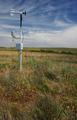
| 06/07/2004 12:22:58 PM | Hilltop Weather Stationby postoakinversionComment: This is one of those very difficult to comment on images :-) Of itself, there's nothing immediately wrong with it - not technically: exposure is fine, sharpness and focus is fine, detail is pretty much there. and it certainly meets the challenge ... but that's all it does. There's no drama in it ... the brushy undergrowth is pretty static, and just a confusion of leaves and brown-greens - there are no patterns there, no textures to hold the eye, and it's just pretty ugly. The weather station isn't so interesting a shape, and framing it across the horizon line makes it seem absolutely mundane. Ther is some distant subject in the shot, but only a very tiny amount, that thin strip of distant field: the light does nothing for that, and again there are no regular shapes or patterns to hold interest, just a random mix of fields. And the sky ... well, at least you avoided the real fear of a blank blue sky.
Such mundane subjects, in my view, require moments of exceptional clarity of light, and the skill and luck to capture that, to be interesting: the light here is your major problem after your choice of subject. It nust isn't doing anything for this scene ... other than making it visible. There's no shape and definition to the foreground, no texture tto the far fields. It's almost as though you've decided that the rule of thirds is enough all by itself.
Viewpoint is something you could happily play with here too - shooting up from the ground, including some of that vegetation at the botttom of fframe would still give you an example of deep depth of field, but with much more drama to the shot: even that change of a few feet in point of view would alter the whole impact of the image, especially compared with what appears to be a head-height shot. 3 | | Photographer found comment helpful. |
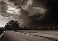
| 06/07/2004 12:10:41 PM | The Stormby dustin03Comment: Great sky, and almost a fabulous composition: to my mind it really cries out for something image right to balance the composition - presently, absolutely everything (road, toning of sky, tree) pulls the eye to image left, and although the road in one sense pulls the eye back to the right, there's nothing there to hold interest inside the frame. Perhaps it's only that the lighter area of cloud starts so far into frame that they eye hunts for something out to the right. Whatever - it feels unbalanced to my eye. But a great scene, nonetheless. Real power. 8 |
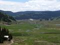
| 06/07/2004 12:05:52 PM | The Green Valleyby TressiderComment: Everything in frame is sharp OK - a start at least. Really difficult to make out any shadows here - looks like the sun may be directly overhead, which has an awful flattening effect on this landscape. If only you'd been able to wait until a lower angle of light might have produced some shadows to give real depth to those hills, some real shape: which might also have helped in terms of pure composition - it's a struggle here to find any shapes to lead the eye around, or any real striking subject to hold the attention and to anchor the image. 5 | | Photographer found comment helpful. |
| 06/07/2004 11:55:14 AM | "All Ears"by tfarrell23Comment: Dang, you must be disappointed to place down here with that score, and to score that low with that shot ... love the detail, the gentleness, subtleness of it. More power to the 5400 :-)
ed | | Photographer found comment helpful. |
| 06/04/2004 08:28:26 AM | Ruler of the Fruitby SonifoComment: Also browsing ... and for me by far the most interesting shot of the challenge. everyone else has resorted, it seems, to tricksy and slightly weird studies: you have found something interesting and dramatic, and genuinely photographic, in a true image of bananas. Top work. | | Photographer found comment helpful. |
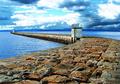
| 06/04/2004 05:09:30 AM | Sea terminusby bpickardComment: Interesting to read your process for altering the sky ... for me, you've taken the contrast thing just a bit too far: the brightness of those white areas of cloud don't sit correctly with the light on the tower on the harbour, and it is perhaps too blue - these are marginal things for me, just a touch less extreme would I think make this more 'photographic', less 'processed'. In similar situations myself, I usually select with a feathering of 200 pixels, so that that join is very progressive, and less cleaning up required.
Having said that, I love the composition, and the tonality you've found in the little building (where the light is extraordinary) and the stones of the wall. Good work indeed. You Scots are starting to rival the Icelanders here - must be something to do with wind and rain :-)
Ed | | Photographer found comment helpful. |
|
Showing 2191 - 2200 of ~3604 |
Home -
Challenges -
Community -
League -
Photos -
Cameras -
Lenses -
Learn -
Help -
Terms of Use -
Privacy -
Top ^
DPChallenge, and website content and design, Copyright © 2001-2025 Challenging Technologies, LLC.
All digital photo copyrights belong to the photographers and may not be used without permission.
Current Server Time: 08/29/2025 02:34:36 PM EDT.
|