|
|
|
Showing 2171 - 2180 of ~3604 |
| Image |
Comment |
| 06/09/2004 09:12:49 AM | Two octaves, clear and sharpby rhipsterComment: And, to extend your analogy, kind of flat, in an odd way. Clever work, though I have doubts about this being a useful subject for the challenge (which you've obviously met). We know the object has depth - but from experience, rather than from what you show. Good light, and tones, though some will find the reflections annoying on the bell - as much I would say because they look for problems rather than the constructive. Somehow, the bar-work on the stops is too confused to allow the simple graphical effect of perspective to function, I think, making the foreshortening much more drastic. A lot of stuff I like though. 7 |  Photographer found comment helpful. Photographer found comment helpful. |
| 06/09/2004 09:08:00 AM | Wrap Around Bayby TommyMoe21Comment: I'm a fan of this compositional technique, although i would personally try to bring the foreground at least into centre frame, if possible, or refrain. Would like to have seen a more interesting moment of light chosen for those stones' sake - there must be enormous texture and variation there that would be amphasised by a different quality of light; this has that high contrast hallmark of midday-ish light, lacking subtlety. 5 | | Photographer found comment helpful. |
| 06/09/2004 09:05:18 AM | Dream Cloudsby NeuferlandComment: Very little definition in the green areas - possibly because of exaggerated sharpening? It's become massively pixelated at the 1:1 resolution - there is no (or at least little) progression between pixels. Quite like the effect actually, though it seems in such contrast to the effect on the sky (I'm sure it's the same thing, but its impact in different areas is weird). Two problems for this challenge: the effect seems more about processing than about photography, and it doesn't strike as a deep dof image (though you aren't losing marks for the latter - I just think you will from others). I like the blankness of the image, of the composition, but for my enthusiasm would like to see more gentlness to the work on the greenery. 7
re-reading comment I haven't mentioned how striking this image is. But I have now. | | Photographer found comment helpful. |
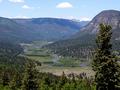
| 06/09/2004 09:00:12 AM | Down In The Valleyby SammieComment: This has a real holiday snapshot feel to the exposure - fundamentally, and I don't mean in the sense of pure technique, this is over-exposed. Obviously all the detail is there, and I'm sure a histogram will tell you otherwise, but this is over. There's no sense of immediacy, no presence to it - all those colours and shapes have become so muted in the haze that definition has begun to go. It also suffers from the age old summer sunlight problem - really so unflattering on any landscape, so harsh. I see nice compositional ideas at work here however, which go some way to rescuing the shot ... but the blue-ing of everything, and the light ... 4 | | Photographer found comment helpful. |
| 06/09/2004 08:54:55 AM | | | Photographer found comment helpful. |
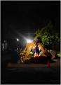
| 06/09/2004 07:14:40 AM | Balloon Festivalby rubyrednailsComment: A lack of colour impact, for me - a white balance thing, perhaps? Fairly chaotic composition - the three overlapping figures add confusion, the cropping of the balloon ... if you'd got down at low level and shot to fame the person holding that rope entirely against the background of the balloon, for instance, you'd have a far stronger image. Including the background only on image left doesn't really seem to add anything to this, especially when cropping out the otop and left of the balloon. 5 |
| 06/09/2004 07:09:32 AM | One Blue Window and an Airplaneby bobdaveantComment: Not two? Like the idea of the shot, not completely happy with the execution - I think I would have tried to frame the plane further from the edge of image, to start with - it's really too close to the edge for happiness for me. I like the processing, though I guess many won't, although the very hard halo's from sharpening I could live without. 6 | | Photographer found comment helpful. |
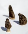
| 06/09/2004 07:06:59 AM | morrelsby snsComment: Oops. I'm not convinced about the shot anyway, leaving aside the challenge; it would seem to me that the variation in these shapes cries out exactly for a deep depth of field rather than this shallow one - had they been identical objects, and had you arranged them so that therre was more progression through the field of focus, then perhaps it would work. 3 - mainly for missing the challenge. |
| 06/09/2004 04:19:36 AM | Dedicated Workersby lizzyc3Comment: This is a marvellously lyrical shot of what is often so very humdrum and messy. You've turned it into some kind of balletic exercise in light. I particularly like the negative space (though I'm certain many people won't understand the point of it). There's that odd smooth quality - is this NI doing it's more heavy work?, or some sort of channel-split gaussian blur? - but it's everso effective in this case.
Obviously has no place in this challenge, unfortunately, and I'm sure you'll have been told that already ... but a wonderful shot nevertheless. |
| 06/09/2004 04:12:02 AM | moloby slonkoComment: Like your use of the vanishing point here. The strong graphic elements of this shot cry out for a black and white treatment to my eye - then it becomes more about the shapes and less about the tones (though the grey-blue of sea and the muted browns of boards are a pleasant combination). The strength of this, though, for me, lies in the way the scene is precisely sectioned by those elements. I think I would also have put some time in darkening sky and sea, which would give a stronger impact, as far as a challenge is concerned: whilst it repays looking, I don't think that many people spend that long when voting. 6 | | Photographer found comment helpful. |
|
Showing 2171 - 2180 of ~3604 |
Home -
Challenges -
Community -
League -
Photos -
Cameras -
Lenses -
Learn -
Help -
Terms of Use -
Privacy -
Top ^
DPChallenge, and website content and design, Copyright © 2001-2025 Challenging Technologies, LLC.
All digital photo copyrights belong to the photographers and may not be used without permission.
Current Server Time: 08/29/2025 12:22:30 PM EDT.
|