| Image |
Comment |
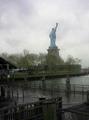
| 07/14/2004 08:01:17 PM |
Our lady in the rainby carinaComment: For all the obvious quality issues, and I must agree the tilted horizon seems more like a mistake than a point of intent, I think this is a fascinating compositional idea - I do like the way the complication and the widening zig-zag of the boards makes the statue seem almost irrelevant, incidental: this has a message, or the intent of a message. Good work, and not deserving of either that score or many of those comments. |
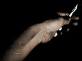
| 07/13/2004 08:46:25 PM |
Mark of the Wizardby ImagineerComment: Thanks for submitting this one John. Not just because of recently being under the knife myself, but for the rationale you've written with it, and the difference of it. |
 Photographer found comment helpful. Photographer found comment helpful. |
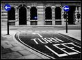
| 07/07/2004 04:46:26 AM |
Monument Valleyby turdaveComment: This is an excellent shot - I urge you to work it up as a black and white, though - with decent conversion to keep the sky dark, and perhaps a general darkening of the foreground you could have a masterpiece. Breaking the 'rule' about centring the horizon in frame works very effectively here - adds to the sense of brutality of the landscape, the uncompromising nature of it, and you've kept both the sense of the size of the outcrops and the way in which they are dwarfed by their location - the combination of those two senses of scale really make the image huge. Great work. |
| Photographer found comment helpful. |
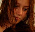
| 06/29/2004 07:58:10 PM |
Making A Pointby e301Comment: Originally posted by laurielblack:
Not a bad placement for a desat hater, huh? ;o) Your eye must have healed very well, because this is a great shot! Congrats on the top ten!! :o) |
Actually this shot was taken with my left eye ... ;-) |
| 06/29/2004 07:43:18 PM |
My First Portrait Attempt! (My Son Karson)by ConcreteDonkeyComment: Compositionally unbalanced - I don't see the benefit of all that negative space image left ... just looks like a mistake; especially whne it places your main subject on the terribly weak central plane of the image. The weight of this composition is more about the djembe than about the child. That said, the light is pretty good (though his head seems under-lit compared with his body, slightly), and there's texture to the clothes; the pose is awkward, and the expression a touch bizarre for a really happy formal portrait. 5 |
| Photographer found comment helpful. |
| 06/29/2004 07:39:38 PM |
My Loveby Thousands_FallComment: Of course one is open to misunderstanding taking a stance on the challenge theme, but it seems to me the 'formal studio portrait' element was pretty strongly stated. This looks like a crop from a snapshot, I fear: weak and indistinct lighting, poor processing; a certainn moodiness, but the cropping lets it down and doesn't bring much life to the image. It seems the kind of thing that would benefit hugely from a black and white presentation - and that tells as much about its suitability for this challenge as anything else. 3 |
| 06/29/2004 02:58:52 AM |
The Journalistby ImagineerComment: Good light - good control of exposure too - highlights are just in control, shadows have detail but still look like shadows. Good character in the face, though perhaps getting him to focus on the top of the page would have made the eyes feature a touch more: they're a bit too closed here, I think. |
| Photographer found comment helpful. |
| 06/29/2004 02:56:49 AM |
Katherineby kncoughlinComment: Very well done - would like a little backlight from the left side, just to bring out some depth in her hair - it wouldn't affect that lovely light across the face. |
| 06/29/2004 02:55:24 AM |
sophisticatedby hopperComment: Lighting excellent - maybe just a tiny bit flat on the hands, but excellent for the face. your crop, especially on the hands, is odd, as is the posing of them - why cut half of them out? 6 |
| Photographer found comment helpful. |
| 06/29/2004 02:53:19 AM |
Photographers portraitby birgirComment: like the style - well, I don't, personally, but I like your execution of it - has a certain meanness to it. White shirt issue though - makes the face look dark, pulls the attention away from subject, and the background highlight is not helping that being in the same area of frame. 6 |
| Photographer found comment helpful. |
Home -
Challenges -
Community -
League -
Photos -
Cameras -
Lenses -
Learn -
Help -
Terms of Use -
Privacy -
Top ^
DPChallenge, and website content and design, Copyright © 2001-2025 Challenging Technologies, LLC.
All digital photo copyrights belong to the photographers and may not be used without permission.
Current Server Time: 08/29/2025 02:58:35 AM EDT.