| Image |
Comment |
| 08/18/2004 08:22:47 AM |
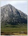
View from King's Houseby BobsterLobsterComment: The only thing I notice from your compression problem is the ghosting along the mountain's edge - some patient and careful cloning could fix that, perhaps? Wonderful tonality in the grasslands and the rocks, and as Gordon has said the composition is wonderful. Tried bringing the sky down a touch? A ND-grad effect or simply some burning might just add that touch more drama - which would I think help to emphasise the height yet more? Great stuff. |
 Photographer found comment helpful. Photographer found comment helpful. |
| 08/16/2004 05:56:38 PM |
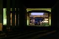
bridges over nothingby krazyComment: Like this very much - structurally, colour, thematically. Ideally, of course, you might have tried to bring up tose crazy forground shadow angles. I'm not completely sure about the collection of whatever it is between the bridges - looks like a trailer or something - and it's perhaps that lack of definition that hurts the image for my score. |
| Photographer found comment helpful. |
| 08/16/2004 05:51:05 PM |
Going away ...by smr78Comment: Oh very dpc! Sure you'll do well - great colours, great sense of depth, effective composition, gently witty. The smallest point, but that blue sky could do with a touch of cleaning up. |
| Photographer found comment helpful. |
| 08/16/2004 05:46:27 PM |
Vanishing into a 'white hole'by johnmkComment: Good work. Nice to see a decent use of burn out, and certainly meets the challenge. lacks any great interest, or difference however - some special moment of light, or composition - to break out of the 6 bracket for me. |
| Photographer found comment helpful. |
| 08/16/2004 05:38:51 PM |
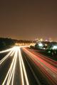
into townby stoney66Comment: Not wholly convinced abut the composition - though you have at least used the leading lines idea sensibly, which is more than some have managed. I agree it needed some amount of sky to give space to the image - but this much, and to weake the vanishing point by placing it centre-frame? I'm not sure. Not at all a poor attempt - could happily for me have had more contrast, more blacks to off-set those trails: it is perhaps a little over-exposed. |
| 08/16/2004 03:38:50 PM |
Reachby JesuispeureComment: Neat, well done image. I personally like the distribution of weight added by the tilt - although it doesn't make it stand out special - and I fear the punters won't get it at all. Something to do with the sense of vertigo one can get from looking up at things like this. Nice stuff, but lacking in an element of delight - perhaps that light is just a touch too ordinary. 6 |
| Photographer found comment helpful. |
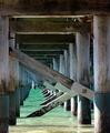
| 08/16/2004 03:33:40 PM |
Repetitive Pylonsby HeavyComment: So difficult I know, but I find this suffers from a lack of definition around those piles and braces - probably simply because of the brightness of the water; even allowing the sunlit areas of wood to burn out (as I think you should, in this instance), there seems a lack of visible texture and tonality in the wood. Perhaps a touch sharper, or a little work with curves, might bring things out more? Good colour in the water though, and in the reflected light. 6 |
| Photographer found comment helpful. |
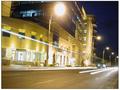
| 08/14/2004 10:41:23 AM |
Waiting for the tramby alithenakeComment: Well - there are a number of obvious 'faults' here - at least things that I see as 'wrong' without seeing a good reason for them. The image appears to have been adjusted to be vertical according to the furthest lampost, but that leaves the entirety of the building and all the (larger) lampposts seeming tilted. There's a simple perspecive correction required if you want everything t be vertical/horizontal. I know there's a tram there because your title tells me so, but it would require some careful looking to find it without that, and otherwise it seems a weirdly tilted image of a buildng at night, with a couple of light trails. The brightnedd of the building's lights means that any trails from the tram's windows as it has passed have failed to register.
It was a good idea, I think: outside of the run-of-the-mill obvious approach taken by most, and a effective use of the challenge stipulations, but badly let down, I fear, by the image's problems. 4
As you've PM'd me asking me to look again at the image, here I am. I think I confused the cross-wires at the end of the road with the suggestion of a partly exposed tram - that and the very odd light-trail so high up the image, and your title. I still absolutely think you were wrong not to adjust the tilt of the shot, I still see no point to it; it adds an unconfortability to the image that it doesn't deserve. Still a 4
|
| Photographer found comment helpful. |
| 08/13/2004 01:21:35 PM |
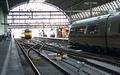
Railway to the eastby tetoComment: A quite common idea, and for me too rigid in its application without adding anything new. The usual recourse of such image is in high quality, but I'm afriad the contrast and light and suspect resolution around the tree don't do you any favours here. 4 |
| Photographer found comment helpful. |
| 08/13/2004 01:19:26 PM |
|
Home -
Challenges -
Community -
League -
Photos -
Cameras -
Lenses -
Learn -
Help -
Terms of Use -
Privacy -
Top ^
DPChallenge, and website content and design, Copyright © 2001-2025 Challenging Technologies, LLC.
All digital photo copyrights belong to the photographers and may not be used without permission.
Current Server Time: 08/28/2025 03:41:44 PM EDT.