|
|
|
Showing 1981 - 1990 of ~3604 |
| Image |
Comment |
| 09/22/2004 04:43:19 AM | Competitionby GabrielComment: Posted this in the forums; think I'll leave a copy here too.
"Having looked through the votes and comments now, I think the complainers are wrong. As a shot of it's type, 'competition' is very very effectively done. Think of this: it isn't a standard 4x3 aspect ratio; the grey has been perfectly matched to the site background; it is a photograph of nothing - rather than any old shot darkened completely and then lightened to the right shade. It shows imagination, thought, and care in execution.
It deals with ideas and concepts that are almost completely out of place here - and a challenge is the only sensible way to display it on the site. Had it been put into a portfolio and a thread linked to it I think it could only have struggled to 100 views or so - as of right now it has 1400 or so.
I can't believe that those who commented along the lines of 'stop wasting my time' actually spent any time at all thinking about it - whilst it was obviously going to be voted down massively, there is certainly more to it than the Burt Reynolds blank black 4x3 shot. Intellectually, the ideas it provokes may hold little interest for a vast majority of this site's competitors, but there is equally no need for an outright dismissal of the thought and ideas behind the shot.
I can absolutely agree with any vote it recieved - all the way through the range, from leaving room in one's own scale for other shots to rank above it, to acknowledgment of a little intrigue, to outright dislike, and the sliding scale in between. Interesting to note that it recieved at least one vote at each score.
But what it isn't, is wasting anyone's time." |  Photographer found comment helpful. Photographer found comment helpful. |
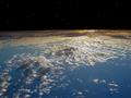
| 09/22/2004 04:41:55 AM | From-Space-for-Portfolio-2.jpgby newtune3Comment: This is an inversion and edit of your challenge sunset shot, yes? I think it needs a couple of extra things: fewer stars - they wouldn't really be visible compared to the brightnedd of the planet from that low an orbit. And some hazing around the edge to represent the atmosphere - the edge of the planet seen from space is not a hard line, but a gradual one. Great idea. |
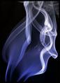
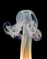
| 09/13/2004 07:13:55 PM | Escapeby smokeditorComment: excellent definition, even if your exposure/brightening has gone a touch too far in places IMO. Including the source might have given the image some sense of contet, instead of being simply a pretty pattern. | | Photographer found comment helpful. |
| 09/13/2004 07:12:30 PM | Pot Porri sticksby trainComment: Some enormously serious sharpening gone on here, huh? was that to get the smoke trails some definition? If so, selecting their area and then sharpening that would have prevented those very strong jaggies on the sticks themselves. It's unfortunate, and ruins a fine effort. |
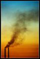
| 09/13/2004 07:10:09 PM | Poison Skyby aznymComment: Two Towers, huh? Simple, elegant, and ... well, just a touch bland for me. A bit obvious, you know? I'm sure it was difficult to shoot and all that, but that should never be a consideration in my book. A heap better than most others however. 8 | | Photographer found comment helpful. |
| 09/13/2004 06:58:38 PM | The sound of gravel under your shoes.by jjbeguinComment: I'm surprised by the provenance of this ... the texture of the shot, the contrast, the detail, the sense of grain all seem to be your work. The green border ... (expression of horror)! I'm afraid I voted it way down, just for that: I cannot look at the image without my eye being drawn to that green square, and that makes it difficult. Where white or black serves to isolate from environment, alows you to choose the context of exhibition, this ... well, it baffles me. I'd love you to explain the thinking.
E | | Photographer found comment helpful. |
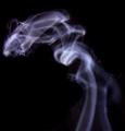
| 09/13/2004 06:51:26 PM | Where there's Smoke...by atsxusComment: I like this, though I wish you hadn't proveided such a mundane title for it. It has a feeling of landscape about it - which, in my opinion, is the secret of all near-figrative photography that isn't people-based. It reminds me of aurora shots, and in it's forms recalls the trumpets of Michelangelo's heralds. The composition is startlingly effective too. 9 | | Photographer found comment helpful. |
| 09/13/2004 06:47:07 PM | Untitledby kevinfComment: I can see the hard lines of your selection around the smoke, adn that foils the effect. Use of levels, or curves would make the desired effect easier i think, and from the look of this you also need a deeper depth of field - very little is in focus - or you need a faster shutter speed - if it's motion blur. I know from my own experience that it's very tricky with smoke ... but my sympathy for your attempt grants you a few points. | | Photographer found comment helpful. |
| 09/13/2004 04:40:37 AM | Risingby bongoComment: Very like one of Kiwiness's shots, though the lighting is poorer here. That front flash is rather strong - and rather harsh; use of a reflector might have softened that light a touch, to remove those hard shadows. | | Photographer found comment helpful. |
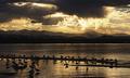
| 09/13/2004 04:37:00 AM | Smoke On The Waterby MWittComment: Lovely shot ... but, well, smoke? I actually find that weird cloud formation distracting here - otherwise I think there might be a fine balance between the mountains, the birds and the sky. | | Photographer found comment helpful. |
|
Showing 1981 - 1990 of ~3604 |
Home -
Challenges -
Community -
League -
Photos -
Cameras -
Lenses -
Learn -
Help -
Terms of Use -
Privacy -
Top ^
DPChallenge, and website content and design, Copyright © 2001-2025 Challenging Technologies, LLC.
All digital photo copyrights belong to the photographers and may not be used without permission.
Current Server Time: 08/27/2025 09:41:56 PM EDT.
|